Become a MacRumors Supporter for $50/year with no ads, ability to filter front page stories, and private forums.

meltedcaramel

macrumors newbie
Original poster
Feb 18, 2011
2
0
Hi there. I just got a job as sales representative and designed a business card. Would appreciate some opinions ^^

--I aimed at a simple business card design
--Is the colour used good?
--I saved the uploaded image in a lower quality to help bandiwdth, so it may have some noise.
--Which 1 is better, the full black or the black with blue?

Again, appreciate the help!!

Edit: Added new Business card (the major green one) for a quick opinion as well.
 

Attachments

  • card1.jpg
    card1.jpg
    46.6 KB · Views: 197
  • card2.jpg
    card2.jpg
    57.2 KB · Views: 168
  • card3.jpg
    card3.jpg
    53.9 KB · Views: 111
  • phan-and-doan.jpg
    phan-and-doan.jpg
    71.1 KB · Views: 109
Last edited:
First impressions:

I like the version with the blue colored area.

The placement of "consultant" seems odd to me. I'm not sure if you're a Sales Rep Consultant (and it didn't fit on one line), or if you're a Sales Rep and a Consultant.

I'd be curious to see what the card looks like if the letters within the blue area were black rather than the light color.

Thanks for your opinion.

I have added image with black text replace the lighter colour. (Image 3)

I added consultant there because my role is kind of both, but more of a rep than a consultant (mainly added it because I wanted to cover the empty space).

Also, I added a green business card for a fruit and vege business. Is it too green in your opinion? As you can see Im a fan of 2-3 colours per image only ^^''

Again, appreciate the help.

I don't have any comments on the design because that's personal preference. I would warn you, however, that you can't have text that close to the edge of the card. All printers require any text be about 1/8" away from the edges to allow for any variation in cutting out the cards after printing. Usually a printer you choose will tell you the safe area they require.
 
I like it. It's simple. I REALLY like the second one. Make text black-on-blue instead of white-on-blue. Maybe at a few blue spots or something up top too. Just my 2 cents.
 
I really like the black and blue card with the black lettering in the blue colored area.

I agree with laurim that you might be cutting it close to being outside of the safe area for printing.

The fruit and vege card looks good to me. I don't think it's too green... I actually like the color. I would think about losing the ".A.D." that's inside the large "P".

Just my opinions though. As mentioned, these are your cards and should ultimately reflect your preferences.
 
You might want to hire a designer. They look like templates modified by design newbies (bad).

First mistake: hand-written fonts
 
You might want to hire a designer. They look like templates modified by design newbies (bad).

First mistake: hand-written fonts

It really depends on the type of business she works in. If it's child-related or something particularly girly or the corporate image is based on that style, the font could work. If it's another business, then a more serious font would be more appropriate. The most important thing is whether it's readable or not.
 
It's all wrong.
Wrong fonts
Wrong layout
Wrong placement of text
Looks amateurish

Sorry. Get a professional to do this for you.
 
meltedcaramel is looking for constructive criticism, not, "go hire a designer".

I give him or her tremendous credit for doing this, and putting it here for us to help him/her learn.

How can anyone get better at something they're attempting to do if the answer is always to go find someone else to do it?
 
Look at that subtle off-white coloring..
The tasteful thickness of it.
Oh my God..
It even has a watermark.

In all seriousness though, I don't think the light green color, or the blue/black combination works that well. I think that if you are to have something as visually disruptive as a signature, then the card itself should be very sober to offset the irregularity of something hand written.

The signature itself should be thicker, and look into making it look more like a stroke than a pixellated curve. The pixellated curve makes it look cheap.

Why not try a dark silver signature on a silver-white background with your name?
 
Hi.
I applaud your attempt at the design. The layout isn't too bad actually.
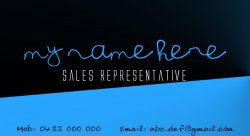
I find myself in favor of the green on as it's turned a different way and forces the client to look twice and interact with the card.

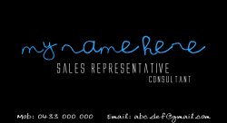
I've seen some suggestions for blue on black, and I can tell you from firsthand experience, that that particular color combo can be the death of your layout. Text, especially thin text tends to disappear.
If I could give you any advice, it would be to make a color study if you have the time.
Pick 30-40 shades of each of the colors you chose, and mix up the combinations. See what works, narrow them down by half each succession through the study down to two combinations. Then pick the winner from that.
I did that with a logo, but I had 60 different shades of a green and yellow, and it finally came down to a neat 2 card design where I was able to play on the reversal of the color for the big boss and the guy underneath him-kept the corporate identity solid, but the switch let some individuality shine through.
Whoever posted about printers requiring a certain border for cutting was right. Find out from whoever your printer is what your die cut will be and give the card that extra size accordingly.
Write down colors you use, sketch ideas...lots of sketches, and know why you picked those colors and those typefaces.

As I said before, I liked the green option best, as it appealed to me most.
If you do decide to go with a designer, check if there is a local college or university with a good design program...ask about some of the students, check out their portfolios from the projects they've done.
If the students are able to take pre-press classes, only talk to students who've made it through that class.
Again, you've done well yourself and I think the green card and the composition has potential. Just keep working with it. My personal motto is "Push it until it breaks". So just make decisions, see what works and have fun above all.
Good luck! :)
 
There should be a reason for every single element in the card. If the "sales rep" was in the business of selling blue and black childrens toys then i'd say the card design may work otherwise you should keep it simple. Why is the blue band there? Why is it angled? The term "mobile" is too short a word to abbreviate. And get rid of the hand written font on critical information such as email address and name.
 
How can anyone get better at something they're attempting to do if the answer is always to go find someone else to do it?

That's the EXACT thing I told my brother in law when he refused to let me practice drilling on his teeth!
 
My only question would be; how does the design relate to what you do?

Also, does the company you've got the job with have it's own branding that should possibly be incorporated?
 
I love the combination of black and blue. I like the third one so much. Making text black-on-blue instead of white-on-blue is really better than other one. Good job.
 
Silly questions...

Why would a recently hired sales rep be designing a business card?

Doesn't the company that hired you already have an identity/stationery/business card that you should use?

What company allows their sales reps to design their own cards? :confused:
 
The combination of black and blue (image 3) is really good. But I think you can change font style for mobile & email. This one is little hard to read and looks a bit ‘casual’ too.
But I really don’t like that last one (green). Looks very gaudy!
 
Register on MacRumors! This sidebar will go away, and you'll see fewer ads.