Become a MacRumors Supporter for $50/year with no ads, ability to filter front page stories, and private forums.

macgfxdesigner

macrumors regular
Original poster
Sep 27, 2004
190
0
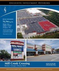
I am working on a new one off design of a marketing package cover for a new listing the company I work for, and wanted some feedback on the overall design and impact. I also took the photos too, Aerials and Ground

1602784518_7a21c92b7e_b.jpg


Thank you in advance!

Matt
 
first reaction is.... What are trying to get me to buy or be interested in? I assume lease retail space? I think you need to clarify your message. Why the roof tops?
 
honestly (sorry if this sounds harsh) although its all technically good work I haven't got a real idea of what you sell.

To me it looks like you're trying to sell a car park and roof (first top picture)
the bottom left kind of feels out of place and the picture bottom right is a nice picture but would look better with people in the view - I wouldn't invest in an area with no through traffic so to speak.

Also that T shaped white lines are thicker than the others, I'd personally match them all the same.

I agree, the photo on top could use some typing over the roof top. Something like... 25,000 square feet available.. etc.

People in the shops would be nice.

Although the bottom left photo does seem a bit awkward, I think its a good idea to leave it there. It shows you already have MAJOR clients, who wouldnt want to be located near a Walmart..

I do like the layout and color choice though.
 
Yeah, I wish the aerial shot could have been taken from a different angle, namely, from the upper right corner of the current picture. There, it would show the front of the buildings.

Because of this, I feel your closer, tighter shots should lead the way, and the aerial used supplementarily.
 
Exclusive Investment Offering means for sale in the real estate world, what is for sale is the shopping center shown in the photo above, the left sign is the monument sign you see while on the road and bottom right is one of the buildings included in the sale.
 
I would tend to agree with the above comments, it works graphically quite well, but the message and information could be clearer.

An idea is to highlight the area in the commercial shot above with a transparent layer or outline to show what is exactly for sale? Then on the one side of the image run some detailed info. I had 20 mins left in the day with not much to do so did a quick mock to show you my suggestion (thought I sell some of Walmart lol)...just rough lines and simple general text, but it shows the basic idea.

I really like your overall design.
 

Attachments

  • sample.jpg
    sample.jpg
    723.9 KB · Views: 147
It looks good.

It's just a shame the client landed you with those photographs. It doesn't look like a classy joint with that signage! :D
 
Register on MacRumors! This sidebar will go away, and you'll see fewer ads.