Become a MacRumors Supporter for $50/year with no ads, ability to filter front page stories, and private forums.

joe.cavers

macrumors regular
Original poster
Sep 16, 2008
178
0
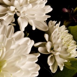
Hey guys, took these this evening, all were shot on auto with my dad's Lumix DMC FZ18. I used a lamp for lighting, and cropped the photos after taking them. I took a bunch but these were my best 3 (IMO).

3407004375_a2cb5bc6df_b.jpg


3407790768_946f992d8f_b.jpg


3407789444_67cb6b24d6_b.jpg


Just wondering what people think of these? Any way I could improve my photography? I was mainly trying to work on composition here, but any positive criticism is appreciated.

Cheers
JC
 

SayCheese

macrumors 68000
Jun 14, 2007
1,720
919
Oxfordshire, England
Hi,

Right, they are nice shots but.......

I personally don't like the shadow on the wall of the first two, I think it detracts from the subject. The lighting is a bit too warm for my liking, maybe try adjusting the white balance a bit.

Otherwise a good try to start with.
Got any others??
 

DaveP

macrumors 6502a
Mar 18, 2005
506
433
The first one looks very bland and agree that the shadow is detracting. I see what you were going for with the shadow on the second, but perhaps the crop isn't working for me. I really like the third, it really draws my eye along the length and just appeals to me.
 

Cliff3

macrumors 68000
Nov 2, 2007
1,556
180
SF Bay Area
Unless you can work the shadows into the composition somehow, I would avoid them if you can. As previously noted, the white balance seems off. I think you're limited to jpeg on that camera, so that will be a bit of a challenge for you to get the white balance correct with the capture. The 2nd and 3rd images are underexposed. I think the 3rd image is the best. You might try placing the light to use it to create some drama - place it low, place it high - experiment to see what works.
 

snberk103

macrumors 603
Oct 22, 2007
5,503
91
An Island in the Salish Sea
You've got a good start....

My observation is that everything is "medium". The focus is sharp, the background is a medium tone, the shadows are sharp, etc... where is the drama?

Throw the shadows out of focus.... now the subject is the stalk of flowers. Or, throw the flowers out of focus, and concentrate the image on the shadows. The flowers are too dark, they should be lighter - like a real flower. Try backlighting them, and they will start to glow. Shoot wide open (shallow DOF) and get closer, and you should start to see some interesting images in the viewfinder. Try for more drama. You have a really good start there, now go and have some fun.

I was having some fun a few weeks ago.... this is basically unedited.... it should become something nice later, eh?
 

Attachments

  • Flower Play.jpg
    Flower Play.jpg
    85.4 KB · Views: 84

joe.cavers

macrumors regular
Original poster
Sep 16, 2008
178
0
Thanks guys, I'll take all of this into consideration and try and do some more I think. Should the white balance be higher or lower? What exactly does that change in the image? Composing the photos themselves aside, I haven't got a good idea of what looks over/under exposed.

I admit that the focus isn't great on these shots either, a number of the other photos I took were simply unusable.

Cheers
JC
 

3paulx

macrumors member
Feb 5, 2009
31
0
I like the third photo the most.
I agree with the others.... just try play on a higher key, maybe get more lighting, adjust the aperture and shutter speed and iso to add more drama...shooting on a much lower key also tells another story. So dont be afraid to break the rules somtimes. also try getting a different angle and shoot from a different perspective, but the leading lines that the stems made (from the 3rd photo) are pretty cool!
Happy shooting!
 

Little HZ

macrumors regular
Nov 15, 2008
241
0
New Mexico
Along w/ others here, I like the third photo the best. I think the middle one could be much stronger w/ a different crop. at first I was going to suggest that the crop is too tight, but actually I think it would have a stronger effect if you cropped a bit tighter on the top, bottom and left--and then, if available in the original sot, add a bit more wall space on the left, to emphasize the shadow a bit more ... ? As it is, the flower itself and the shadow seem to be getting equal billing, so neither one serves as a focal point.

Keep sharing your images!

PS Love your photo snberk!
 
Register on MacRumors! This sidebar will go away, and you'll see fewer ads.