Become a MacRumors Supporter for $50/year with no ads, ability to filter front page stories, and private forums.

CrackedButter

macrumors 68040
Original poster
Jan 15, 2003
3,221
0
51st State of America
Hi there, I use to do design but I major in Photography. My friend is starting a tour guide business and has designed everything herself, she had asked me but I don't think there is much point.

However she asked me for feedback and I don't think the design is 100% there, it's too cluttered for me, too much information.

Anybody with feedback on how to simplify the design would be helpful, be as brutal as possible, i have been so far. :) Thank you. She's used photoshop even though I told her she should use indesign. The little animations annoy me but I know at a later date she wants to brand her coach with the bus icon. Becoming her logo.

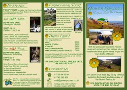
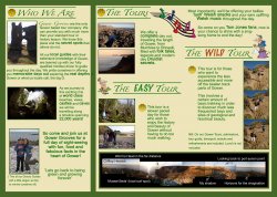
The leaflet is a 3 fold design, showing the front (pictured left) and back (right).
 

Attachments

  • aflyer1.jpg
    aflyer1.jpg
    1.1 MB · Views: 239
  • bflyer2.jpg
    bflyer2.jpg
    1.1 MB · Views: 183
She should increase the margins around the text everywhere within the leaflet. ie - The text is too close to the green borders and too close to the images, such as Tally Abbey photo, as well.

Establish consistency with headlines. Some of them have green bars going all the way across. Some of them don't. I'm not a huge fan of the typeface selected for headlines, and I especially don't like the additional typeface used for "WILD" and "EASY".

On the page with the cartoon bus, "Gower Grooves - The Gower Based Tour Company" should really be in another color without the gradient. A dark green / light green gradient text on top of a dark blue / light blue gradient sky is just asking for trouble.
 
She should increase the margins around the text everywhere within the leaflet.

+1

Margins, margins, margins.

And about 100 other things.

But margins are a start.


Okay, 1 other thing...

It's your big, fat green borders. The page boundary and the folds don't need the extra focus that these lines create. Plus, if the trimming or folds are off a little bit these green bars will just make that more evident. You never want to design something that accentuates the inevitable errors that occur in the printing and bindery process.

99 more to go...

Don't get me started about the clip-art.

It's making me cranky.
 
Margins

Agreed on the margins remarks. You need more space between EVERYTHING.

Also

- Lose the gradient flower clipart
- Pick a new color scheme. I can hardly look at the thing. Try http://kuler.adobe.com/
- Way too much information.
- Lose the hodge-podge panorama at the bottom, it contributes nothing but to an amateur look.
- You need consistency within the copy font and styles. There are random bolds and size changes and it's confusing
 
Check the panels sizes, I'm guessing they will all be the same size.
The page that folds in should be a 1/16" narrower than the other two.

I'll leave the design critique to the designers, I just work in prepress!!:)
 
I agree with the consensus above regarding clutter, negative space (or lack there off) as well as margins. Choice of colour is also not my first choice, or second for that matter ;) Take a look at the vibrant greens below, perhaps the brown/green scheme in the first attached thumbnail but on a white background....just a thought. Kill the boarders. You can use a vibrant green or brown text boxes with reverse type for emphasis on certain info or even for headings/subtitles, but it should be strategically placed.

Also, it opens as a spread, so why panel it off? Why not lay it out with a single panel front and back and have the tri-fold spread that opens up read like a magazine....as one piece, not 3 separate divided panels....see what I am getting at? Tri-folds are not meant to be read as individual, separate pages, rather a spread, just keep it somewhat divided, connected and structured but allow for some open flow.

I would also ditch the cartoon clip art, it makes the brochure look very Windows-esque. :p

If you are going to use icons, there are stock sets of vectors that you can purchase online for very little. These will at least provide a consistency in design and allow for a more professional look.

Personally, I try to stray from vector icons in brochures but they can look ok if done and placed correctly. Combining vectors and real life photos can be a tricky business, but again, if done correctly, it can work well.

I would also go with a white background and and try to clean it up, simple is always better.

Put some emphasis on negative space as well as typography.

Here a few that could replace and enhance what you have. Just do some searches for "nature vecotrs" or "travel vectors" or "abstract nature" etc.

Some more professional looking vectors can be found at www.istockphoto.com
 

Attachments

  • ist2_7237023-natural-icons.jpg
    ist2_7237023-natural-icons.jpg
    88.7 KB · Views: 144
  • ist2_8587948-green-spring-twig.jpg
    ist2_8587948-green-spring-twig.jpg
    72.8 KB · Views: 117
  • ist2_9335380-leaves.jpg
    ist2_9335380-leaves.jpg
    51.2 KB · Views: 116
  • ist2_10226287-grunge-nature.jpg
    ist2_10226287-grunge-nature.jpg
    60.6 KB · Views: 114
  • ist2_11082138-tropical-leaves.jpg
    ist2_11082138-tropical-leaves.jpg
    97.6 KB · Views: 3,213
Another way to open up the space is to edit down the content and eliminate the repeating stuff. There is a lot of shouting going on there! Make things simple and elegant sends a stronger more professional message. Look at hierarchy. What reads first, second, third. Is that the order you want? Who is your target audience? Do you really need to dumb it down so much for them? Try not to fill up those "boxes", create flow across the panels instead.
 
Register on MacRumors! This sidebar will go away, and you'll see fewer ads.