Become a MacRumors Supporter for $50/year with no ads, ability to filter front page stories, and private forums.

rmcwhae

macrumors newbie
Original poster
Jul 2, 2009
12
1
Canada
I like, they are nice simple and easy to read. The only suggestion I would make is to lighten up on the drop shadows.
 
Hi.

A few questions for you. Did you do all of the work or just the web sites?
Did you do the PDFs for St. Anthony's?
Did you do the photography for Oasis Landscaping?

The overall design and color scheme for both is really quite nice and easy on the eye. I especially like the Logo/header for Oasis. Nice and clean.

The photos in the Oasis Gallery are all way too big. They took a long time to download on my cable so I stole one to look at in PhotoShop and it weighed in at 25MB! Help! Your choking me!

I can add some more, but I want to know how much of the sites are yours and how much is given to you by an outside source. I don't really want to comment on anything you don't have control over.

Dale
 

Attachments

  • Picture 1.png
    Picture 1.png
    41.6 KB · Views: 78
Thanks for the input.

To answer your question: yes, I do have control over basically all aspects of the above websites. I did not make the Oasis Logo, but I created the layout around the logo and tried to maintain a consistent colour/design scheme.

As for the huge PDF and image files, that is simply me being lazy. I set up the St. Anthony's client with the free doPDF converter for their weekly bulletins (the only PDFs we have control over) which, of course, gives filesizes nowhere near as svelte as my Acrobat Professional, but it means a lot less work for me.

You do have a valid point about the images being too big. They are taken right off of a digital camera. My intention was to have the client take his own pictures and be able to upload them without my supervision. I don't expect him to know how to resize images. I will look into this further.
 
Overall, I too like the layout. Nice clean, simple designs.

I do however agree with both of the comments from the posters above, images took a while to load and perhaps lenthening your blend and/or softening the shadow(s) on the band across the calgary site would soften the visual transition from imagery to solid space. The blend looks a touch off imo.

I also wonder how the oasis site would look if you took out the shadow/blend as your transition from image to solid space in the header and instead just used a block and added some emphasis to the text, as seen in the template example here: http://osc.template-help.com/drupal_24776/

This would perhaps compliment your existing contemporary design of clean lines.
 
The first one is simple and easy to read. Just a little to much green for me.
Really like the second one,its bold with out being to trendy and feels like a company one could trust.
 
Now I see what you all mean about the drop shadows. See the attached pic. Will work on fixing the text shadow next.

I know the blend on either side of the band is a little cheesy, but it creates a nice pyramid atop the page to lead a user's eye into the content.
 

Attachments

  • difftransshadows.jpg
    difftransshadows.jpg
    97.1 KB · Views: 124
I am among those who aren't sure about the fade in the St. Anthony image bar. It doesn't look like a triangle to me and doesn't really lead my eye to the content. I would like a rounded even fade out or an even linear gradient style at each end of the photo bar.

I do really like both of the sites. I find little to comment on and a lot to compliment on.

Dale

Edit: Something I noticed when playing with guides in your photo bar. The fade makes it a bit off center. That is why is kept bothering me.
 
Hi. Thanks for the great photo of Calgary. I live in the Seattle area, and that city is one I intend to visit in the next year or so.

The color scheme and typography of this site is well thought out. Especially the colors. The name pops right out of the blue field and the grey blends with it just right. I would like to see a continuation of the photo theme you set up in the About Me page. Same size but different images. Very nice "start".

Dale
 
Thanks for the input, as always. I should point it out now that I didn't take that particular pic of Calgary (a quick Google image search will reveal its true author). It is just a placeholder until I take my own.

I too would like to continue the photo theme. I must resist the temptation to throw in some legal scales somewhere.
 
first off, welcome to the forums :):)

2ndly, here we go!

St. Anthony's Website:
it is overall has a very nice layout and its well orientated. i had no problems navigating the site as there are distinguishable links up the top, however i did have a bit of trouble identifying the use of the site - maybe you can have a more dedicated introduction page and move the 'news and announcements' to another page?

i quite like the Green / grey / white colour scheme you have going on, but there is too much whitespace (only slightly on some webpages), is it possible to seperate it with some sort of green 'swoosh' in the background (just as an idea)??

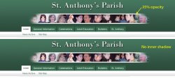
i just noticed:: in regards to navigation under the "General Information" tab, when it is clicked "General Information" is presented to the user, if they click "Contact Us" (for example), and want to return to "General Information" they may be a bit confused because it is not presented to them in the grey/white bar. something to think about.

overall its a very nice website to use :)

Oasis Landscaping:
This website has a completely different feel to the previous website, which is a good thing. it shows you have diversity in your creations, however i can still see similarities in navigation and themes (you've re-used the good parts, which is good haha).

the logo is nice and vibrant, however contrasts too much to the rest of the webpage, the gap between the island and the logo also seems too far.

on the home page at the bottom where "services" is, i would not link each of these services (e.g. patios, walkways etc) individually, because each user might think that it leads to a separate webpage rather then the one webpage - provide one link only to the webpage.

as others have said, please fix those images, they are horrific to load on slower internet speeds!

other then those small things, the website is very attractive yet quite usable!! nice job. a very "in" thing at the moment is too provide a google-maps map directly in the webpage, give that a thought.

sorry if anything is too abrupt, just trying to critique, give us a yell if you need anything else :)
 
Register on MacRumors! This sidebar will go away, and you'll see fewer ads.