Become a MacRumors Supporter for $50/year with no ads, ability to filter front page stories, and private forums.

cwesty

macrumors member
Original poster
Oct 22, 2005
50
0
Hello All,

Quick question. I'm developing a site at the moment, and need some advice as to how to set the screen resolution so the site will look the same on a 12" or 17." monitor.

I've designed it all on my PB G4, and when uploaded & viewed on my screen at work, there's more whitespace than I had thought, plus the logo is floated left and repeated (-x) i think so it's repeated down the left only.

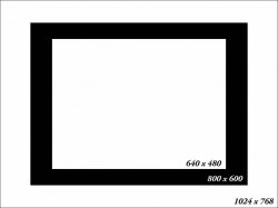
How do I do it so the screen and web page looks the same accross all platforms & screen sizes?
 
Consistant design across all browser/os/rez is a dream. Trust me! I am currently working on my webapp and I have the same problem as you do.

The first solution would be to use a fixed width, like 780px and then float/elastic everything in it. You can then make another design for wide and super wide screens and let the user switch if he wants to. Also, using em as font unit can be a pain in a restricted layout since the width wont grow as the text goes bigger.

As you can see, there isnt any 'easy' solution to this. But I hope someone with more experience than me in CSS/design might contradict me and show a good technique!

My workstation has a 23'' Apple display so I tend make everything too big. So working with a fixed 780px design helped me to figure out what I could and couldnt show on screen. Once I have statistics about my users, I will probably move the layout toward what the majority is using.
 
Use percentages instead of pixels for everything. I even use them for images. That way regardless of resolution the website should look the same on any screen. I think that would help?
 
Use percentages instead of pixels for everything. I even use them for images. That way regardless of resolution the website should look the same on any screen. I think that would help?

That's the easiest way to do it.

Also, using em as font unit can be a pain in a restricted layout since the width wont grow as the text goes bigger.

That's false.

Code:
div {
width: 50em;
overflow: auto;
min-width: 700px;
}

That should expand fine. Just a quicky example.
 
not all browsers play nice with the min-width command, especially IE...

which brings to the OP a case and point, maybe your problems are browser issues or slight code issues and not so much resolution or liquidity problems.

With that in mind, using ems for fonts, or actual "names" like x-small, will keep text from going crazy-bizzazy.

do you want the page to be the width of any monitor, regardless of how wide or small?

do you want the page to be centered, or left/right aligned, and always be there regardless of the monitor size?

http://blog.html.it/layoutgala/ has what you need.
 
I'm developing a site at the moment, and need some advice as to how to set the screen resolution so the site will look the same on a 12" or 17." monitor.

You probably already know this, but I figured I'd throw it out there just in case ya didn't...

The actual monitor size is irrelevant. It's all about resolution. 1024x768 will look the same on a 12" monitor as it does on a 30" monitor. The only difference is that the 30" will display the stuff a lot larger. But you have the same screen real estate.

This is a good thing, btw. It means you can test to see how it will look on other people's displays, without having to run out and buy a new monitor. Just adjust your resolution.

Or, better yet, do what I do. Use the attached image as a background wallpaper. Do NOT set it to "stretch". Set it to "center". Instead of changing your resolution, just re-size your browser window to fit inside the res you want to test for. So if you're testing for 800x600, make your browser fit inside the black box.

This isn't perfect. It doesn't account for docks and windows taskbars. It doesn't take the adjustment of text size into account either. But it does get you awfully close without having to fiddle with your display settings.
 

Attachments

  • Resolution Guide.jpg
    Resolution Guide.jpg
    19.9 KB · Views: 224
Register on MacRumors! This sidebar will go away, and you'll see fewer ads.