L
Lau
Guest
Original poster
I'm building a site that's effectively one page, that you scroll down to view, and it's a four column grid that sometimes spans four columns (like the header) and sometimes two, and sometimes all four. I'm controlling this with divs, in the code posted below. As it's quite image heavy, I'm making the columns fixed width, as they mostly have images in them that wouldn't wrap.
It seems to be working fine, until I try to add text. It's 800px wide (in an outer container), and when I use a 600px wide image to replace the text and a 200px image to the right, it's fine. However, if I replace the 600px image with text and 20px padding to the left, 30 px padding to the right, and keep the 200px image to the right (in a seperate floated right div) the text should automatically fill a 550px wide space, right? But no, it pushes the 200px image onto the next line for some reason.
See images:
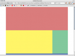
The text is a yellow box 600 px wide here:

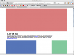
Replace it with text and it pushes the green box down onto the next line:

Is there a way to force text to only be a certain width? Or what am I doing wrong here? This is driving me absolutely batty, and so thanks so much for any help you can give me here. (Even a pat on the shoulder and telling me everything's going to be all right would be good too )
)
Here's the code: CSS
And HTML.
It seems to be working fine, until I try to add text. It's 800px wide (in an outer container), and when I use a 600px wide image to replace the text and a 200px image to the right, it's fine. However, if I replace the 600px image with text and 20px padding to the left, 30 px padding to the right, and keep the 200px image to the right (in a seperate floated right div) the text should automatically fill a 550px wide space, right? But no, it pushes the 200px image onto the next line for some reason.
See images:
The text is a yellow box 600 px wide here:

Replace it with text and it pushes the green box down onto the next line:

Is there a way to force text to only be a certain width? Or what am I doing wrong here? This is driving me absolutely batty, and so thanks so much for any help you can give me here. (Even a pat on the shoulder and telling me everything's going to be all right would be good too
Here's the code: CSS
Code:
body {
	font-family: Arial, Helvetica, sans-serif;
	font-size: 11px;
	color: #000000;
	background-color: #FFFFFF;
}
#container {
	width: 800px;
	margin-left: auto;
	margin-right: auto;
}
#header {
	width: 800px;
	margin-left: auto;
    margin-right: auto;
}
#about {
	width: 800px;
	margin-left: auto;
    margin-right: auto;
}
#leftAbout {
	width: 600px;
	float: left;
	margin-top: 20px;
	margin-right: 30px;
	margin-bottom: 20px;
	margin-left: 20px;
}
#rightAbout {
	width: 200px;
    float: right;
}
#featured {
	width: 800px;
	margin-left: auto;
    margin-right: auto;
	}
#leftFeatured {
	margin-left: auto;
    margin-right: auto;
	width: 400px;
	float: left;
}
#rightFeatured {
	margin-left: auto;
    margin-right: auto;
	width: 400px;
	float: right;
}
#other {
	width: 800px;
	margin-left: auto;
    margin-right: auto;
	}
#leftOther {
	margin-left: auto;
    margin-right: auto;
	width: 400px;
	float: left;
}
#rightOther {
	margin-left: auto;
    margin-right: auto;
	width: 400px;
	float: right;
}
#innerleftOther {
	margin-left: auto;
    margin-right: auto;
	width: 200px;
	float: left;
}
#innerrightOther {
	margin-left: auto;
    margin-right: auto;
	width: 200px;
	float: right;
}
And HTML.
Code:
<html>
<head>
<title>Untitled Document</title>
<meta http-equiv="Content-Type" content="text/html; charset=iso-8859-1">
<style type="text/css">
<!--
@import url("test.css");
-->
</style>
</head>

<body>
<div id="container">
	<div id="header"><img src="images/testimages/fullwidth.jpg" width="800" height="300"></div>
	<div id="about">
			<div id="leftAbout"><img src="images/abouttitle.png"><br>I'm a twenty-six year old recent graduate in graphic design. I recently moved to Edinburgh, and I am currently looking for a position in a design agency in the city. I've completed a work placement at <a href="http://www.redpath.co.uk/">Redpath</a>, and have done some freelance print work. For more information about me, please click here or scroll down. If you like what you see, please get in touch at <a href="mailto:laura@laurabarnard.co.uk">laura@laurabarnard.co.uk</a>.</span></div>
			<div id="rightAbout"><img src="images/testimages/200column.jpg" width="200" height="300"></div>
  </div>
	<div id="featured">
	  		<div id="leftFeatured"><img src="images/testimages/400column.jpg" width="400" height="300"></div>
			<div id="rightFeatured"><img src="images/testimages/400column.jpg" width="400" height="300"></div>
		</div>
	<div id="other">
	  		<div id="leftOther">
			<div id="innerleftOther"><img src="images/testimages/200column.jpg"></div>
			<div id="innerrightOther"><img src="images/testimages/200column.jpg"></div>
				</div>
			<div id="rightOther">
			<div id="innerleftOther"><img src="images/testimages/200column.jpg"></div>
			<div id="innerrightOther"><img src="images/testimages/200column.jpg"></div>
				</div>
		</div>
</div>
</body>
</html>
