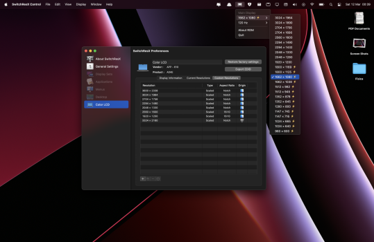
Reading some posts here on the forum, I saw that some people complained about the resolutions available on the new MacBook Pro 14. Because the default configuration (1512x982) would have very large icons and little screen space, while the larger configuration (1800x1169), left everything too small to allow for more space.
Well, I have the solution to your problems, the middle ground between visibility and space.
I estimated an intermediate resolution between the two, which maintains the 14:9 standard, that is, the screen will not be "cut" in the notch region, it will be completely filled.
The resolution is 1662x1080.
An area of space very similar to the area of the old (2016~2019) 15" MacBooks (1680x1050), and maintains a clear and readable size.
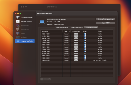
To configure, just download SwitchResX, and configure a scaled resolution 3324 x 2160. This will enable HDPI 1662x1080 resolution with NOTCH aspect ratio, and magic, space and readability together.


