Got a tip for us?
Let us know
Become a MacRumors Supporter for $50/year with no ads, ability to filter front page stories, and private forums.
Dark Mode is better, but...
- Thread starter tekboi
- Start date
- Sort by reaction score
You are using an out of date browser. It may not display this or other websites correctly.
You should upgrade or use an alternative browser.
You should upgrade or use an alternative browser.
I still don't understand why we don't have a full dark mode for Yosemite. I'm glad the dock and menubar is finally dark. But what about the window backgrounds and bezels. Shouldn't those be dark also for consistency purposes.
I’m not happy with the dark mode. I like how the menu bar looks, but the Dock seems to have an added glow to it. If only it was slightly darker, it would look perfect! Perhaps it was too much work to change the windows as well. I hope that developers at least update the menu bar icons soon!
Attachments
I still don't understand why we don't have a full dark mode for Yosemite. I'm glad the dock and menubar is finally dark. But what about the window backgrounds and bezels. Shouldn't those be dark also for consistency purposes.
Maybe because there is Mr. Ive (I've) messed up the OS.
I don't get it either... Some nice dark transparent windows would be normal...
Maybe they wait for next OS release to add it as feature and call it a revolution - although I started to like Yosemite despite the bad battery life under safari.
I still don't understand why we don't have a full dark mode for Yosemite. I'm glad the dock and menubar is finally dark. But what about the window backgrounds and bezels. Shouldn't those be dark also for consistency purposes.
Because it would probably break a lot of existing software. You don't want to get black text on black background.
Because it would probably break a lot of existing software. You don't want to get black text on black background.
this is why I've always been confused by the entire concept of dark mode on OS X. It never seemed feasible.
this is why I've always been confused by the entire concept of dark mode on OS X. It never seemed feasible.
Well, the 'dark' and 'light' are actually two visual themes which are available in Yosemite. There are all kinds of smart APIs that work around these themes and the UI elements can adapt accordingly. Manu of the core UI elements can detect which theme they are running and change their color/drawing etc. to match (e.g. a label would use white text color when running under dark theme and black text color when running a light theme).
So what the 'dark' mode in Yosemite actually does is toggle the theme on selected system UI. Doing it on third-party applications would be impossible without severely restricting the freedom of the developers. Potentially, this is possible, but it would require explicit developer support.
Im not happy with the dark mode. I like how the menu bar looks, but the Dock seems to have an added glow to it. If only it was slightly darker, it would look perfect! Perhaps it was too much work to change the windows as well. I hope that developers at least update the menu bar icons soon!
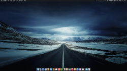
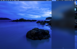
Wallpaper please!
Im not happy with the dark mode. I like how the menu bar looks, but the Dock seems to have an added glow to it. If only it was slightly darker, it would look perfect! Perhaps it was too much work to change the windows as well. I hope that developers at least update the menu bar icons soon!
I like your background image, where's that from?
This is why I don't like dark mode. At least with it enabled, the notification center matches the menubar.
Because it would probably break a lot of existing software. You don't want to get black text on black background.
I actually thought Dark Mode would be similair to the dark theme in iBooks, so reading would be better. Or that everything around the one program you're using would be dark. So I was like, huh that's nice. But I didn't get the fuss. Then I enabled it and saw what it actually was
And I love it, it makes Yosemite incredibly beautiful for me. I have a white macbook, so all the whiteness was a tad overkill. Dark mode creates a more confined and homey feel, and it makes the colours of the apps pop out.
But to be honest, I think that all the other 'Dark Mode' features you can think of are actually more separated. So I think they'll be available as separate settings, either still in Yosemite or in 10.11.
But I was pleasantly surprised by Dark Mode!
I suggest that everybody who thinks that dark mode should have dark finder windows etc too then use the feedback assistant and tell Apple about it (like I did). That's the only way we might see full dark theme in the future.
The whole purpose of dark mode is to make it easier to focus on the main content. Making the main content also dark defeats the point?
I understand why people want dark mode to be everywhere, but a part from the aesthetics, there's no real reasoning behind it.
The whole purpose of dark mode is to make it easier to focus on the main content. Making the main content also dark defeats the point?
I understand why people want dark mode to be everywhere, but a part from the aesthetics, there's no real reasoning behind it.
I suppose it begs the question: what is the main content? Apparently, Apple thinks that apps are the main content, complete with toolbars. But you may equally think that the content of those apps, e.g. a webpage inside the browser, is the ‘main content’. The grey toolbars are visually very dominant and expose the user to a similar amount of distraction as the menubar and the Dock. I think Apple’s dark mode is more about aesthetics rather than purely focus, regardless of what Federighi said.
Menus and sidebars 
If only the added the right click menus and sidebars to the dark mode that would be awesome


If only the added the right click menus and sidebars to the dark mode that would be awesome


The whole purpose of dark mode is to make it easier to focus on the main content. Making the main content also dark defeats the point?
I understand why people want dark mode to be everywhere, but a part from the aesthetics, there's no real reasoning behind it.
We need to be able to easily make certain things dark at night - for instance Reader doesn't allow dark background with white text like iBooks does and Readability, etc. It's so trivial to give us choices but then Jony Ive's eyes will bleed.
I still don't understand why we don't have a full dark mode for Yosemite. I'm glad the dock and menubar is finally dark. But what about the window backgrounds and bezels. Shouldn't those be dark also for consistency purposes.
I totally agree. And Safari should have a dark mode also. Especially for the menu bar and Top Sites screen. It would look badass.
It is still using black font over black background. Here, I typed "dark mode", you can't really see what you are typing...
You have a messed-up install or something strange is going on that's mucking with your font. In Dark Mode the Spotlight search text shows up as white for me.
In regards to why Apple shelved more integration with the OS/apps, I think they'll probably have introduce an appearance API so that developers can select appropriate text and graphic colors. Or they may have just decided it's just too much effort for everyone to bother.
Wallpaper please!
I like the darker theme personally. I grabbed the beta wallpaper a few months ago and dropped the brightness/contrast.
I placed some here, click "DOWNLOAD" for all image in a .zip file
http://imgur.com/a/gpJNO
Example:

I totally agree. And Safari should have a dark mode also. Especially for the menu bar and Top Sites screen. It would look badass.
Write up a CSS with some defaults that you like. Then you can go to: Safari > Preferences ... > Advanced > Style Sheet and choose it.
It can be overridden, but it's better than nothing.
Register on MacRumors! This sidebar will go away, and you'll see fewer ads.


