Got a tip for us?
Let us know
Become a MacRumors Supporter for $50/year with no ads, ability to filter front page stories, and private forums.
Dark Mode screenshots?
- Thread starter zen
- Start date
- Sort by reaction score
You are using an out of date browser. It may not display this or other websites correctly.
You should upgrade or use an alternative browser.
You should upgrade or use an alternative browser.
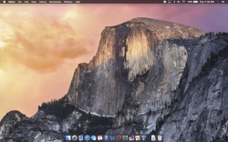
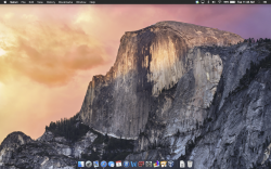
Here's mine.
Could you take one with "Translucent menu bar" unchecked?
Could you take one with "Translucent menu bar" unchecked?
Sure
Attachments
How does a Finder window look? Menus, folders, etc?
The same. Finder does not go dark.
The same. Finder does not go dark.
Hmm. So not much of a dark mode then, really.
Hmm. So not much of a dark mode then, really.
Yeah it's only the menu bar and dock. Still though, I kinda prefer it. I'm still going back and forth.
Sure
Thanks. From what I'm seeing on the forum, it seems like we're being given three choices: translucent, white, or black. Is that correct?
I wonder if dark mode will be more widespread in future releases? I love it 
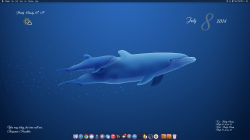
Edit: I forgot to enable the dock so you could see how it looks so I took another one
Edit: I forgot to enable the dock so you could see how it looks so I took another one
Attachments
Last edited:
Thanks. From what I'm seeing on the forum, it seems like we're being given three choices: translucent, white, or black. Is that correct?
There's 4 options:
Dark (Translucent/Opaque)
Light (Translucent/Opaque)
I wonder if dark mode will be more widespread in future releases? I love it
Edit: I forgot to enable the dock so you could see how it looks so I took another one
Woah, I love your dock icons! Where did you get them from, and how did you change them? Apologies if that sounds like a simple question, but I'm new to UI mods
Woah, I love your dock icons! Where did you get them from, and how did you change them? Apologies if that sounds like a simple question, but I'm new to UI mods
Most are stock Yosemite. The finder icon I found on deviantart. You will find it there if you search Uniq Finder icons. The folder icons are some I had from my Linux KDE days that I converted. I use Liteicon [search MacUpdate] app to change everything. It is a great little app....you just drag and drop and then logout for the changes to take place
There's 4 options:
Dark (Translucent/Opaque)
Light (Translucent/Opaque)
Right. Thanks for correcting me.
This is probably not the final state of dark mode - they'll probably add more UI elements later.
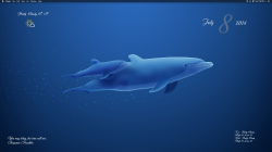
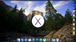
I'm sorry if this is the wrong place, but I absolutely adore your wallpaper. Is there a chance you could provide a link to it? 
I wonder if dark mode will be more widespread in future releases? I love it
Edit: I forgot to enable the dock so you could see how it looks so I took another one
Dark mode menu text looks terrible, all jaggy, only looks anti aliased when you hover over. If they can improve that then I think it will look pretty cool. Wouldn't want to see everything in dark mode as I use the adobe Cc apps that are all dark mode and I think it would be hard to differentiate apps from system. Keep it to a minimum I say.
I'm sorry if this is the wrong place, but I absolutely adore your wallpaper. Is there a chance you could provide a link to it?
Sure!
Attachments
Last edited:
http://s000.tinyupload.com/index.php?file_id=34436563193345023105Cool wallpaper. Would you have a link?
it is a 2560x1600 wallpaper I made just to change up my home server background.
I may have the original wallpaper without the wording or logo also.
Most are stock Yosemite. The finder icon I found on deviantart. You will find it there if you search Uniq Finder icons. The folder icons are some I had from my Linux KDE days that I converted. I use Liteicon [search MacUpdate] app to change everything. It is a great little app....you just drag and drop and then logout for the changes to take place
Thanks, I think I've found most of them!
Register on MacRumors! This sidebar will go away, and you'll see fewer ads.


