Is anyone else finding this just looks like high contrast mode from accessibility? I'm not sure I like it, the white font on a black background looks kinda crappy to me.
Got a tip for us?
Let us know
Become a MacRumors Supporter for $50/year with no ads, ability to filter front page stories, and private forums.
"Dark Mode"
- Thread starter orestes1984
- Start date
- Sort by reaction score
You are using an out of date browser. It may not display this or other websites correctly.
You should upgrade or use an alternative browser.
You should upgrade or use an alternative browser.
I'm wondering if calibrating the display would help? It's like a day and night difference at the moment Yosemite Vs Mavericks using the same profile.
I'm wondering if calibrating the display would help? It's like a day and night difference at the moment Yosemite Vs Mavericks using the same profile.
I haven't done a colour calibration as yet, it may help, but, so far I think dark mode looks like freshly warm poop.
Is anyone else finding this just looks like high contrast mode from accessibility? I'm not sure I like it, the white font on a black background looks kinda crappy to me.
Agreed, looks "unfinished" to me.
Its a beta release. OF COURSE its not finished yet.
Its a beta release. OF COURSE its not finished yet.
Yes, but as a gauge of where its at now, which is all we can go by it looks kinda crappy. Hopefully the Apple developers take note of all the feedback.
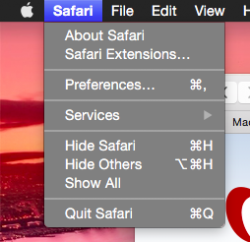
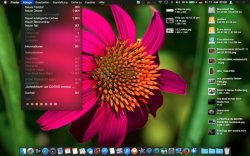
Sorry to hijack but my dark mode's menus are only, gray, not translucent black like shown on the front page article. Is this just a bug or is there a setting I can change somewhere?
I've attached both what mine looks like and what I was hoping it'd look like from the front page article
Edit: fixed, it was the translucent menu bar option in Desktop & Screen Saver settings
I've attached both what mine looks like and what I was hoping it'd look like from the front page article
Edit: fixed, it was the translucent menu bar option in Desktop & Screen Saver settings
Attachments
Last edited:
Is anyone else finding this just looks like high contrast mode from accessibility? I'm not sure I like it, the white font on a black background looks kinda crappy to me.
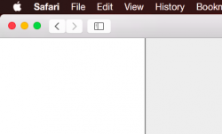
I think they need to rethink Dark Mode. I mean, this doesn't make any sense to me... the menu bar is black, but the Safari Bar isn't. Maybe they're still working on it.

Sorry to hijack but my dark mode's menus are only, gray, not translucent black like shown on the front page article. Is this just a bug or is there a setting I can change somewhere?
I've attached both what mine looks like and what I was hoping it'd look like from the front page article
Maybe you have translucency disabled in accessibility preferences? That is my best guess. Not running Yosemite now so I can't check.
I'm a little disappointed with dark mode myself. For some reason it makes the menu bar look HUGE on my macbook air. I really like the regular mode though so not complaining.
Maybe you have translucency disabled in accessibility preferences? That is my best guess. Not running Yosemite now so I can't check.
Thanks for your reply. I figured it out just before coincidentally. I had translucent menu bar disabled from when I was on 10.9. Apparently that affects menus as well. Enabled it and it's now translucent black.
I think they need to rethink Dark Mode. I mean, this doesn't make any sense to me... the menu bar is black, but the Safari Bar isn't. Maybe they're still working on it.
View attachment 482170
It's incomplete, that's another issue yes that apps will need to be coded for Dark Mode as its not a system wide theme. What I'm saying however is that it just looks like high contrast mode out of accessibility in Mavericks.
I have seen a lot better efforts at coding a dark theme, even Adobe and Pixelmator do a better job at dark themes. Apple's dark theme so far is just not very good at all, but then OS X has never been a dark operating system and has always been light and colourful.
Register on MacRumors! This sidebar will go away, and you'll see fewer ads.


