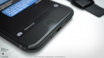
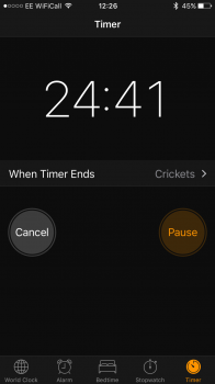
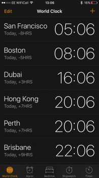
I thought that there would be a dark mode option. I'm on 10.0.1 GM for a week and thought that todays update would have the dark mode option. Plus, why didn't this new update have a new list of choices of wallpaper? There is only one new wallpaper. It would've been nice but still enjoying this look on my phone.
Got a tip for us?
Let us know
Become a MacRumors Supporter for $50/year with no ads, ability to filter front page stories, and private forums.
Dark mode?
- Thread starter jquest68
- Start date
- Sort by reaction score
You are using an out of date browser. It may not display this or other websites correctly.
You should upgrade or use an alternative browser.
You should upgrade or use an alternative browser.
As nice as it would be, no such thing was ever promised or even really mentioned by Apple in regards to iOS, nor has it made an appearance in any beta or final version of iOS.I thought that there would be a dark mode option. I'm on 10.0.1 GM for a week and thought that todays update would have the dark mode option. Plus, why didn't this new update have a new list of choices of wallpaper? There is only one new wallpaper. It would've been nice but still enjoying this look on my phone.
Apple doesn't believe in any type of personal customization, their way only. Can't even change SMS bubble colors after 8 years.I thought that there would be a dark mode option. I'm on 10.0.1 GM for a week and thought that todays update would have the dark mode option. Plus, why didn't this new update have a new list of choices of wallpaper? There is only one new wallpaper. It would've been nice but still enjoying this look on my phone.
The bubble colors have meaning that is essentially part of the Apple ecosystem, which is why customization of those wouldn't really make sense from Apple's side of things. Aside form that, there are some options provided here and there, but there are certainly some more that could be offered, and even that it would be far from everything or close to it.Apple doesn't believe in any type of personal customization, their way only. Can't even change SMS bubble colors after 8 years.
Dark mode may be a strong possibility in the future, but for now, it remains with Apple TV.
Dark mode may be a strong possibility in the future, but for now, it remains with Apple TV.
Sadly so and my eyes will be worse off for the continued brightness of iOS.
I'm not sure you have the name right. Dark Mode is a desktop menu appearance option of OSX 10.11. I you are talking about Night Shift for iOS we have had that since iOS 9.3 in the Display and Brightness settings. Dark Mode was never predicted for iOS 10.
Well, actually it was predicted by many, and there was even some code found in the early betas about it, but Apple never announced or implemented it.I'm not sure you have the name right. Dark Mode is a desktop menu appearance option of OSX 10.11. I you are talking about Night Shift for iOS we have had that since iOS 9.3 in the Display and Brightness settings. Dark Mode was never predicted for iOS 10.
Would be nice to have, but apparently not as easy to implement as it sounds.
[doublepost=1473851088][/doublepost]You mentioned saving your eyes and I fully understand that so why not make use of night shift?Well, actually it was predicted by many, and there was even some code found in the early betas about it, but Apple never announced or implemented it.
Would be nice to have, but apparently not as easy to implement as it sounds.
Perhapes I don't understand what dark mode was to be. Have you tried the "Invert Colours" option in Accessibility preferences?
It wasn't actually me who made the comment about eyes. I was merely responding that people who wanted Dark Mode were not actually out in left field (as would someone who was expecting "Holographic Rendering" would be!).[doublepost=1473851088][/doublepost]You mentioned saving your eyes and I fully understand that so why not make use of night shift?
Perhapes I don't understand what dark mode was to be. Have you tried the "Invert Colours" option in Accessibility preferences?View attachment 651544
I do agree that Night Shift does help, but not completely. Its still a shock to wake up, unlock the phone and have a slightly off white page glaring at you. I think Apple agrees (case in point, Dark Mode in iBooks), but just hasn't implemented system wide (yet). Your suggestion about inverting is also a good one (setting can be found in Accessibility settings). That can be jarring for its own reasons (think looking at everything like its a photographic negative!).
The bubble colors have meaning that is essentially part of the Apple ecosystem, which is why customization of those wouldn't really make sense from Apple's side of things. Aside form that, there are some options provided here and there, but there are certainly some more that could be offered, and even that it would be far from everything or close to it.
This. Blue means iMessages and green means SMS/MMS messages. We'll never be able to change the colours, get over it.
I thought that there would be a dark mode option. I'm on 10.0.1 GM for a week and thought that todays update would have the dark mode option. Plus, why didn't this new update have a new list of choices of wallpaper? There is only one new wallpaper. It would've been nice but still enjoying this look on my phone.
Why did you think there would be a dark mode option? Apple has never said anything about a dark mode and there has been no real indication of it... So I'm not sure why you would expect it.
This. Blue means iMessages and green means SMS/MMS messages. We'll never be able to change the colours, get over it.
we will as soon as the jailbreak comes out. message customizer is the tweak i believe
Why did you think there would be a dark mode option? Apple has never said anything about a dark mode and there has been no real indication of it... So I'm not sure why you would expect it.
probably because the clock app is now dark? I was confused myself when I first opened it after the update.
Dark mode meaning all the white and light grays turn to black and dark grays. Night shift just makes everything yellow and looks awful, dark mode is something people can use all day long and changes the UI from a bunch of whites to a bunch of dark grays.I'm not sure you have the name right. Dark Mode is a desktop menu appearance option of OSX 10.11. I you are talking about Night Shift for iOS we have had that since iOS 9.3 in the Display and Brightness settings. Dark Mode was never predicted for iOS 10.
Obviously, that picture represents what we'd like to see, but yeah. I think the fact that that picture was chosen as a mockup, and the real world case of iBooks, highlights, to some extent, the issue: it will work with text, but dealing with images and other colored objects is probably the problem. If a photo, say, has a lot of white or white-tending colors, do you keep them the way they are or do you swap them out for their inverse? The latter would probably look very odd. If not the inverse, how would colors be chosen? No matter what, you'd end up with a very unpleasant effect on image heavy sources. Would people even use it then?I know now the reason, thanks guys for the heads up. I thought because of this picture that we were expecting an option but now I know its not true.
I hope they implement it before we see iOS 11 (maybe with some 10.x update like they've done with night shift)
Register on MacRumors! This sidebar will go away, and you'll see fewer ads.


