Become a MacRumors Supporter for $50/year with no ads, ability to filter front page stories, and private forums.

cjohnson

macrumors newbie
Original poster
Nov 10, 2003
3
0
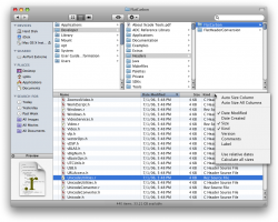
While reading a review a Leopard, I came across this statement: "The Finder is now iTunes." My mind skipped right over the Cover Flow analogy and started dreaming of browsing the Finder like I browse music in iTunes. A few hours later, here is a Photoshop mockup. Apple, I want this!

-chad
 

Attachments

  • Chad's-Finder-Mockup-v3.png
    Chad's-Finder-Mockup-v3.png
    197.8 KB · Views: 467

yg17

macrumors Pentium
Aug 1, 2004
15,028
3,003
St. Louis, MO
Looks nice.

How did you get your scroll bars like that though? Is that Photoshopped? Because my scroll bars in Finder (and other aps) are aqua
 

cjohnson

macrumors newbie
Original poster
Nov 10, 2003
3
0
It's all Photoshop. It just a figment of my imagination (until someone from Apple reads this, I guess).

I grabbed elements from iTunes, Finder, and various Leopard screenshots and mashed them all together. The only thing I really created from scratch was the new button to select this fictional view (between the Icon View button and the Cover Flow button). It's kind of a hybrid between the List View button and the Column View button.
 

yg17

macrumors Pentium
Aug 1, 2004
15,028
3,003
St. Louis, MO
Ahhh...OK, I thought maybe it was a hidden setting somewhere.


The Aqua scrollbars seem out of place now that everything else Aqua is gone. It just seems rather inconsistent since iTunes has those scrollbars and everything else doesn't.
 

JJBcn

macrumors newbie
Oct 28, 2007
2
0
Ahhh...OK, I thought maybe it was a hidden setting somewhere.


The Aqua scrollbars seem out of place now that everything else Aqua is gone. It just seems rather inconsistent since iTunes has those scrollbars and everything else doesn't.

Gooooooooooooooood !! I imagine it !
 

GoCubsGo

macrumors Nehalem
Feb 19, 2005
35,742
155
I stayed away from reading too much about Leopard knowing I would not upgrade any time soon so I do not know much about it. However, I do think your mockup is seriously cool and it seems to just flow. I've always liked Finder but found it to be cumbersome at times when I'm going from folder to folder to folder.

Good work. I wonder if this would be adopted later. I don't know if they'd update Leopard to support it (bummer) but would wonder if they would put it in future OS releases. Would it even be possible to put it in an update of Leopard? Just curious now.
 

Nuc

macrumors 6502a
Jan 20, 2003
798
6
TN
I actually really like this! It would be nice to see the details of a file in column view without having to go to each file to view the details.

Apple take note!

Nuc
 

Verto

macrumors 6502a
Jul 20, 2005
582
0
Denton, TX
Ahhh...OK, I thought maybe it was a hidden setting somewhere.


The Aqua scrollbars seem out of place now that everything else Aqua is gone. It just seems rather inconsistent since iTunes has those scrollbars and everything else doesn't.

Is there not an option to switch from Aqua to Graphite, like there is in Tiger?
 

Abstract

macrumors Penryn
Dec 27, 2002
24,889
921
Location Location Location
I don't have Leopard, but Finder has always sucked, and I'd be willing to try anything that's better than it.

(and yes, I tried Pathfinder, but found it much slower than Finder in OS X, so I ditched it)
 

Mal

macrumors 603
Jan 6, 2002
6,253
30
Orlando
Is there not an option to switch from Aqua to Graphite, like there is in Tiger?

There is, but it's still not quite right. The scroll bars in iTunes would be much nicer to have system-wide, but they didn't offer that option yet.

As for the OP, I like that mockup, not sure I'd use it, but it seems like a very useful upgrade to the current column/list views.

jW
 
Register on MacRumors! This sidebar will go away, and you'll see fewer ads.