Got a tip for us?
Let us know
Become a MacRumors Supporter for $50/year with no ads, ability to filter front page stories, and private forums.
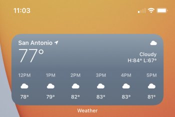
Default Weather Widget is depressing....
- Thread starter Baldilocks
- Start date
- Sort by reaction score
You are using an out of date browser. It may not display this or other websites correctly.
You should upgrade or use an alternative browser.
You should upgrade or use an alternative browser.
Definitely would take the solid blue widget over the lighter one on top
Really? Looks very dreary to me. If the sun is shining, it should be bright and airy.
Really? Looks very dreary to me. If the sun is shining, it should be bright and airy.
Again Weather Line
Really? Looks very dreary to me. If the sun is shining, it should be bright and airy.
The sun color is off, it's a bug since a couple of betas ago. Normally, it looks yellow.
How is iOS STILL getting uglier?Compare the two. iOS 13 and iOS 14. Not really enjoying the dim colors and the solid background. Anyone else think the previous widget is iOS 13 had a better design?
View attachment 957436View attachment 957439
[automerge]1600783665[/automerge]
The sun color is off, it's a bug since a couple of betas ago. Normally, it looks yellow.
Oh look, more bugs Apple can’t be bothered to fix for their rushed release dates...
I don’t view the weather widget and being depressing. It would be nice to be able to change the color but, it isn’t a must have feature for me.
14.0.1 didn’t fix the dark orange sun color. Hopefully it’s fixed in a future update.
At least you get a sun, even if it’s the wrong colour! I put the large weather widget on both my iPad and iPhone, but for next Wednesday it shows a crescent moon for the day, and other days a moon poking out from behind a cloud..! I removed and readded the widgets, rebooted both devices, but still didn’t fix the issue. (I’ve now changed it to the middle size widget on both devices, which at least shows the proper detail for the next few hours for the current day.)
At least you get a sun, even if it’s the wrong colour! I put the large weather widget on both my iPad and iPhone, but for next Wednesday it shows a crescent moon for the day, and other days a moon poking out from behind a cloud..! I removed and readded the widgets, rebooted both devices, but still didn’t fix the issue. (I’ve now changed it to the middle size widget on both devices, which at least shows the proper detail for the next few hours for the current day.)
Yes, that’s odd. Hopefully they sort it. I know on some devices it’s working fine.
Register on MacRumors! This sidebar will go away, and you'll see fewer ads.


