Become a MacRumors Supporter for $50/year with no ads, ability to filter front page stories, and private forums.

Cabbit

macrumors 68020
Original poster
Jan 30, 2006
2,128
1
Scotland
2307739360_8088dfbb4f_o.png


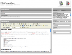
This is what my editor looks like for my new site i am developing, i would like to know what people think about the layout and design(buttons). All the technical parts work fine on every browser so i have only included a picture for review.

Anyone god any ideas/thoughts/opinions?
 
I like it (especially the position of the Title-box), though it is very feminine / girlish.

Just make sure to change "Announcments" to "Announcements" ;)
 
I like it (especially the position of the Title-box), though it is very feminine / girlish.

Just make sure to change "Announcments" to "Announcements" ;)
:eek: i'll make sure i change the Announcments. ^_^ the aim was a very girlish look its for a girlish site.
 
Looks pretty good. Just got a couple pieces of advice and opinions.
  1. It has a very simple appearance which is good.
  2. The "Back to Announcements" sounds like a link, but doesn't look like one. Make sure links are easy to spot.
  3. I would pick a different background color for the "Title" box just to help it stand out a little more. Possibly using the dark purple for the background and the light pink for the text color. Though they may not work, it's hard to see how that would look in my mind alone.
  4. I'd personally capitalize all the words in "Post new topic," and make "Announcements" lower case.
  5. Since you're going for a girlish look you may want to try out using dotted borders in some areas. It lightens the feel of it. Just something to try out. I'm just a guy so what do I know. :)
  6. Not sure if you're using any :focus CSS styles for when the visitors in clicked in side the text fields, but I find those helpful, both functionally and accessible, and offers another pace to add color. Also think about a good font to use inside the text fields, maybe you want more than just Arial or Times.
 
Hard to say without really knowing the scope if this is effective. What about SEO info? Slugs, images, tags, meta, post date, etc? I don't know, those are things we integrated into our CMS. I guess it just depends on the level of complexity you are trying to accomplish.
 
Hard to say without really knowing the scope if this is effective. What about SEO info? Slugs, images, tags, meta, post date, etc? I don't know, those are things we integrated into our CMS. I guess it just depends on the level of complexity you are trying to accomplish.

Well i don't know about slugs(no clue) or meta but the post date and things like that are taken care of server side. And images is something that is pretty hard for me to successfully integrate so i am leaving them out for now but may add in the future.
 
Well i don't know about slugs(no clue) or meta but the post date and things like that are taken care of server side. And images is something that is pretty hard for me to successfully integrate so i am leaving them out for now but may add in the future.

Gotcha, Although sometimes people will want to change the date, we have that issue all the time so we started building that into our blog and news portion. No CMS though.
 

Attachments

  • Picture 1.png
    Picture 1.png
    112 KB · Views: 90
And what is overly complicated about meta data? I call them options for clients to improve their sites :)

I don't see the purpose of it when i can't build a working search engine with my current skills. As that is the only thing i think would make it useful, and then i would use the body text for searching.
 
This any better?

I'm not sure "Back" is what you want to say, but maybe it is. Seems like you may call it Cancel and place it down near the post button. Browsers have back buttons so I generally feel it's better to not try to implement it. Also, if a person arrived at the page from a Google search or something (somehow), Back wouldn't have as much meaning.

Oh, as an aside, I don't think you need to worry about allowing people to adjust the date. Seems rather unnecessary.
 
Register on MacRumors! This sidebar will go away, and you'll see fewer ads.