I removed the links, thanks for everyone replies.
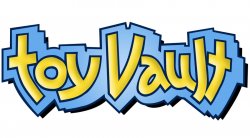
So I work for a toy company as the Art Director. Currently I am attempting to rework our company logo, but I am finding serious resistance so Im looking to everyone here to let me know what you think of my modest overhaul.
Im not allowed to do much, so Im trying to just update it w/o making it unrecognizable. Holding to the blues and yellows. A little more edgy and 21st century. We call ourselves a "vault" and our website is draped in brushed metal and macho black ... and then we have a logo thats baby blue and yellow ... it is juxtaposition without trying to make a point.
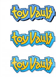