Got a tip for us?
Let us know
Become a MacRumors Supporter for $50/year with no ads, ability to filter front page stories, and private forums.
iPhone Different tones of color when backround is set
- Thread starter skadd
- Start date
- Sort by reaction score
You are using an out of date browser. It may not display this or other websites correctly.
You should upgrade or use an alternative browser.
You should upgrade or use an alternative browser.
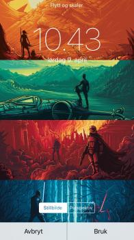
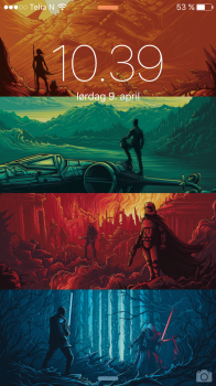
I think it darkens it to improve contrast with white text (eg time and app names) but a) it's not like the contrast was terrible to begin with and b) why doesn't it apply this in the preview? Apple could do better here.
I never noticed this with other images.
Maybe it's the color space or that the image has a rather high resolution (2160 x 3840)
I know someone stitched these artworks together to make the background, so maybe they messed something up, color space wise.
Edit: Nope. Changed the color space, resized the image. Didn't change anything.
Edit 2: It seems as if all images get "dimmed" slightly when set as a background. I don't like that, at all!
Feedback sent to Apple.
Last edited:
Yes, issues like you mentioned. Although I'm nitpicking.
Some blurred wallpapers when applied with more blur from apples ui like spotlight and passcode screen will cause banding issues.
When you set a wallpaper with many lines or objects and you zoom out to disable parallax. When waking the screen on the lockscreen the wallpaper will still slightly zoom out. And you'll get a weird effect on the border of the image as its smaller than the screen but they don't want to show you a black border so the picture gets pulled out to fill the screen.
Also if you have two different wallpapers on lock and home screen. During the unlock animation you get a harsh black fade. This did not happen with iOS 6 and still doesn't happen if you unlock to an open app. Then it will fade from the lockscreen to the opened app. I think is has to do with the unlock animation to home screen having all the apps jumping into place. iOS 6 didn't have that.
With iso6 almost all wallpaper looked good on the home screen. iOS 7 and up the contrast between icons and wallpaper is very small and imo looks ugly. I mostly use blurred wallpapers now. It works best in most situations.
Yes, issues like you mentioned. Although I'm nitpicking.
...
Also if you have two different wallpapers on lock and home screen. During the unlock animation you get a harsh black fade. This did not happen with iOS 6 and still doesn't happen if you unlock to an open app. Then it will fade from the lockscreen to the opened app. I think is has to do with the unlock animation to home screen having all the apps jumping into place. iOS 6 didn't have that.
That isn't true, the fade to black during unlock is in iOS 6, look at 1:06.
It happens because there are different background images. How would you improve the switch?
It happens a bit too quickly for me to figure out what happens but when you unlock to an app I don't see a black switch so couldn't it work the same as that?It happens because there are different background images. How would you improve the switch?
That isn't true, the fade to black during unlock is in iOS 6, look at 1:06.
It happens because there are different background images. How would you improve the switch?
Try opening an app and lock your phone. Then unlock. It will fade from the wallpaper into the app. Without a black flash. Hmm I remember it not doing that pre iOS 7. A better way to do it is hard to say without being able to test it. Maybe let the icons fly in like they do. But the lock wallpaper will smoothly fade into the home screen wallpaper without the black flash.
Edit: after greyOS post I actually made a slow mo video of the switch from lock to app. This is what happens. It's just a simple direct fade from wallpaper to the app. But the app start zoomed and gets pulled in into full view. Looks great. Not sure why they don't do that from lock to home.
Since ios 7, apple resizes and compresses pictures set as wallpapers presumably because of the parallax effect. Looks awful. Try it for yourself, you'll see a massive difference in picture quality when comparing the wanted photo before setting it as wallpaper and a screenshot of the lock and home screen.
Unbelievable.
Unbelievable.
Register on MacRumors! This sidebar will go away, and you'll see fewer ads.


