Got a tip for us?
Let us know
Become a MacRumors Supporter for $50/year with no ads, ability to filter front page stories, and private forums.
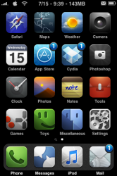
Do you customize your home screen?
- Thread starter ozzyman500
- Start date
- Sort by reaction score
You are using an out of date browser. It may not display this or other websites correctly.
You should upgrade or use an alternative browser.
You should upgrade or use an alternative browser.
I like to put my most used apps in the front.... I never put a 3rd party app on the 1st page though. It's some weird OCD thing.
me too...i thought it was odd on my part but im glad im not the only one
I do. I have my own theme, that I've made by combining icons and a wallpaper I like. I organize my apps by page; first page is apps I use daily, 2nd is regular apps, 3rd is stock apps, 4th is games
I like to spruce it up a bit compared to stock, definitely had to put the att carrier logo, as well as wifi logo and the 3g flame that takes its place. Battery percent meter is definitely a plus, and idk why but I prefer no labels on the 5 icon dock apps. Finished it up with the MGS Grey background as well as all the sounds for sms and email, and it works perfectly as a stand-in until I get my regulation CODEC from Otacon (sorry about all the MGS references!)
Attachments
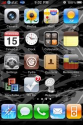
I keep my home screen completely default. I have no idea why, but I prefer all of "Apple's" applications to stay put. The next page is my applications such as Evernote, Pandora, MLB, etc. My third page is all games.
I try to keep it very nice and clean so when other people use my iPhone it isn't hard for them to figure out where there favorite game is.
I try to keep it very nice and clean so when other people use my iPhone it isn't hard for them to figure out where there favorite game is.
I try to keep it very nice and clean so when other people use my iPhone it isn't hard for them to figure out where there favorite game is.
Lol, that's the exact reason why I also downloaded "Un-unlockable" right away
. Didn't matter though, the gf figured it out right away and called me stupid for trying that.edit: Idk who doesn't know, but Un-unlockable hides the "slide to unlock" bar and slider, so it's just the background
Lol, that's the exact reason why I also downloaded "Un-unlockable" right away
edit: Idk who doesn't know, but Un-unlockable hides the "slide to unlock" bar and slider, so it's just the background
I used this for a while as well. Rather than to trick people, I found it showcased the wallpaper better. Anyhow, there's a new one that came out on Cydia recently that disguises your lockscreen as a springboard full of icons. The bottom left Music icon is your slider. Pretty tricky. Unfortunately, there's only an iPod springboard available.
Oh well. I suppose it's designed to fool people who don't know the difference anyway.
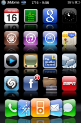
here's mine I like having the icons reflected and no labels. dock flow is nice too.
I agree, but I really liked dockflow in 2.2.1 when it went from left to right Safari, SMS, Phone, Mail, iPod. I don't know if I could handle the new version, is it easy to get a grasp of?
I agree, but I really liked dockflow in 2.2.1 when it went from left to right Safari, SMS, Phone, Mail, iPod. I don't know if I could handle the new version, is it easy to get a grasp of?
there are 3 or 4 different layouts to use. It doesn't tell you the order tho so you just have to check them all out and see what you like. I didn't use it before 3.0 So I can't compare it to that.
I guess you could say I switch it up a bit

-Statusbar Springdots
-Clear Springdots
-Clear Spotlight icon
-Transparent dock
-blank icons
-custom-made clear icons for Mail (left corner of dock) and Phone (right corner of dock)
can you post that wallpaper
You forgot the most important piece of info, the name of this theme. I like it a lot. Might replace my glass orb I've been using forever.I cant go back to not customizing my home screen/lock screen..it looks soooo much better:


im constantly changing/customizing/modifying my homescreen(and every other screen for that matter....lol). its not that i dont like the stock look of the iPhone; its just after seeing the same icons, lockscreens, etc., for over two years, it just started to look plain. so i finally decided that the best thing to do was to jailbreak so i can make my iPhone look like MyPhone. so heres what i have as of right now.....Glass Orb theme w/ amora dock flow. a few modified icons. kasper font from fontswap. fireball 3G icon. removed the page dots and spotlight search icon. digital signal bar. custom carrier logo. and a wallpaper i got from Background(App store).

here's mine I like having the icons reflected and no labels. dock flow is nice too.
How did you get the icons reflected? Is that part of the icon, or is that an actual effect?
You forgot the most important piece of info, the name of this theme. I like it a lot. Might replace my glass orb I've been using forever.
Seriously, what theme is this? I love it.
Register on MacRumors! This sidebar will go away, and you'll see fewer ads.