Become a MacRumors Supporter for $50/year with no ads, ability to filter front page stories, and private forums.
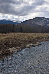
Do you like this landscape shot?
- Thread starter G.T.
- Start date
- Sort by reaction score
You are using an out of date browser. It may not display this or other websites correctly.
You should upgrade or use an alternative browser.
You should upgrade or use an alternative browser.
No, not really. A few things come to mind:
(1) It is a poor BW conversion, it's mostly grayish soup. I would need to see the original in color to judge whether tweaking the BW conversion would yield better results. In any case, it needs more contrast.
(2) There is no focus, no lines that guide my eyes. With a more contrasty conversion (or squinting at the current pic), I can make out a few lines, but they're disconnected and don't guide me anywhere.
The most interesting feature seem to be the clouds, lots of texture. But they're marginalized.
How about you tell us what you wanted to show when you took that picture? What's the mood you want to convey?
They call it landscape orientation for a reason")
True but I was reading this http://photoshoptutorials.ws/photog...ps-to-improve-composition-in-your-photos.html scroll to the foreground section. I understand that because I took the picture without any real purpose it isn't great.
So as a kind of frame/background would it have worked if I had an interesting subject in the foreground. Maybe the B&W was not my best choice.
I understand that because I took the picture without any real purpose it isn't great.
You don't need C&C. You know the answer already.
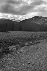
i'm on a laptop ATM, so a bit of a small screen when I click on the image and view it at full size I can only get about half of it on my screen. Two things, one cut the image in half and look at the lower half... then look at the upper half. The upper half has some potential but... there is a very big but there.
The bottom half is just blah, really your foreground, fully 1/2 the picture is blah, worse than no reaction it is unappealing.
The top half though is close, but still as said before needs more contrast. The dull gray of the field, to the dull gray of the trees to the dull gray of most of the mountains just dull gray. There is really good light... but it is waaaay over there on the far mountains, the majority of the shot is just to dull. I also would think that tree to the left would have made a nice forground subject, but you would have needed to get there earlier for better light or wait a while, depending on your orientation I'm thinking.
Some good comments here already. The advice you are following to shoot a landscape with a foreground, middle ground, and background is actually good. You just need to spend time finding the right composition.
If you look at their example here that you referenced, there is some interest in the partially submerged rocks. It's not just that they are rocks or that they are partially submerged, but that they draw your eyes from front to back through the depth of that shot. The clear water up front essentially merges into high contrast reflection and on back to that wispy-ish cloud between the two mountain peaks. Great stuff!
What happened with your shot is that I saw your foreground wasn't interesting, and there wasn't any good contrast to draw me back to the mountain and I basically stopped right there. <shrug>
Check out Moose Peterson's free intro section (about 10 minutes, ignore the disjointed musical transition at the beginning) to his "Landscape Photography, Part 2 tutorial (on Kelby's online training website); pay particular attention to when he talks about interest and sharpness in the anchor point and how carefully he chose that, and also how he tries to minimize the uninteresting gray highlights in the reflection in the water that detract from the anchor point -- but not the reflection itself. I don't know that I think it's the strongest shot (he's famous and I'm not, so take that for what it's worth) but IMO his emphasis on composure is right on the mark. I wish he spent a little more time talking about hyperfocal distance while discussing sharpness and focus, but IIRC he gets to that in another lesson into the paid section of the training.
(Love the comment: "Can't sharpen water." LOL!)
If you look at their example here that you referenced, there is some interest in the partially submerged rocks. It's not just that they are rocks or that they are partially submerged, but that they draw your eyes from front to back through the depth of that shot. The clear water up front essentially merges into high contrast reflection and on back to that wispy-ish cloud between the two mountain peaks. Great stuff!
What happened with your shot is that I saw your foreground wasn't interesting, and there wasn't any good contrast to draw me back to the mountain and I basically stopped right there. <shrug>
Check out Moose Peterson's free intro section (about 10 minutes, ignore the disjointed musical transition at the beginning) to his "Landscape Photography, Part 2 tutorial (on Kelby's online training website); pay particular attention to when he talks about interest and sharpness in the anchor point and how carefully he chose that, and also how he tries to minimize the uninteresting gray highlights in the reflection in the water that detract from the anchor point -- but not the reflection itself. I don't know that I think it's the strongest shot (he's famous and I'm not, so take that for what it's worth
) but IMO his emphasis on composure is right on the mark. I wish he spent a little more time talking about hyperfocal distance while discussing sharpness and focus, but IIRC he gets to that in another lesson into the paid section of the training.(Love the comment: "Can't sharpen water." LOL!)
I really would like to see more of that sky, and a lot stronger contrast - using a graduated ND filter would've been beneficial. A tree - hills - sky landscape shot would work better, even though that's the "traditional" shot. Breaking with tradition can be good... if you have a specific reason for doing so.
That oil pipeline doesn't help either - could you move it?
That oil pipeline doesn't help either - could you move it?
Its done very nicely, Black and white looks nice, It is not much attacking but you had did it beautifully. You can always make changes if you want to do.
For nice BW landscape photography, have a look at David Fokos' website.
@toxic
There are no fixed rules in art and there are surely some BW photos where high contrast isn't necessary (e. g. in some high key and low key situations). But upping the contrast usually helps to put more emphasis on the texture and lines.
@toxic
There are no fixed rules in art and there are surely some BW photos where high contrast isn't necessary (e. g. in some high key and low key situations). But upping the contrast usually helps to put more emphasis on the texture and lines.
Hi all and thanks for the replys/comments, i'll edit the RAW again and post colour one as some have requested.
OK thanks for the help, next time I'll put more thought into the shot with these comments and try to think hard about a subject that works
Thanks, could you sum up hyperfocal distance I keep reading different things about it and i'm slightly confused.
It's actually a water pipeline but yeah when re-editing I'll take it out. I agree the sky was very bright, so I shot RAW to help with editing, however, an ND would have really helped and might have made the landscape have better lighting because I could have had a slower shot.
The subject was the mountains, but I think the sky has stolen its thunder
Will make it a bit more contrasty
Thanks
If I may criticise my image, I like the diagonal divide of the road, leading to the horizontal edge of the mountains and then then jagged line of their tops with the dramatic sky. I can see the lack of contrast and subject have let this shot down though.
i'm on a laptop ATM, so a bit of a small screen when I click on the image and view it at full size I can only get about half of it on my screen. Two things, one cut the image in half and look at the lower half... then look at the upper half. The upper half has some potential but... there is a very big but there.
The bottom half is just blah, really your foreground, fully 1/2 the picture is blah, worse than no reaction it is unappealing.
The top half though is close, but still as said before needs more contrast. The dull gray of the field, to the dull gray of the trees to the dull gray of most of the mountains just dull gray. There is really good light... but it is waaaay over there on the far mountains, the majority of the shot is just to dull. I also would think that tree to the left would have made a nice forground subject, but you would have needed to get there earlier for better light or wait a while, depending on your orientation I'm thinking.
OK thanks for the help, next time I'll put more thought into the shot with these comments and try to think hard about a subject that works
Some good comments here already. The advice you are following to shoot a landscape with a foreground, middle ground, and background is actually good. You just need to spend time finding the right composition.
If you look at their example here that you referenced, there is some interest in the partially submerged rocks. It's not just that they are rocks or that they are partially submerged, but that they draw your eyes from front to back through the depth of that shot. The clear water up front essentially merges into high contrast reflection and on back to that wispy-ish cloud between the two mountain peaks. Great stuff!
What happened with your shot is that I saw your foreground wasn't interesting, and there wasn't any good contrast to draw me back to the mountain and I basically stopped right there. <shrug>
Check out Moose Peterson's free intro section (about 10 minutes, ignore the disjointed musical transition at the beginning) to his "Landscape Photography, Part 2 tutorial (on Kelby's online training website); pay particular attention to when he talks about interest and sharpness in the anchor point and how carefully he chose that, and also how he tries to minimize the uninteresting gray highlights in the reflection in the water that detract from the anchor point -- but not the reflection itself. I don't know that I think it's the strongest shot (he's famous and I'm not, so take that for what it's worth
(Love the comment: "Can't sharpen water." LOL!)
Thanks, could you sum up hyperfocal distance I keep reading different things about it and i'm slightly confused.
I really would like to see more of that sky, and a lot stronger contrast - using a graduated ND filter would've been beneficial. A tree - hills - sky landscape shot would work better, even though that's the "traditional" shot. Breaking with tradition can be good... if you have a specific reason for doing so.
That oil pipeline doesn't help either - could you move it?
It's actually a water pipeline but yeah when re-editing I'll take it out. I agree the sky was very bright, so I shot RAW to help with editing, however, an ND would have really helped and might have made the landscape have better lighting because I could have had a slower shot.
there's nothing inherently wrong with a low-contrast B&W.
B&W puts emphasis on forms and texture. what forms and texture are you trying to emphasize?
for that matter, what's the subject?
The subject was the mountains, but I think the sky has stolen its thunder
Its done very nicely, Black and white looks nice, It is not much attacking but you had did it beautifully. You can always make changes if you want to do.
Will make it a bit more contrasty
For nice BW landscape photography, have a look at David Fokos' website.
@toxic
There are no fixed rules in art and there are surely some BW photos where high contrast isn't necessary (e. g. in some high key and low key situations). But upping the contrast usually helps to put more emphasis on the texture and lines.
Thanks
If I may criticise my image, I like the diagonal divide of the road, leading to the horizontal edge of the mountains and then then jagged line of their tops with the dramatic sky. I can see the lack of contrast and subject have let this shot down though.
Color
I like the color version wayyyy more.
I would try a slight de-saturation, and mess with the curves a bit to add some depth maybe.
Or do a more finely-tuned b/w conversion to add depth.
I like the color version wayyyy more.
I would try a slight de-saturation, and mess with the curves a bit to add some depth maybe.
Or do a more finely-tuned b/w conversion to add depth.
I agree. And you could have done a much better BW conversion with this nice color contrast *
I like the color version wayyyy more.
I would try a slight de-saturation, and mess with the curves a bit to add some depth maybe.
Or do a more finely-tuned b/w conversion to add depth.
Here is the colour in B&W again hopefully it has more dept/contrast. I accept though this image wasn't great to begin with but just so you can see. Before and after.
Attachments
I think when doing landscape photography, it is easy to become overwhelmed by the scene and miss out on the visual language of what is actually going on. Sometimes it is subtle, but when recognized and masterfully portrayed, you often just get carried into the scene like it is some sort of ride in that the subtlety becomes the lead character in your photographic "Play".
So what your image is missing has been pretty much covered by most of the replies in that it is missing that "Anchor Point". For example, there are images that you see even from far away like in a gallery or on a magazine across the street that get your attention with some kind of stark trait. And it does not always have to do with dramatic lighting, crazy wide angle effects or if it is black and white or color. It has more to do with the fact that a landscape is not as still as we humans perceive it to be and that is is actually like a river, a torrent of occurrence that we just don't always grasp with human lifespans of less than 100 years. There is a dynamic language in this and sometimes, it comes out in a photograph when seen and well represented.
When I look at this image, I keep wanting to see the rest of the surroundings because the bottom is not really doing much for me. It looks like a gravel road and the fact it is leading out of the right of the frame is creating a tension for me that makes me want to see more, as if I am visually unsatisfied, so I guess I am.
As for the banter in terms of how to make it look better technically, it is kind of a mute point until you refine your vision more. There really is not much of a point to look at it in terms of color, black and white, contrast adjustments until the convergence of elements through better composition speak to the place a bit better.
I would highly suggest this book, it is to this day one of the very best books in terms of how one connects with the visual energy and collective intellect of the great outdoors and how this applies to photography through "Personal Vision":
http://www.amazon.com/Mountain-Ligh...=sr_1_1?ie=UTF8&s=books&qid=1270572986&sr=1-1
Great landscape photography is not so much about technique as it is putting in enough time in the field to clear your head so that the subtle language of elements comes on stronger in front of you. Over time, you start to connect with this language more and if you are good and lucky, it comes out in your photos.
It's actually a water pipeline but yeah when re-editing I'll take it out. I agree the sky was very bright, so I shot RAW to help with editing, however, an ND would have really helped and might have made the landscape have better lighting because I could have had a slower shot.
Why? It is there, it's part of the landscape, why not forgo the cliche of an altered reality and incorporate it somehow into the image to make it more powerful? I would have gotten closer to it and made it the anchor point.
Michael Kenna is mostly regarded as a landscape photographer, but often some of the subject matter in the composition is man made, it speaks to that language I refer to above.
Some of his work:
http://images.google.com/images?cli...esult_group&ct=title&resnum=4&ved=0CCEQsAQwAw
His site:
http://www.michaelkenna.net/
I think when doing landscape photography, it is easy to become overwhelmed by the scene and miss out on the visual language of what is actually going on. Sometimes it is subtle, but when recognized and masterfully portrayed, you often just get carried into the scene like it is some sort of ride in that the subtlety becomes the lead character in your photographic "Play".
So what your image is missing has been pretty much covered by most of the replies in that it is missing that "Anchor Point". For example, there are images that you see even from far away like in a gallery or on a magazine across the street that get your attention with some kind of stark trait. And it does not always have to do with dramatic lighting, crazy wide angle effects or if it is black and white or color. It has more to do with the fact that a landscape is not as still as we humans perceive it to be and that is is actually like a river, a torrent of occurrence that we just don't always grasp with human lifespans of less than 100 years. There is a dynamic language in this and sometimes, it comes out in a photograph when seen and well represented.
When I look at this image, I keep wanting to see the rest of the surroundings because the bottom is not really doing much for me. It looks like a gravel road and the fact it is leading out of the right of the frame is creating a tension for me that makes me want to see more, as if I am visually unsatisfied, so I guess I am.
As for the banter in terms of how to make it look better technically, it is kind of a mute point until you refine your vision more. There really is not much of a point to look at it in terms of color, black and white, contrast adjustments until the convergence of elements through better composition speak to the place a bit better.
I would highly suggest this book, it is to this day one of the very best books in terms of how one connects with the visual energy and collective intellect of the great outdoors and how this applies to photography through "Personal Vision":
http://www.amazon.com/Mountain-Ligh...=sr_1_1?ie=UTF8&s=books&qid=1270572986&sr=1-1
Great landscape photography is not so much about technique as it is putting in enough time in the field to clear your head so that the subtle language of elements comes on stronger in front of you. Over time, you start to connect with this language more and if you are good and lucky, it comes out in your photos.
Thanks some good advice.
Why? It is there, it's part of the landscape, why not forgo the cliche of an altered reality and incorporate it somehow into the image to make it more powerful? I would have gotten closer to it and made it the anchor point.
Michael Kenna is mostly regarded as a landscape photographer, but often some of the subject matter in the composition is man made, it speaks to that language I refer to above.
Some of his work:
http://images.google.com/images?cli...esult_group&ct=title&resnum=4&ved=0CCEQsAQwAw
His site:
http://www.michaelkenna.net/
Thanks for the link and yeah I could have used it in the image more.
Register on MacRumors! This sidebar will go away, and you'll see fewer ads.