Become a MacRumors Supporter for $50/year with no ads, ability to filter front page stories, and private forums.

shadowboi

macrumors 6502a
Original poster
Feb 16, 2024
635
1,126
Unknown
For ages iMacs (since 1999 to be precise) had this cute little bitten Apple sign on the front of their “faces”.

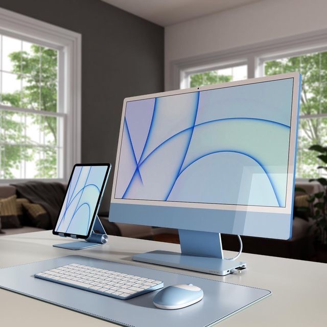
Does anyone else miss Apple logo in new iMacs?
1713558567038.jpeg


When I look at this machine it feels… liminal. Empty. Like something is missing from the picture.

It would totally make sense if iMacs were all-screen like all modern iPads. But they aren’t. And there is no Apple logo:(
 

za9ra22

macrumors 65816
Sep 25, 2003
1,441
1,931
I remember a heated debate (or dozen) right here about this very subject, back when the M1 iMacs came out. I presume there's no option in macrumors to search for prior discussions on the self-same subject?

But OK, I'll bite: I couldn't care less. I know what I bought, and I don't need a logo to tell me. And it isn't an iPad, so carrying through the heritage of 'iMac design language' seems totally reasonable to me, because it is an iMac.
 
  • Like
Reactions: EedyBeedyBeeps

AustinIllini

macrumors G5
Oct 20, 2011
12,699
10,567
Austin, TX
I feel like they probably should have put an Apple on it. Not a fan of the chin but definitely hate it blank. At this point the chin is kind of ridiculous.
 
  • Love
Reactions: shadowboi

kagharaht

macrumors 68000
Oct 7, 2007
1,707
1,400
I feel like they probably should have put an Apple on it. Not a fan of the chin but definitely hate it blank. At this point the chin is kind of ridiculous.
Or put back the sleep indicator to make it useful? I never sleep the iMac but for some that would be nice to see for functionality for the Jay Leno chin on the iMac.
 
  • Like
Reactions: AustinIllini

G5isAlive

Contributor
Aug 28, 2003
2,856
4,908
eh, the logo neither bothers me or excites me too much. I do like the sticker idea, but perhaps a bit smaller. And I am happy it's thin and with a chin. but mostly I agree with the sentiment that as long as it works well as a tool.. I dont get too critical on appearance.
 
  • Like
Reactions: arefbe

G5isAlive

Contributor
Aug 28, 2003
2,856
4,908
For ages iMacs (since 1999 to be precise) had this cute little bitten Apple sign on the front of their “faces”.

Does anyone else miss Apple logo in new iMacs?

View attachment 2369999

When I look at this machine it feels… liminal. Empty. Like something is missing from the picture.

It would totally make sense if iMacs were all-screen like all modern iPads. But they aren’t. And there is no Apple logo:(

thats a sweet set up you have btw :)
 

multimania

macrumors regular
Nov 2, 2007
121
23
I think the logo on the back is too big and yes, on the front it should be a small raised/embossed Apple logo as was practice on the Apple Cinema displays. Whilst at it, the white border puts me off the look. Maybe with a logo added it would work better. Apple make some strange design decisions more and more. Jobs & Ive are missed for me.
 

Nguyen Duc Hieu

macrumors 68040
Jul 5, 2020
3,016
1,005
Ho Chi Minh City, Vietnam
For ages iMacs (since 1999 to be precise) had this cute little bitten Apple sign on the front of their “faces”.

Does anyone else miss Apple logo in new iMacs?

When I look at this machine it feels… liminal. Empty. Like something is missing from the picture.

It would totally make sense if iMacs were all-screen like all modern iPads. But they aren’t. And there is no Apple logo:(

And you couldn't just buy or get for free an Apple sticker?
 

kagharaht

macrumors 68000
Oct 7, 2007
1,707
1,400
I think the logo on the back is too big and yes, on the front it should be a small raised/embossed Apple logo as was practice on the Apple Cinema displays. Whilst at it, the white border puts me off the look. Maybe with a logo added it would work better. Apple make some strange design decisions more and more. Jobs & Ive are missed for me.
How about hidden Apple Logo behind and not visible when turned off. Soon as you turn on the iMac a very light glowing Apple logo behind it. That would be cool to me.
 
  • Like
Reactions: multimania

shadowboi

macrumors 6502a
Original poster
Feb 16, 2024
635
1,126
Unknown

G5isAlive

Contributor
Aug 28, 2003
2,856
4,908
Gotta be honest that’s not my setup😃 This is a pic from Pinterest. Would be honest that lack of logo/lack of full screen design is one of the reasons I didn’t upgrade my old 2012 iMac yet. Also color options are way too…colorful to my taste. Would tolerate green one tho

chuckles. okay well, unless you already own a apple silicon Mac in another form, I can not urge you enough to upgrade to even a logo less iMac. The performance will blow you away. You are in for a real treat. Or as others have suggested, use an Apple sticker to put on a logo! Go wild. And the blue really isn't that bed. I hear you on the other colors though.
 

Alpha Centauri

macrumors 65816
Oct 13, 2020
1,444
1,140
The budget has gone into the intricate embossing on (literally), the other side, or base, of the MBP. Was quite surprised to initially see this on my M2.
 

MultiFinder17

macrumors 68030
Jan 8, 2008
2,740
2,087
Tampa, Florida
For ages iMacs (since 1999 to be precise) had this cute little bitten Apple sign on the front of their “faces”.

Does anyone else miss Apple logo in new iMacs?

When I look at this machine it feels… liminal. Empty. Like something is missing from the picture.

It would totally make sense if iMacs were all-screen like all modern iPads. But they aren’t. And there is no Apple logo:(
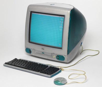
To be fair, the original iMac didn't have an Apple logo front and center. On the top and back, yes, but not on the front. So one could consider this more of a return to form to the original!

IE-003_apple.jpg,original.jpeg
 
Register on MacRumors! This sidebar will go away, and you'll see fewer ads.