Become a MacRumors Supporter for $50/year with no ads, ability to filter front page stories, and private forums.

taylorwilsdon

macrumors 68000
Original poster
Nov 16, 2006
1,870
13
New York City
I very infrequently use Safari, but I did today to see how things looked in it and I noticed a fairly glaring problem.

picture1xl3.png
(Click to make full-size)

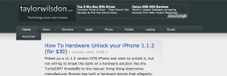
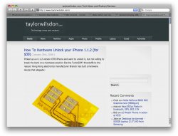
I'm guessing as mac users some of you use safari, so can you check something for me. See if the logo at http://taylorwilsdon.com matches the rest of the header color, or if it displays what you see in the attached screenshot.

Please, if possible, include Safari version, Operating System and any other information you may think relevant so that I can fix this. In reality, the color codes match so I'm not sure why safari would display them differently.
 
OS X 10.5.1
Safari 3.0.4 (5523.10.6)

As you can see it doesn't match the rest of the header color but it's not nearly as much of a contrast as in the shot you have.
 

Attachments

  • Picture 1.jpg
    Picture 1.jpg
    172.1 KB · Views: 159
strange... in my Safari 3.0.4 it appears as in your attachment... the logo image does not match... but it matches in Camino (another mac browser)...

i would suggest that you remove the background color layer in your logo image to make it completely transparent, leaving only the text layer... this is also more ideal than trying to match colors... that will solve your problem, but i have no idea what the actual cause in safari could be, other than just assuming it's the way Safari is rendering colors...

[EDIT] i am now noticing from your attachment that the colors are slightly off in your Firefox screenshot as well, although much less apparent... so just change the logo image using a fully transparent background and you'll be fine.
 
This happens because safari reads color profiles and firefox doesn't. There's a few ways to deal with it, the easiest being to remove the color profile from the images when you export from photoshop.
 
Eeeeenterestnig. I never realized it but I jacked up the contrast of my LCD and I can see a faint difference in firefox as well. Hmm... I will try re-exporting it as either a transparent png (although I've heard Internet explorer 6 cannot process those?) or without the color profile.

Thanks for the help :) I'll let you know how it goes.
 
Or make your logo a transparent gif with your green background color as the matte
 
Here's how it looks in my Safari:
Mac OS X 10.4.11
Safari 3.0.4
 

Attachments

  • Picture 1.png
    Picture 1.png
    64.4 KB · Views: 118
I THINK I've got it fixed. If someone has IE6, a check would be great. I only have IE7 available. I'm not going to do a transparent GIF because they look awful... PNG was the only way to go.
 
I THINK I've got it fixed. If someone has IE6, a check would be great. I only have IE7 available. I'm not going to do a transparent GIF because they look awful... PNG was the only way to go.

I tested with IE6 on Mac using ie4osx and it doesn't look good. The transparency shows through to the body background color, the light gray. A gif shouldn't look any differently than your png here. May you were saving it wrong.
 
I tested with IE6 on Mac using ie4osx and it doesn't look good. The transparency shows through to the body background color, the light gray. A gif shouldn't look any differently than your png here. May you were saving it wrong.

GIF is never a good idea. Its quite a bit lower quality then a png-24 or a high quality JPG. I see artifacts on all GIF exports.

Re: IE6 - I was afraid of that, but I guess I'll just have to live with it. Less then 2.5% of my traffic is from IE6 and it is **** to begin with (80+% bounce, >30 sec on page). If you use ie6, you can get your news elsewhere :D
 
i dont know if you guys can but i can still see the colour differences with my 20 year old eyes. maybe try using the digital colour meter in the utilities folder set to 8-bit RGB to match up the colours in photoshop. this is if you want to have a unified perfect look. looks fine atm.

this is how i made my avatar match up with the forum background & looks fine in Firefox, Safari and IE7.

this is with Safari 3.0.4 and 10.5.1

Screencapture 1.jpg

this is with IE7 in windows XP SP2

Screencapture 2.jpg
 
Are the two in the same color space?

See if the logo at http://taylorwilsdon.com matches the rest of the header color, or if it displays what you see in the attached screenshot.


This is a common problem with a common fix.

Yes the color codes match but that is not the whole story. Safari will modify the color before displaying it on the screen if the image contains an ICC color profile. So if the colors should be the same not only must the RGB values be the same but the color profiles must also match.

Most browsers will ignore the ICC profile and assume it is "sRGB". THe best fix is to take the images into Photoshop and convert (not assign) then to the sRGB profile. And while in PS set the default color space to sRGB.
 
Make sure your workspace in Photoshop is set to your specific monitor. Then make sure you're exporting to sRGB. Alternatively, as suggested, you could use a transparent GIF. Since your logo is monochromatic, it should be a relatively lossless compression.

(Also, 279 messages? Check your e-mail! ;))
 
Summary:

1) In a web site, don't embed color profiles in exported graphics - not all browsers support this, causing cross platform rendering issues. Color profiles are excellent for print medium (magazines, etc.)

2) Avoid .png with transparency - this isn't supported by all browsers, yet more cross platform rendering issues - use .gif for transparency and web

3) Export as RGB, slice the image and upload the rest as table cells or div's (depending on HTML vs. XHTML) with the background color matched using RRGGBB hex values. Less graphics = faster page load.

In Adobe PS this implies file -> work on the PSD, save it as 8 bit RGB. For your web site file -> save as web -> save as GIF or JPEG. This optimizes the image and allows you to mark pixel ranges as transparent easily from that screen, including saving slices.

-jim
 
Summary:

1) In a web site, don't embed color profiles in exported graphics - not all browsers support this, causing cross platform rendering issues. Color profiles are excellent for print medium (magazines, etc.)

....

In Adobe PS this implies file -> work on the PSD, save it as 8 bit RGB. For your web site file -> save as web -> save as GIF or JPEG. This optimizes the image and allows you to mark pixel ranges as transparent easily from that screen, including saving slices.

Even if you save as JPEG, you may still need an embedded profile to make sure your images appear more of less correctly. In fact, I find that I need to make sure my profile and proof settings are properly set esp. when working with JPEGs.
 
If you wish not to follow the advice given, that is up to you. I've given an example of exactly how to export the image using PhotoShop and you'll notice no color profiling is involved on the export.

On a local save and editing the image, that's a different matter and full color profile embedding including color calibration is not at issue.

-jim

My point is your advice is misguided. Just because you're not actively including a color profile, doesn't mean there isn't. The saturated picture is the result of "save for web" without color management.

I chose an Apple background with bright green to illustrate my point.
 

Attachments

  • screenshot.png
    screenshot.png
    549.4 KB · Views: 87
  • jpeg3.jpg
    jpeg3.jpg
    66.1 KB · Views: 89
  • Picture 4.png
    Picture 4.png
    424.4 KB · Views: 107
The conversation earlier was about exporting the ICC Color Profile (or any other), the ICC format being proprietary in nature from the International Color Consortium and is intended to be vendor neutral and cross platform specific. A format which as you learned is not compatible with all browsers.

Technically, profiles like ICC are "attached" to the encoded binary data which is referred to as "embedded at the page level" vs. "inline", the profile of which your comments apply.

We're not discussing the inline profile although you pointed it out, obviously all replies here to you are in context to the page level profile.

Nobody here is misguided, and lets set the record straight on terminology.

-jim
 
I'm a designer not a developer or programmer so I don't really care about terminology. I just care about my colors coming out properly and my point is, your directions as followed produce saturated colors - as I demonstrated with the attachments.

As for "discussing," you don't discuss. You just add posts loaded with terminology at the end of threads (often when the topic has been resolved like this one). I only added comments in case someone decided to follow your directions and got saturated pictures.
 
You're a great designer, but you do realize the advice I gave was for the transparent image noted earlier in this thread (your png after a user suggested transparency, I suggested gif), yet the test you ran was for a different format (jpeg) and non-transparency and only 60% of the quality. No wonder you questioned my advice. Sorry if this is "technical", but it's what happened.

I am sure you know image resolution, choice of format and optimization settings affect things (like saturation) because that's common knowledge, not advanced tech stuff only developers talk about while reading inane manuals. By not spelling it all out in my summary, I gave you the benefit of the doubt you know how to do all that in Adobe PS, that you're a pro and you'd use the sRGB settings suggested by others, the proper format, and proper quality if the objective was cross platform rendering. Once you find the right combination of these important factors via Adobe tweaking, you will have "more or less" a complete success to use your own phrase, so long as you know Safari is the "less" part if you, in the end, opt to use the ICC profile in the export.

BTW -- I often reply first on other topics but this time others beat me to it, and it's more likely to happen that way as I don't spend all day on here, BTW. Thanks for getting personal there, unnecessarily. Way to keep it friendly.

Will someone please help him with the saturated profile so he can export it and also be 100% the same across ALL browsers, including Safari. Thank you very much for your time, and best of luck to you (honestly, no sarcasm).

-jim
 
i also noticed that when i view my iweb page in safari the fonts and color appear messed up.... i really don't get it but it appears fine on firefox etc.
 
Register on MacRumors! This sidebar will go away, and you'll see fewer ads.