Become a MacRumors Supporter for $50/year with no ads, ability to filter front page stories, and private forums.

NXTMIKE

macrumors 6502
Original poster
Nov 11, 2008
386
0
Canada
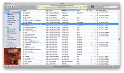
Is it just me or does the difference between the new iTunes 9 "shinny" interface and the rest of the Apple/Leopard Apps bother you?

Like it's a great new design and all.....but it sticks out like a sore thumb with all my other windows open.
 

Attachments

  • Screen shot 2009-09-24 at 12.55.38 AM.png
    Screen shot 2009-09-24 at 12.55.38 AM.png
    15.7 KB · Views: 590
  • Screen shot 2009-09-24 at 12.57.13 AM.png
    Screen shot 2009-09-24 at 12.57.13 AM.png
    27 KB · Views: 582
It reminds me of the old Aureal Vortex application skin that came with the Diamond Monster soundcards back in 1999...
 
And it's supposed to be "shiny", not "shinny". ;) Anyway, no, it doesn't bother me...I actually prefer apps to look kind of different from each other; makes Exposé with lots of windows easier.

--Eric
 
You do know that you can edit the thread title?

One thing that annoys me in iTunes 9 is that the top of the window looks like it is not selected.

In other apps, the bar at the top (pics attached) are dark when selected, and light when deselected. The top of the iTunes 9 window is much lighter than before and I always think that it isn't selected. Not a problem but something I noticed.

Left is selected, right is deselected.
Notice in Firefox the selected window is noticably darker. In iTunes, the selected window is quite light.
 

Attachments

  • darklight.png
    darklight.png
    20.1 KB · Views: 102
  • darklight2.png
    darklight2.png
    27.5 KB · Views: 91
lol it was just after 1am EST when I made this thread. thats probably why there was all the spelling mistakes in the title. :p
 
yes, it drives me nuts. It gets worse each time.

If they were going to keep it exactly like the rest of the interface, I wouldn't mind. But to be different, but only slightly different for no apparent reason, really rubs me the wrong way. I kind of wish it was REALLY different... like Garageband or something.
 
I wish they would make it like the iLife stuff, dark gray and blue.

I think its fine but I dont know why Apple keeps changing iTunes but wont get rid of the nasty aqua in their damn OS. At least the new scroll bars work well as OS scroll bars unlike the iTunes 8 ones which were too dark and didnt bode well for situations where the scroll bar wasnt at the edge of the window.
 
There are ways you can revert iTunes 9 back to the look of iTunes 8. I have it applied on mine. I can't remember where it was, though. Google it.

Here's what my iTunes 9 looks like now:
I personally like the shiny yellow LCD more than what it was in previous versions.
 

Attachments

  • Screen shot 2009-09-25 at 1641 AM.png
    Screen shot 2009-09-25 at 1641 AM.png
    418.2 KB · Views: 118
There are ways you can revert iTunes 9 back to the look of iTunes 8. I have it applied on mine. I can't remember where it was, though. Google it.

Here's what my iTunes 9 looks like now:
I personally like the shiny yellow LCD more than what it was in previous versions.

yes i must admit, the yellow "now playing" lcd is much nicer in iTunes 9. And I will google through to find that modification. I hope I could find it.
 
Register on MacRumors! This sidebar will go away, and you'll see fewer ads.