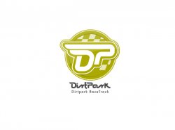
Hi!
I was asked by a Motocross/Supercross racetrack called DirtPark to create their logo. After about a dozen variations we ended up with this logo.
After all these alterations I think I lost my sense of judgement. I need a fresh opinion whether this can stand for a motocross track?
Any opinion welcome.
I'm going to make a full color version and also a smaller version without the text.
Thank you,
Balint
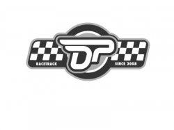
") )
)