Got a tip for us?
Let us know
Become a MacRumors Supporter for $50/year with no ads, ability to filter front page stories, and private forums.
DP7's new system font is a big improvement on non-Retina
- Thread starter pickaxe
- Start date
- Sort by reaction score
You are using an out of date browser. It may not display this or other websites correctly.
You should upgrade or use an alternative browser.
You should upgrade or use an alternative browser.
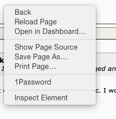
Just wanted to say this. I think it looks a lot less jagged and crappy.
Could you post a screenshot of the clock area of your Mac. I won't be able to update till later today, but I'd like a look. Thanks!
Attachments
It looks much better on retina display too. It's a bit thinner which sounds really bad but it looks really quite amazing in my opinion.
Just wanted to say this. I think it looks a lot less jagged and crappy.
I disagree... Too light (gray) and thin. Looks bad on my 27" display. By making it lighter it "looks" less jaggy, but that also makes it harder to read.
There is not new system font… it's just that Apple's is changing things are they disabled sub pixel rendering in the menu for this build. The font is exactly the same.
But they finally enabled it for the windows title!
https://en.wikipedia.org/wiki/Subpixel_rendering
But they finally enabled it for the windows title!
https://en.wikipedia.org/wiki/Subpixel_rendering
There is not new system font it's just that Apple's is changing things are they disabled sub pixel rendering in the menu for this build. The font is exactly the same.
But they finally enabled it for the windows title!
https://en.wikipedia.org/wiki/Subpixel_rendering
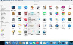
Thank you for clarifying this us, especially nervous folks like me. I have no problem with thin font except in the right click menu i see very thin as compared to the previous releases. Can we assume the apple with correct this in future or final release and it is merely for this one?
Attachments
Register on MacRumors! This sidebar will go away, and you'll see fewer ads.


