anyone know how to show different data level displayed against a map. so if you have a city and you want to show lets say 5 neighborhoods and want to compare the support a candidate has against another candidate in each of those 5 neighborhoods could you do it? I am thinking of something where like either the area is raised or a bar chart comes out or the color is a certain color, I don't know but I am just trying to show more support or less support in different regions. Thanks.
Got a tip for us?
Let us know
Become a MacRumors Supporter for $50/year with no ads, ability to filter front page stories, and private forums.
excell mapping
- Thread starter Aniej
- Start date
- Sort by reaction score
You are using an out of date browser. It may not display this or other websites correctly.
You should upgrade or use an alternative browser.
You should upgrade or use an alternative browser.
Sounds like you need something like Microsoft MapPoint.
Wow, I have heard of many thing, but never that? is it part of office or what?
Wow, I have heard of many thing, but never that? is it part of office or what?
No...it's a stand-alone app updated yearly. Windows only. North American version is $299.
More info here.
Yeah i just checked it out and discovered it is windows only also. Wildcowboy, any ideas on what to do? It doesn't even have to be a real map, as in it can be just a 2D outline of certain political boundaries with a 3D color representation of each candidate's support? The map part really just needs to be the most basic possible for example:
Attachments
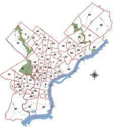
The map part really just needs to be the most basic possible for example:
There might be a bit of a learning curve.. but you could do what you're asking with an open-source GIS program like GRASS or QuantumGIS.
It looks to me that the map you just posted was made in arcview (guessing from the north arrow.) I'm not sure if you'd be abe to get your hands on the shapefiles or not.. but that'd make the task at hand very easy.
beleive it or not I have ArcGIS 9, would that make this a lot easier?
beleive it or not I have ArcGIS 9, would that make this a lot easier?
I was operating under the assumptions that you were a novice and a mac user. Apparently neither of those two are true? Is the map above the one you want to change? Do you have it's data sources?
Is the data geocoded already? What does the data table look like?
If it really is as simple as 5 communities and wanting to display their political preference.. I might just grab a map from google and using photoshop replace the background colors to represent the data.
I am most certainly a Mac user, but have had to resort to me Dell when working on GIS related matters, which is why I was asking about Apple specific geocoding software. I am also not a newbie.
Yes the map above is the one I was looking a changing or I might just redo it entirely myself instead of trying to get my hands on the shape files.
Any more thoughts on how to go from here?
Yes the map above is the one I was looking a changing or I might just redo it entirely myself instead of trying to get my hands on the shape files.
Any more thoughts on how to go from here?
I was operating under the assumptions that you were a novice and a mac user. Apparently neither of those two are true? Is the map above the one you want to change? Do you have it's data sources?
Is the data geocoded already? What does the data table look like?
If it really is as simple as 5 communities and wanting to display their political preference.. I might just grab a map from google and using photoshop replace the background colors to represent the data.
If its just about drawing an image why not use illustrator, photoshop or anything that does graphs. (I dont understand much about cartography)
If you want to make something 3d quick and easy you could try quartz and make the program yourself.
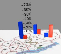
Here I whipped this up in like 35min with zero lines of code. (well there is a little javascript in there but I stole that from something else i had).
I know you probably need a real program but if you like I can send you the qz file I used.
EDIT: here is a picture of what the program looks like with content.
If you want to make something 3d quick and easy you could try quartz and make the program yourself.
Here I whipped this up in like 35min with zero lines of code. (well there is a little javascript in there but I stole that from something else i had).
I know you probably need a real program but if you like I can send you the qz file I used.
EDIT: here is a picture of what the program looks like with content.
Attachments
Here, you can download the entire xcode project from:
http://www.zimmerfamily.de/sebastian/motion/Excel%20Mapping.html
http://www.zimmerfamily.de/sebastian/motion/Excel%20Mapping.html
Register on MacRumors! This sidebar will go away, and you'll see fewer ads.