Become a MacRumors Supporter for $50/year with no ads, ability to filter front page stories, and private forums.

Chundles

macrumors G5
Original poster
Jul 4, 2005
12,037
493
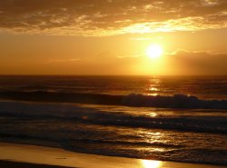
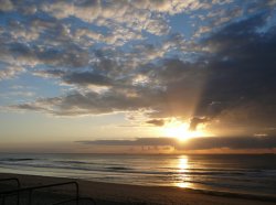
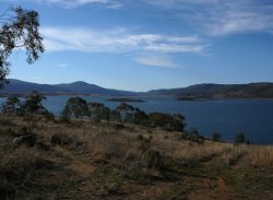
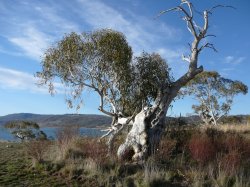
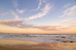
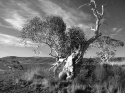
With Father's Day this Sunday 3rd of September I want to enlarge and frame one of my photos to give to my Dad. I've got a shortlist of 4, all are 5MP, which do you guys like and how big could I get it enlarged?

8"x10"??
 

Attachments

  • P1010350.jpg
    P1010350.jpg
    202 KB · Views: 118
  • P1010765.jpg
    P1010765.jpg
    213.4 KB · Views: 107
  • P1010831.jpg
    P1010831.jpg
    213.8 KB · Views: 105
  • P1010877.jpg
    P1010877.jpg
    234.3 KB · Views: 115

tobefirst ⚽️

macrumors 601
Jan 24, 2005
4,612
2,335
St. Louis, MO
I like the top-left and the bottom-left the best. I think 8x10 would be good, mounted bigger, and framed.

Also, have you thought about making them a series, as all the images are great? You could do 4 smaller prints, framed individually, to be hung together.

(At first, I was thinking, "Oh great, first another desktop thread too early, and now a thread asking about a holiday that is 10 months away! But you're not in the US, so it's okay now.) :)
 

kretzy

macrumors 604
Sep 11, 2004
7,921
2
Canberra, Australia
What a great father's day present idea! I always struggle to think of something.

Personally, I really like the one in the bottom right hand corner and think it would look the best framed. tobefirst's idea of getting them printed into a series would also work really well I think.
 

scem0

macrumors 604
Jul 16, 2002
7,028
1
back in NYC!
I like the two on the right, but the bottom one might be misunderstood as saying "you're old" or something like that :). I'd do the top right.

e
 

thedude110

macrumors 68020
Jun 13, 2005
2,478
2
I like the bottom right as well -- something really human/real about it.

It's delicate, it's rugged and it evokes.
 

Chundles

macrumors G5
Original poster
Jul 4, 2005
12,037
493
EricNau said:
I like the dead tree.

It's not dead. Gum trees do that when they get really old, they lose a lot of the middle out of them and form a cylinder. That tree's probably a thousand years old.

Took that one looking north from near the shore of Lake Jindabyne in the snowies.
 

EricNau

Moderator emeritus
Apr 27, 2005
10,730
287
San Francisco, CA
Chundles said:
It's not dead. Gum trees do that when they get really old, they lose a lot of the middle out of them and form a cylinder. That tree's probably a thousand years old.

Took that one looking north from near the shore of Lake Jindabyne in the snowies.
Well, if it's 1000 years old it should be dead. :p
 
C

CompUser

Guest
I like the old tree too.

There is this tree in my town, one of the oldest in CT. Sorry for the randomness, but its pretty cool.

Oak_2.jpg


newoak4.jpg
 

Abstract

macrumors Penryn
Dec 27, 2002
24,889
921
Location Location Location
Well photos 1 and 4 are the best. I like the sunset/sunrise, but if you get it printed, it may come out waaaay too dark. There isn't a lot of detail in the waves to begin with. If you have it printed, the printery might print all the dark parts completely black, and that won't look good.

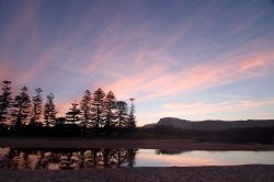
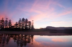
If I were you, I'd go to the beach on 2 or 3 consecutive nights and take some more photos of a great sunset. It's best after a rain or when there are clouds right above Mt Keira. Nice sunset photos are very safe. ;)

I went to North Beach (do you live near there?) and took some photos in front of Stuart Park. There's a guy who takes photos there somewhat regularly, and he could even give you advice. :)

Here are 3 photos I took just yesterday. :) One is facing Mt. Keira, and two are facing the ocean near Stuart park. I like the 1st and 2nd photo best because the 3rd looks particular imbalanced due to the trees, but it's a different perspective of the same thing and might give you ideas.
 

Attachments

  • Sunset.jpg
    Sunset.jpg
    104.4 KB · Views: 78
  • Sunset 2.jpg
    Sunset 2.jpg
    112.3 KB · Views: 87
  • Sunset 3.jpg
    Sunset 3.jpg
    118.3 KB · Views: 93

Chundles

macrumors G5
Original poster
Jul 4, 2005
12,037
493
Abstract said:
Well photos 1 and 4 are the best. I like the sunset/sunrise, but if you get it printed, it may come out waaaay too dark. There isn't a lot of detail in the waves to begin with. If you have it printed, the printery might print all the dark parts completely black, and that won't look good.

If I were you, I'd go to the beach on 2 or 3 consecutive nights and take some more photos of a great sunset. It's best after a rain or when there are clouds right above Mt Keira. Nice sunset photos are very safe. ;)

I went to North Beach (do you live near there?) and took some photos in front of Stuart Park. There's a guy who takes photos there somewhat regularly, and he could even give you advice. :)

Here are 3 photos I took just yesterday. :) One is facing Mt. Keira, and two are facing the ocean near Stuart park. I like the 1st and 2nd photo best because the 3rd looks particular imbalanced due to the trees, but it's a different perspective of the same thing and might give you ideas.

I have a 5"x7" of the sunrise/waves - got it done at Rabbit Photo - looks awesome. Still trying to decide.
 

rdowns

macrumors Penryn
Jul 11, 2003
27,397
12,521
Completely off topic, but I love this Father's day ad.
 

Attachments

  • Picture 1.png
    Picture 1.png
    105 KB · Views: 118

Chundles

macrumors G5
Original poster
Jul 4, 2005
12,037
493
rdowns said:
Completely off topic, but I love this Father's day ad.

That is possibly the best ad I've seen since New Year's Day 2000 when Toyota did a full-page in the Herald of the Harbour Bridge in ruins, surrounded by the smoke of the previous night's fireworks and just one word - "Bugger."
 

BurtonCCC

macrumors 65816
May 2, 2005
1,005
0
Wheaton/Normal, IL
rdowns said:
Completely off topic, but I love this Father's day ad.
Haha, that's great.

As for which of the four pictures I think would be best. That tree is absolutely the most beautiful picture I've seen in a long time. The lighting is PERFECT.

Daniel.
 

Mydriasis

macrumors 6502
Mar 17, 2005
476
0
i like the 1th and the 4th, like everyone else, but on the fourth I'd pump up the saturation a little bit. The red in the busches plays nicly off the green in the tree. Or i'd try a black and whith version, the image has good contrast!

My humble little opinion. Here is a really rough job... the bw is a mix with about 80% reb channel and 20% green.
 

Attachments

  • color.jpg
    color.jpg
    180 KB · Views: 85

Chundles

macrumors G5
Original poster
Jul 4, 2005
12,037
493
Mydriasis said:
i like the 1th and the 4th, like everyone else, but on the fourth I'd pump up the saturation a little bit. The red in the busches plays nicly off the green in the tree. Or i'd try a black and whith version, the image has good contrast!

My humble little opinion. Here is a really rough job... the bw is a mix with about 80% reb channel and 20% green.

Yeah it's cool but it's too green. We're in the middle of one of the biggest droughts in history here and the photo I took is the exact colour of the landscape - there's very little green about at the moment, especially in that part of the country. I appreciate the effort but it just looks a bit too "fake" especially when you see the land as it is now - I really like the way the image captures the stark quality of the bush.

I'm leaning towards the tree, my Mum's coming down here tomorrow so I'll get her spin on it then go and have it developed.
 

njmac

macrumors 68000
Jan 6, 2004
1,757
2
scem0 said:
I like the two on the right, but the bottom one might be misunderstood as saying "you're old" or something like that :). I'd do the top right.

e

Yeah, he could put a caption on it.


Dear Dad,

I love this old tree... thanks for planting it!
 

Mydriasis

macrumors 6502
Mar 17, 2005
476
0
I went overboard with the color saturation on purpose so that people can see the effect even if the images are not next to one another.

I really do like the image in its original version, espeacially the detail and sharpness. In fact, if I had taken it I would print it as well. I guess the dry country does fit the tree better but I still think the jpeg thats on the web is a little flat. (I dunno maybe it's my monitor, or my eyes)
 

Chundles

macrumors G5
Original poster
Jul 4, 2005
12,037
493
Scarlet Fever said:
you could by a mac mini and a 23" ACD, put the mini in the wall and wall mount the ACD, and show all of them, all the time...

You fund it, I'll do it.
 
Register on MacRumors! This sidebar will go away, and you'll see fewer ads.