Become a MacRumors Supporter for $50/year with no ads, ability to filter front page stories, and private forums.

cleo

macrumors 65816
Original poster
Jan 21, 2002
1,186
0
Tampa Bay Area, FL, USA
Hey, folks! I've decided to do a bit of spring cleaning with my websites. I have three: a "professional" site, a blog that I don't write in any more, and a centralized homepage. There's no common design elements, the "professional" one was thrown together in Photoshop 3 years ago and hasn't been touched since, and like i said, the blog is in update limbo. SO.

I started with the homepage, and that's what I'd like feedback on. My goal, eventually, is to have all three sites have the same basic page layout and "feel," but with different color palettes and such. My goal for the design was very minimalist, both in appearance and code. I want to hit the balance between pleasing aesthetics and accessibility, fast loading times, standards compliance, and so forth. So, without any further nervous rambling:

http://beckyblitch.net

Please feel free to look "under the hood" at my code... there is a wee bit of php involved (to calculate my age and the data for the pdf), which I can post if anyone's interested. I'm particularly curious about how the page looks on iPhones and other mobile devices and would love feedback on that, as well.

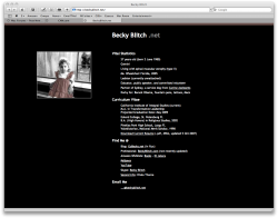
For what it's worth, I'm attaching a .png of what it looks like on my screen.

So, thanks! :)
 

Attachments

  • screen-capture.png
    screen-capture.png
    206.7 KB · Views: 105
I like minimalist approaches, but perhaps this is overly minimalist? Not that it's a bad thing, but I'm finding it hard to give feedback on anything.
 
Yea, definitely minimalist. It leaves you wanting more, but maybe you're going for that so people contact you.

  • There is some invalid code (http://validator.w3.com/). Looks like some tags didn't get closed properly.
  • CSS is valid.
  • To add some more semantic tagging, you can use the address tag for the um ... well addresses. (Example below.)

Code looks good though and like your picture on the page. I like that color style of black and white with an area given its color back. I don't have any cool mobile technology to check the page, but did use Opera's "Small Screen" rendering and it looked fine there. It just makes it linear so you have the image then your listed content as you might expect.

Example of use of address tag:
HTML:
<address>Eckerd College, St. Petersburg FL</address>
 
Yea, definitely minimalist. It leaves you wanting more, but maybe you're going for that so people contact you.

Heh, that's what I get for posting past bedtime. :) Yeah, my goal, hopefully, is eventually to have that site/page come up before the others on Googles for my name, so that someone (old friend/acqaintance, potential employer, whatever) can get the central facts and my resume super-fast, and then can look at other sites if they choose. Kind of a central directory of me, if you will. ;)

There is some invalid code (http://validator.w3.com/). Looks like some tags didn't get closed properly.

Good catch! Hadn't validated since changing some stuff around. Thanks for that.

Code looks good though and like your picture on the page. I like that color style of black and white with an area given its color back.

Thank you!!! That was my first foray into doing anything remotely artistic with a photograph in Photoshop... I'm glad it succeeds! Doesn't the 4-year-old me look like a complete sass?

I don't have any cool mobile technology to check the page, but did use Opera's "Small Screen" rendering and it looked fine there. It just makes it linear so you have the image then your listed content as you might expect.

Awesome. That was exactly what I was going for. :)

Thanks so much for the feedback! I super-appreciate it!
 
Not strictly on your site, but I love the font you used for the headings on the resume. Can you tell us what it is?

I like the page, although I have a bit of a tough time resolving the white on black with my aging eyes. Also, would like to see a current pic...maybe just a small, tight head shot at the bottom to balance things? A reward for scrolling to the bottom on a small screen.
 
Register on MacRumors! This sidebar will go away, and you'll see fewer ads.