When I look at a photo critically I first react emotionally to it, then try to break it down to figure out what caused the reaction to it (or not). That's a process of reverse engineering where I make a mental inventory of everthing I noticed in the photo in the order of attraction then condsider how all those elements relate to each other and the message.
Photos will contain elements which deliver the message or guide the eye to where it is delivered (the effective stuff) but may also contain elements which distract from the center of interest and the message. That's where the relative attractiveness -- contrast with the background -- comes into play. A photo in which the center of interest contrasts with the overall background will be more effective at delivering the intended message that a photo where the COI and background blend together or where some other area of the photo has more contrast and becomes an eye catching distraction. The quicker the viewer finds the COI and the longer it holds their attention the more effective the message will be.
How the various things in the photo relate to each other in large part will dicate the path the viewer's eye follows within the photo to find the center of interest and grasp the message. How the COI is composed in the frame will dictate the path the eye must take to find it. How interesting the path to the center of interest is and where the eye goes next after locating play a big role in how effectively the story in the photo is told.
Some photos with a single strongly contrasting COI are like a one-line joke; short delivery and a quick strong "punchline". You wouldn't want or need a lot of other stuff in the photo to distract from the message. A head and shoulders portrait is a good example. The real COI is the front of the face, specifically the eyes. Putting light on the front of the face and in both eyes is really what is important. Everything else is secondary, but you want to compose the face in the frame in the upper third so the viewer sees all the less important stuff on the way to the face and there's really nowhere to go above the head to distract the eye off the face. The viewer finds and stays on the face and the net result is a very effective portrait.
Some photos may have more than one center of interest. It's a challenge to compose these types of photo well because whenever there is more than one COI they will compete with each other to some degree. The degree they appear to be harmonious or in conflict is controlled compositionally via their relative contrast to each other and the background tone -- the one with the strongest contrast will get the most attention and be noticed first -- and by their distance from each other in the frame.
Viewing a photo with two eually strong COIs on opposite sides is like watching a ping-pong match. The viewer can focus on them both at the same time so the eye flits between them. The abrupt eye movement creates the illusion of conflict. But put the same to equal COIs close together and they will merge together as a single unfied and harmonious COI. That dynamic is very important in group shots. If the heads are too far apart the photo begins to look like a collection of individual portraits pasted in the same frame. Keeping the heads closer together and equally spaced unfies them an creates a nice smooth dynamic as the viewer moves from face-to-face.
Its the movement of the eye within the photo which creates an illusion of movement in the composition. That long preamble leads us to how you selected your center of interest and composed it in the frame.
Some of your scenic shots like the first one don't have any compelling center of interest for the eye of the viewer to gravitate towards. The eye is led out the sides of the photo without really finding any strong focal point to stop it. There is no visual clue what you thought was most important and thus its not particularly interesting to look at in part because the horizon is cutting the photo in half. The reason for composing a scenic with either more foreground and less sky or more sky and less foreground is to clue the viewer what is most important in the photo (i.e. the part that occupies the most area in the photo).
In the scenic shots with a foreground center of interest such as the boat and the flag and lion you have put the COI "dead" center in the frame. That can be used effectively if you want a static composition, but it causes the eye of the viewer to tend to stay there and not explore the rest of the photo because the eye is conflicted -- should I go right, left or up? Putting your foreground COI off center provides a more interesting path for the viewer's eye to follow to get to it.
For example the composition of that rainbow/flag shot would have been killer if the base of the rainbow was in the lower right and the flag over on the left at the end of it. The eye would either see the rainbow and follow it to the flag, or alternately see the flag first then the rainbow and follow its eye pleasing curve. Which one the viewer would likely pick can be predicted and controlled by which you make contrast with the background more with color, tone and size; the flag or rainbow.
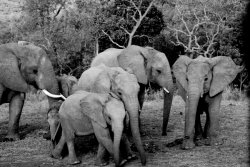
The two photos in the batch which are composed most effectively are the elephants and the sunset.
The close pack of elephants unifies them as a single harmonious group and the arrangement creates a nice curved eye path up along the backs of those on the left leading the to the one facing the camera on the right. The elephant on the far left is actually a bit of a distraction because it does not contribute to that nice eye movement. You might try cropping him out and compare.
The sunset shot works well because its not cut in half by the horizon and because is has two compelling centers of interest - the tree and the sun. The fact you managed to keep sun and tree close together unifies them and contributes to the harmonious feeling this photo evokes.
I think the flower manipulation photo is also a good example of when centered static composition can be effective. The grid pattern lends itself to a symmetrical, centered composition and the flower with the best overall contrast (most eye catching) is in the central square. The fact you tilted the grid at an angle is a nice counterpoint to the centered static compostion of the flower, which adds another level of interest to the shot.
Chuck Gardner
http://super.nova.org/DPR/
")