I must say I love the look of Yosemite. Like iOS 7 I was a little skeptical at first but then it sets in and it starts to grow on you. The Finder Icon is the only one I'm not digging. Not a fan of the square vs rectangular look. Where I'm going with this is that I was talking to a friend at work who had not seen the change to to Yosemite so I pulled up Apples website to show her and I was talking about the Finder icon and when I pulled up the Yosemite page on Apple I noticed the icon in their images is different then what is in the first beta. I hope they change it too this one! What does everyone else think?
Got a tip for us?
Let us know
Become a MacRumors Supporter for $50/year with no ads, ability to filter front page stories, and private forums.
Finder Icon not final?
- Thread starter ChrisFerri
- Start date
- Sort by reaction score
You are using an out of date browser. It may not display this or other websites correctly.
You should upgrade or use an alternative browser.
You should upgrade or use an alternative browser.
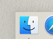
I like the one on Apple.com better, but I think the one in the developer preview is probably what will be final.
Funny thing is that the one on the website is a rectangle as opposed to the DP which uses a square. I think for some reason the rectangle is more pleasing to the eye. I always equated it with the ratio of the display. Either way we'll get used to it, but it would be nice if they used the one on their website.
I agree, it's nasty looking. Yet again, I've never been too big on the current finder icon either, I just got used to this one over time.
It being a square I think I can get used to, but I'm hoping Dark Mode will dim the colors of all these icons. Cuz really, they said they're adding Dark Mode for devs who want to focus. How the heck is leaving that rainbow in the dock reducing distractions? Those are way more of an eye draw than white backgrounds.
It being a square I think I can get used to, but I'm hoping Dark Mode will dim the colors of all these icons. Cuz really, they said they're adding Dark Mode for devs who want to focus. How the heck is leaving that rainbow in the dock reducing distractions? Those are way more of an eye draw than white backgrounds.
I agree, it's nasty looking. Yet again, I've never been too big on the current finder icon either, I just got used to this one over time.
It being a square I think I can get used to, but I'm hoping Dark Mode will dim the colors of all these icons. Cuz really, they said they're adding Dark Mode for devs who want to focus. How the heck is leaving that rainbow in the dock reducing distractions? Those are way more of an eye draw than white backgrounds.
I can take the Finder icon either way but I think it looks more inline with the new Dock scheme. You can always hide the Dock when using Dark mode.
I'm used to the new one, and I think it fits in better with all the other new icons. It's likely going to be the final version. The one on Apple.com must be an earlier version, as it's just the old one in a different color.
I'm not liking the Finder Icon, something about it is just rubbing me the wrong way.
It's the creepy smile.
I think the one in the WWDC intro video (the one in the DP) is probably the final one.
Agreed. Considering that the finder icon in Mavericks was rectangular, it makes very little sense to make it square and then revert back to rectangular again. They probably at first made it flat, then changed the proportions and made some additional corrections.
Definitely am HOPING against hope for the website version to be the final one. The DP version is just weird looking and not pleasing to the eye.
Based on the number of complaints here, I wouldn't be surprised if people over at the developer forums are complaining, too. It doesn't seem like anyone likes the icon, so there should be a good chance of Apple changing the icon to the one on the website. Feedback, feedback!
Based on the number of complaints here, I wouldn't be surprised if people over at the developer forums are complaining, too. It doesn't seem like anyone likes the icon, so there should be a good chance of Apple changing the icon to the one on the website. Feedback, feedback!
I changed the [IMHO ugly] icon in "Finder" and "Dock". I keep custom icons for the sidebars in Finder and core app's as well as system app's, even changed the generic icon folder (that Miami Vice blue was killing my eyes).
As iOS 7 development progressed, I'm hopeful Apple will make GUI adjustments. It's petty but I really like the 3D dock, the new one takes be back to 10.4 and I didn't like it then. Additionally, the Finder and Safari toolbars are too light in contrast and text, just as iOS 7 had been.
As iOS 7 development progressed, I'm hopeful Apple will make GUI adjustments. It's petty but I really like the 3D dock, the new one takes be back to 10.4 and I didn't like it then. Additionally, the Finder and Safari toolbars are too light in contrast and text, just as iOS 7 had been.
they will be changing the icon. they are not done with the complete UI changes yet. iTunes icon is still not red and some other apps look incomplete; game center for an example. wait for DP2 for some of these changes or later DP builds.
Last edited:
they will be changing the icon.
Nobody but Apple knows that. The WWDC build was newer, so the Apple site is probably out of date.
Thank god they've changed it. The Finder icon in DP1 is horrendous.
They haven't.
I like it, It looks a lot happier!
But I made a bigger version if you want.
1st one is original DP1,
2nd one is my custom stretched version
3rd one is from Apples website.
4th one is from Mavericks
But I made a bigger version if you want.
1st one is original DP1,
2nd one is my custom stretched version
3rd one is from Apples website.
4th one is from Mavericks
Attachments


Last edited:
Nobody but Apple knows that. The WWDC build was newer, so the Apple site is probably out of date.
They haven't.
the website would not be out of date they posted what the final design should be like when OS X Yosemite is released this fall. the WWDC build is newer and the version they gave to developers is older and does not include the final design.
the WWDC build is newer and the version they gave to developers is older and does not include the final design.
huh? the wwdc build and the developer preview have the same icon
I doubt any of what we're seeing is final.
In fact, I'm starting to really look forward to (read: hope for) some major tweaks to the design as it progresses through the betas.
I'm a big fan of iOS 7, but Yosemite, on a 21.5" 1080p display, is rough on the eyes.
Fonts are thin and in many cases jagged (has to be a bug). There is a severe lack of contrast on the new icons that sit in the dock. I see lots of BLUR everywhere, and no I'm not referring to the opacity in use on menus.
All things that need to be addressed, and likely will be.
I actually love the current finder icon, I hope it doesn't change.
Yeh, we can tell by your display pic/avatar.
 ?
?
Register on MacRumors! This sidebar will go away, and you'll see fewer ads.