Hi there,
I have gone through the works of creating a logo for a venture of mine (well, not me alone) and I am only going to present iterations of what I think to be the strongest contender. However, I am in dire need of feedback and would welcome some advice from the fine community here in tuning my logo so that it does convey the meaning I intend it to carry.
The logotype is German and could roughly translate into "context works" or more literally "context forge". The logo will be used for a web publishing platform (in rather profane words: a multi-author blog) that tries to focus on contextualizing information rather than merely presenting the newest fad. It will look very much like an interactive magazine, but restructures news categories in a semantic hierarchy and hopefully distinguishes itself through the quality of the authors' posts. The claim is not set in stone, so I put a generic one there for you to visualize the whole thing.
So - do you find the underlying idea of the logo befitting? And if so, where do you think it requires tweaking?
Of course I have a personal favorite, but I would welcome your unbiased input. Thanks a lot! (Oh, and don't worry: I CAN take it, so fire away)
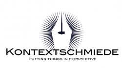
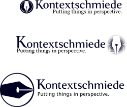
")