Personally I think you've taken the wrong approach with your portfolio.
Its all very well showing end products but you need to show some development too. Take your table for example, you've got one page with 3 cad rendered images, where are the images of the final model, the sketches etc leading up to the final design. An architecture course has model making involved (even if they are fairly simple affairs on the Lincoln course - you know my views on this already
")
) and so it would be good to show something on that front. What happened to any reference to the show the tables going into too.
If I was to do a portfolio again (and this is basically how I did mine when I went to uni) is I had a few select pieces of work and showed a couple of pages per project with a bit explaining about the project.
I would probably go a3 landscape and then do half a page (ie a4) max before the first page explaining the project etc, and then 2-3 pages on the designs. Now obviously this doesnt work for everything but I would work around this basis.
Now regarding the current work. The main issues are:
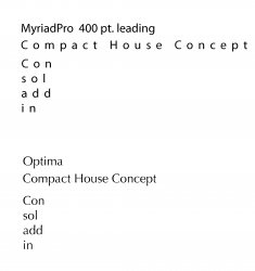
1) Typography - theres too much spacing between the text, needs to be sorted.
2) Your titles - check the alignment and layer positions, several of them are hidden under the images on the page.
3) Get someone to have a read (and possibly rewrite) some of the text under the images, some of it just doesn't flow very well - page 5 for example.
4) Check spellings as a precaution (although I didn't look hard)
5) You need more hand drawn stuff, architecture still uses pen and paper etc to design concepts, at present you don't appear to be able to do anything but use a computer.
6) decide if you are having a border around the images or not
Changes -
Personally I dont like the cheetah and car picture and the description is also wrong as I'm pretty much certain the cheetah is a photo not a cad model. Also i Don't feel the car looks right, the wheels aren't blurred enough to represent the speed its supposedly going etc. (the camera would be slow shutter speed, to allow for the motion blur behind, so the wheels would travel further and as such have more blur)
I think that the order could be changed for p11 and p12 (or 12 and 13) so the 2 lambo pictures are together.
Split the 4 photos onto 4 pages, why waste the realtively good images, I'd drop the purple flower too personally.
p15 - do you really want to put in an image with a blatent spelling mistake (gorillaz is missing an l)
I think thats all for todays slating