Got a tip for us?
Let us know
Become a MacRumors Supporter for $50/year with no ads, ability to filter front page stories, and private forums.
Font help.
- Thread starter piBook
- Start date
- Sort by reaction score
You are using an out of date browser. It may not display this or other websites correctly.
You should upgrade or use an alternative browser.
You should upgrade or use an alternative browser.
Off the top of my head, VAG Rounded or Helvetica Rounded
VAG Rounded was the font developed for Volkswagen and used for VW Beetle ads for years.
They are available for purchase from Adobe (and the usual online sellers), I am unaware of non-commercial knockoffs.
VAG Rounded was the font developed for Volkswagen and used for VW Beetle ads for years.
They are available for purchase from Adobe (and the usual online sellers), I am unaware of non-commercial knockoffs.
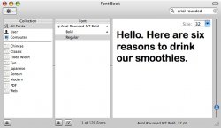
Differences in the lowercase 'a', the 'r' and the 't'thequicksilver said:It's very similar to, but not quite, Arial Rounded MT Bold.
Looks like Futura Round.
http://www.faces.co.uk/fonts/fontview.cfm?productsku=SCG1115411
This is a copyrighted font and should be purchased. Please don't ask for illegal copies, links or assistance with pirating copyrighted material on these forums.
BTW, I adore innocent smoothies.
It's not Helvetica Rounded, the lower-case 'a' is different.
Blue Velvet said:Looks like Futura Round.
http://www.faces.co.uk/fonts/fontview.cfm?productsku=SCG1115411
This is a copyrighted font and should be purchased. Please don't ask for illegal copies, links or assistance with pirating copyrighted material on these forums.
BTW, I adore innocent smoothies.
It's not Helvetica Rounded, the lower-case 'a' is different.
Futura Round -- much closer - but I think our smoothie here has a bigger x-height.
I'm still liking VAG Rounded Bold
here
Or one of the variants
CanadaRAM said:Differences in the lowercase 'a', the 'r' and the 't'
Hence my "not quite"
CanadaRAM said:I'm still liking VAG Rounded Bold
here
Me too.
That lowercase 'g' is quite idiosyncratic. Pity there's only one cap in the sample given... sometimes it's easier to identify by uppercase letterforms.
And no descenders in it at all... boo.Blue Velvet said:Me too.
That lowercase 'g' is quite idiosyncratic. Pity there's only one cap in the sample given... sometimes it's easier to identify by uppercase letterforms.
CanadaRAM said:And no descenders in it at all... boo.
Boo? Is that really a noise that rams make?
OopsBlue Velvet said:Boo? Is that really a noise that rams make?
Baaaaahd
Baaaahd
Like CanadaRam, my first reaction when I saw it was VAG Rounded. I've compared it against the version we've got here at work and it is indeed VAG Rounded Bold.
VAG Rounded.... jesus people, have you all no taste? 

I tell you all something, it's lucky I ain't a mod, 'cos I'd ban you all for a day so you could all sit and contemplate such a horrific mass error of judgement. hahahahahaha.
Speaking of ID fonts, I nailed my first ID on Typophile the other day, very proud of myself
  Just incase anyone was wondering what face it was, t'was Ito Regular E.
I tell you all something, it's lucky I ain't a mod, 'cos I'd ban you all for a day so you could all sit and contemplate such a horrific mass error of judgement. hahahahahaha.
Speaking of ID fonts, I nailed my first ID on Typophile the other day,
No, it's the smoothies that have all the taste.iGav said:VAG Rounded.... jesus people, have you all no taste?

Register on MacRumors! This sidebar will go away, and you'll see fewer ads.


