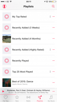
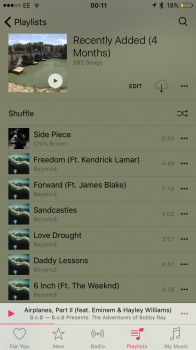
Hi Everyone, Does the below image annoy anyone else other then myself?
Cant help but see this as a design oversight, maybe an intended one - but could have been designed to look a lot nicer. For all of the Genius playlists I have, an ugly Genius cog is present - instead of a nice collection of artwork (which I note is present - when you click into the playlists themselves).
I have reported this to Apple and looks like others have, as it is listed as a duplicated bug. However I have no hope that this will be fixed anytime soon. Seeing as I have bug reports dating back to 2011 & 2012 which haven't even been responded to....


