Become a MacRumors Supporter for $50/year with no ads, ability to filter front page stories, and private forums.
Status
Not open for further replies.

redheeler

macrumors G3
Original poster
Oct 17, 2014
8,624
9,266
Colorado, USA
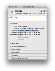
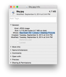
I have noticed a rather annoying change in Yosemite. When I Get Info on a file, instead of displaying the actual path with slashes like in Mavericks it places ▸ characters between the folders. Although it looks more stylish, this becomes especially annoying when I want to copy the path into "Go to Folder", as I have to replace these characters with slashes for it to work.

Does anyone now of a way to revert it back to the Mavericks method of displaying the path, or is it like most of the behavior changes made in Yosemite and there isn't a way to revert back?
 

redheeler

macrumors G3
Original poster
Oct 17, 2014
8,624
9,266
Colorado, USA
On the left is Mavericks, and on the right is Yosemite.
 

Attachments

  • Get Info Path Mavericks.png
    Get Info Path Mavericks.png
    158.3 KB · Views: 233
  • Get Info Path Yosemite.png
    Get Info Path Yosemite.png
    156.2 KB · Views: 211

GreyOS

macrumors 68040
Apr 12, 2012
3,358
1,694
Can't add anything other than just to say I noticed this the other day and found it annoying too
 

KALLT

macrumors 603
Sep 23, 2008
5,380
3,415
this is the epitome of style over substance.

But at least it’s more consistent now and easier to understand. A UNIX path is something not everyone understands, let alone uses (how many people would readily know that “/Library/Desktop Pictures” is located in your system root rather than your own user folder?). When you enable the path bar in Finder, you will get the same arrows. Developers can obtain the paths in other ways: files and folders dragged into Terminal or any code editor will be transformed into a file path and, as shown above, it’s also trivial to add a shortcut with a workflow using Automator.

It’s certainly annoying for people that do need them, and I wished Apple would have added an option for this, but I kind of understand the reason for changing it.
 
Last edited:
Status
Not open for further replies.
Register on MacRumors! This sidebar will go away, and you'll see fewer ads.