I'm doing lab write ups for my engineering classes and they normally include a couple of graphs. I've been using Excel to do these graphs, but I'm having trouble finding how to control some aspects of the graph. I have a set of data that looks like this:
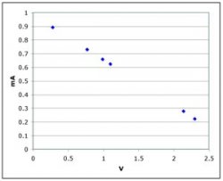
0.28 V 0.892 mA
0.77 V 0.730 mA
0.99 V 0.658 mA
1.10 V 0.623 mA
2.14 V 0.278 mA
2.30 V 0.222 mA
I want to make a voltage vs. current graph, but when I try to do this on Excel, there's no way to change the x-values. Basically, I get a graph with points (1, 0.28) (2, 0.77) (3, 0.99) for one line and (1, 0.892) .... for the other. Is it possible to make this graph correctly in Excel so I have one line depending on the values above or do I need a seperate program to do that? If so, any suggestions on programs that would work?
I'm pretty sure this should be simple to do in Excel and I'm just missing something, so any help would be appreciated.
Thanks