Become a MacRumors Supporter for $50/year with no ads, ability to filter front page stories, and private forums.

grahamperrin

macrumors 601
Original poster
Jun 8, 2007
4,942
648

The question

What design blunders have Mac users experienced recently?


For starters

An application that requires:
  1. Shift-click to select a single item and then
  2. click to extend the selection to include multiple items.
– I'll name that software later.

First, I'd like to learn of other people's discoveries. I'm:
  • minimally interested in well-known pet hates such as leather effect and the system font in Yosemite
  • most interested in blunders that might go unnoticed or unchallenged.
I expect differences of opinion on matters of taste, but some things are just wrong


Related

Typical Mac-like interfaces (2010)

Old versions of the OS X Human Interface Guidelines (2015)
 
Without any doubt the flattening of the OS, decreased contrast, and new system fonts. This has only succeeded to reduce the overall readability of OS X significantly. I recent booted up one of my old Mac`s an Early 2008 15" MBP for the first time in a couple of years and was amazed at just how much better Snow Leopard looked in comparison to the latest efforts.

I am in no means comparing the functionality of Snow Leopard to Yosemite & El Capitan, I am comparing the look and readability of the UI, with 10.6 being far superior. I absolutely have no idea why Apple feel that the desktop OS needs to mirror IOS and take such retrograde steps with the readability of the GUI. These days I even prefer Windows 10 new UI to OS X as it`s clean and readable.

Q-6
 
Lack of contrast (blunder by Apple)

decreased contrast

Yes.

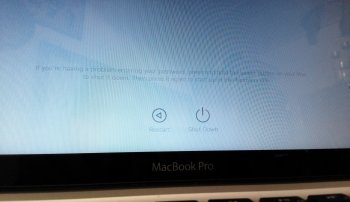
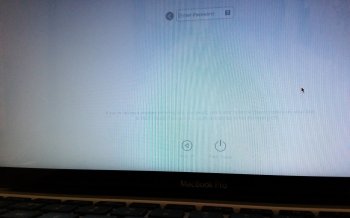
FileVault 2 Sierra system startup for example. The two or three lines of light grey text that appear, automatically, above the two buttons on the light grey background when the operating system senses that the customer might require help:

IMG_20160817_064204.jpg

Eyesight is not the problem. If I allow Photos to automatically crop the untouched photograph, everything (below the circular icon for the user, which I aimed to exclude when holding the camera) is interpreted as nonexistent. Or maybe misinterpreted as dirt on the lens of the camera. The only good contrast is between the grey of Apple's background, and the black of the cosmetic border that surrounds the display:

IMG_20160817_064204(1).jpg

Readers can argue that the original photograph was blurred – true, I took it with my phone held too a little too close to the display – but even when the texts are crisp, Apple's choice of colours is obnoxiously lacking in contrast.

Postscript: with the camera steadied on a flat surface, I took some less blurry photographs. All had moiré effect (not intentional), I picked the three that were least affected by moiré:

IMG_20160817_073433.jpg IMG_20160817_073536.jpg IMG_20160817_073614.jpg

Zoomed in on one:

zoomed in.jpg


There are many are other examples of the operating system itself using a level of contrast that is counterintuitive. The FileVault 2 example is probably the worst.

Moving on from the Apple example …

Any comparable blunders by other software developers?
 
Last edited:
  • Like
Reactions: Queen6
Lack of contrast (blunder by Apple)
Its funny (and sad), that when I boot my iMac into Windows, I'm finding the user experience to be much better, thanks to a higher degree of contrast and system font usage. For some reason, the text feels more crisper and easier to read. No in both cases, (windows and OSX), I'm scaling the resolution to improve readability, my old 50+ eyes cannot handle the default resolution that OS X wants out of the box. I have to scale it to make everything larger.
 
Console in pre-release Sierra (16A294a)

The title bar has lost:
  • the ability to show the name of the file
  • the ability to show the name of the query …
 
Last edited:
I'm in the "Jony Ive's new 'look' appears to be designed to appeal to small children" school as far as the "improved" appearance of the OS goes, but there are other, real problems. Right now I'm using Mountain Lion for one simple reason: I can see it. I've never needed to use reading glasses before when using a system but if I use Yosemite or newer, reading glasses are not an option, they're a requirement. The fonts are too thin and tiny and an apparently designed-in lack contrast doesn't help. Even if I modify the display settings to a lower resolution which makes the fonts appear larger, in some cases the stuff is just too tiny to see, but then they take on the characteristics of looking sloppy. With anything earlier than Yosemite this hasn't been a problem.

Another problem is with the progress bars. If you have a progress bar that's supposed to go from, say left to right as progress is being made, during an initialization phase you used to get the light blue and white striped "spinning barber shop poll" (I don't know what else to call it.) Now what you get during this initialization is essentially a "wave" effect caused by the two shades of light blue basically making a "wave" effect across the progress bar. If a monitor is set so it's contrast deviates even slightly off the norm this can look not like an initialization, but like the progress is 100% complete. The two colors used in the "wave" effect are only slightly different from one another. I don't think I'd call this a complaint, I think I'd call it a mistake. The progress bars themselves are too thin, IMHO.
 
Register on MacRumors! This sidebar will go away, and you'll see fewer ads.