Got a tip for us?
Let us know
Become a MacRumors Supporter for $50/year with no ads, ability to filter front page stories, and private forums.
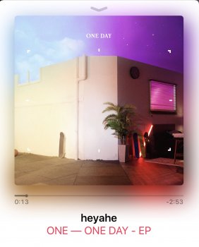
Has anyone noticed this in the Music App?
- Thread starter AVS0S
- Start date
- Sort by reaction score
You are using an out of date browser. It may not display this or other websites correctly.
You should upgrade or use an alternative browser.
You should upgrade or use an alternative browser.
Yes. It does that but it depends on the cover and the colors of the cover. I can see it on my 5s on covers with saturated or strong colors (like the one you posted).
K we're wrong and youre right. Against the outnumbered odds. Your eyesight trumps all elses including the OPsIt most certainly is normal
Just figured this one out. iOS 11 music app drops that shadow almost completely.

K we're wrong and youre right. Against the outnumbered odds. Your eyesight trumps all elses including the OPs
Prove otherwise then. The drop shadow behind artwork is always the same colors as the artwork.
Noone doubted that that is the case. We are saying the screenshot of the OP has a far stronger 'fade' of the album art than is normal. Hence, we believe it is a bugProve otherwise then. The drop shadow behind artwork is always the same colors as the artwork.
Noone doubted that that is the case. We are saying the screenshot of the OP has a far stronger 'fade' of the album art than is normal. Hence, we believe it is a bug
I guess the ultimate test would be getting that same album art and trying it on your device.
I've never noticed this in Music. The album artwork has this shadow thing that matches the artwork.
Try quitting the music app or restarting your phone and see if it looks the same as before.
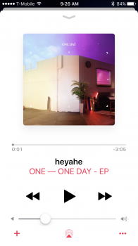
Not there in 10.3.3
You have to actually be playing the song for the album to have the colored backdrop.
Ah ok did not know this. Ok then it's doesn't look as strong in 10.3.3You have to actually be playing the song for the album to have the colored backdrop.
Attachments
Ah ok did not know this. Ok then it's doesn't look as strong in 10.3.3
It doesn't look as strong as the OP, but the effect is still there.
Noone is questioning that point. Read the thread mateProve otherwise then. The drop shadow behind artwork is always the same colors as the artwork.
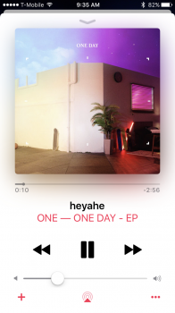
[doublepost=1500503789][/doublepost]Just did it with that album art. Not even close to what the OPs screenshot is showing.
1-0
That's a bummer. I like the now playing color matching shadow. I hope that changes before the final release.Just figured this one out. iOS 11 music app drops that shadow almost completely.
View attachment 709022
Noone is questioning that point. Read the thread mate
[doublepost=1500503789][/doublepost]Just did it with that album art. Not even close to what the OPs screenshot is showing.
1-0
Without having seen the other screenshot with the same album art, I would've thought that was normal. I see now that the OP's screenshot was more saturated. I couldn't tell because I don't have that album to test it on, so thank you RadioGaGa1984 for supplying a normal screenshot for us.
Register on MacRumors! This sidebar will go away, and you'll see fewer ads.


