Imagine you’ve just switched to iOS. You boot up and activate your cool new iPhone 15, and swipe into the Home Screen for the first time.
You’re greeted with 39 pre installed apps, across two home screens. Two stacks of widgets, and another smattering of random widgets off to the left. There are duplicate widgets in stacks all over the place, and on top of that, a full App Library sorted into random categories when you swipe to the right.
It’s chaotic, ugly, and it’s clear that as Apple has made more and more default apps, they are sticking them without care on the default Home Screen.
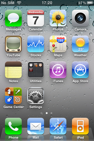
Here’s iOS 4 for comparison.
You’re greeted with 39 pre installed apps, across two home screens. Two stacks of widgets, and another smattering of random widgets off to the left. There are duplicate widgets in stacks all over the place, and on top of that, a full App Library sorted into random categories when you swipe to the right.
It’s chaotic, ugly, and it’s clear that as Apple has made more and more default apps, they are sticking them without care on the default Home Screen.
Here’s iOS 4 for comparison.