I know the redesign has several bad issues, but I'm interested if this visual bug has been fixed.
Steps to reproduce:
1. Start playing a podcast
2. Set the Podcast app to the 30% split screen:
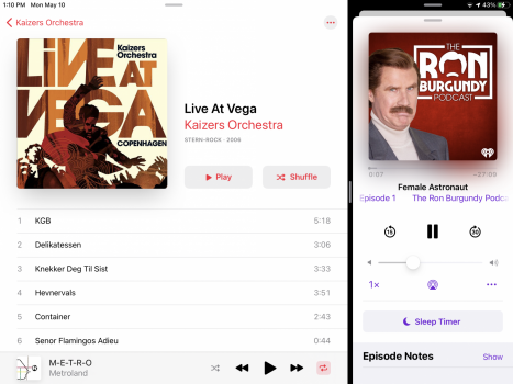
3. Minimize the Podcast app's "Now Playing" panel
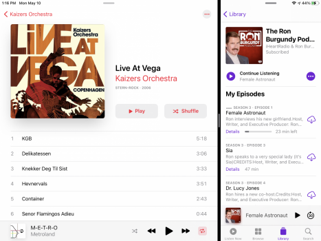
4. Maximize the "Now Playing" panel:
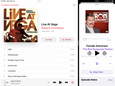
The issue is that the "Now Playing" controls and text are huge.
Steps to reproduce:
1. Start playing a podcast
2. Set the Podcast app to the 30% split screen:

3. Minimize the Podcast app's "Now Playing" panel

4. Maximize the "Now Playing" panel:

The issue is that the "Now Playing" controls and text are huge.

