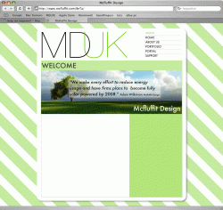
hi im making a website with at the moment, to replace the current http://www.mcfluffit.com
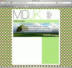
i want a MUCH smaller wesite, with a more..were a design company feel.
i started playing around last night and ended up making this:
http://www.mcfluffit.com/BeTa
problem is im not sure if its quite right..
could you just let me know what you like and dislike so far?
i know theres not much there to look at but just the navigation and the general look...
thanks a bundle
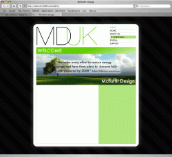
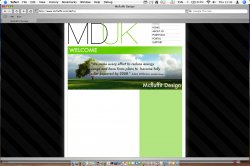
 haha
haha