Become a MacRumors Supporter for $50/year with no ads, ability to filter front page stories, and private forums.

ghall

macrumors 68040
Original poster
Jun 27, 2006
3,771
1
Rhode Island
I have been hired by a local company to make their website. I have pretty good experience with Adobe GoLive having designed my own website with it, however, I have a few questions:

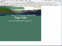
Is it possible to change the link color in Adobe GoLive CS2? I want it to look like the included image.

How do I fix the centering of the page? I've never had this issue before.

Also, any ideas on how to spruce the page up?

I need to get this done as soon as possible, so any help whould be appreciated.
 

Attachments

  • Picture 1.jpg
    Picture 1.jpg
    114.9 KB · Views: 215
Centering the page is easy in GoLive. You just highlight everything (command A) and push the center button, just like you would with centering text. This will put a div align tag around the whole page.

Changing the link color is more complicated. That involves setting up a style sheet using CSS. You can put a small style sheet in the individual page, but it's better if you build an external style sheet that you can reference on every page. For example on my site which is a scifi comic, I use CSS to make the rollovers turn green and italics when you roll over any link. There are lots of good tutorials for CSS on the Web, just do a Google. I found one with a quick search on how to set up rollover styles http://www.projectseven.com/tutorials/css/pseudoclasses/.
 
Thanks. Now I just need advice on the asthetics.

Edit: I tried what you suggested about centering, but it didn't work.
 
ghall said:
Edit: I tried what you suggested about centering, but it didn't work.
If the select all thing isnt working for you (GoLive is a little finicky about selecting things), the easiest thing is probably just to go into the code and stick a <div align="center"> after the <body> tag and put a </div> before the </body> tag. This will center your whole page.

As for design tips, it looks nice. You've got a good clean start there.
My suggestions would be:
  1. Change the color green of the header. It sortof clashes with the picture behind it (its not a very natural green).
  2. The navigation is too crammed and too big. I would put those items in a smaller sans serif font and space them out so they're not right on top of each other.
  3. The gridwork on the lefthand mountain is too subtle if you are tring to show a technology type of effect. I would either get rid of it or extend it up some and make it more obvious. I didn't even notice it the first couple times I looked at the image.
 
baleensavage said:
If the select all thing isnt working for you (GoLive is a little finicky about selecting things), the easiest thing is probably just to go into the code and stick a <div align="center"> after the <body> tag and put a </div> before the </body> tag. This will center your whole page.

As for design tips, it looks nice. You've got a good clean start there.
My suggestions would be:
  1. Change the color green of the header. It sortof clashes with the picture behind it (its not a very natural green).
  2. The navigation is too crammed and too big. I would put those items in a smaller sans serif font and space them out so they're not right on top of each other.
  3. The gridwork on the lefthand mountain is too subtle if you are tring to show a technology type of effect. I would either get rid of it or extend it up some and make it more obvious. I didn't even notice it the first couple times I looked at the image.


Creeps! Looks like I already did that.

I'm not trying to worry too much about the beutification right now, but that is by no means the final color scheme.

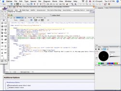
Here's a screenshot of my HTML code if your interested. Maybe you can find something I'm missing.
 

Attachments

  • Picture 1.jpg
    Picture 1.jpg
    235.9 KB · Views: 173
Register on MacRumors! This sidebar will go away, and you'll see fewer ads.