Got a tip for us?
Let us know
Become a MacRumors Supporter for $50/year with no ads, ability to filter front page stories, and private forums.
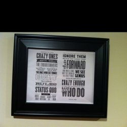
"Here's To The Crazy Ones..." Steve Jobs Poster - Typefaces?
- Thread starter 6749974
- Start date
- Sort by reaction score
You are using an out of date browser. It may not display this or other websites correctly.
You should upgrade or use an alternative browser.
You should upgrade or use an alternative browser.

Helvetica Ultra Compressed (different weights)
Gotham
The rest look like HFJs offerings, though you can find similar on Font Squirrel.
Still a very nice typographic find.
Gotham
The rest look like HFJs offerings, though you can find similar on Font Squirrel.
Still a very nice typographic find.
while a part of me does like the look of this, i have to say that i am officially tired of this particular design trend and the typefaces. what were once "ooh" typefaces "let's use them sparingly" are now "hey, let's make something trendy and use blah condensed italic, blah slab, blah script, blah inline." it's not ugly, it's just overused and i think that in a creative field you'd wanna steer away from looking like everything else. seriously, spend 10 minutes looking around on dribbble and you'll see darn near every one of these fonts used in a similar matter. end rant.
also, ezekialrage is right, a handful of those are definitely HF&J offerings.
also, ezekialrage is right, a handful of those are definitely HF&J offerings.
while a part of me does like the look of this, i have to say that i am officially tired of this particular design trend and the typefaces. what were once "ooh" typefaces "let's use them sparingly" are now "hey, let's make something trendy and use blah condensed italic, blah slab, blah script, blah inline." it's not ugly, it's just overused and i think that in a creative field you'd wanna steer away from looking like everything else. seriously, spend 10 minutes looking around on dribbble and you'll see darn near every one of these fonts used in a similar matter. end rant.
also, ezekialrage is right, a handful of those are definitely HF&J offerings.
Great point, actually although very cool it's kind of over done... So many of these styles of type treatment has surfaced over the last year or so, overdone or not it's still pretty cool.
Also to the OP I'd recommend I Love Typography it does have some rather nice tips for type, font suggestions and for producing similar.
For the OP, after showing it to a Typonazi friend the fonts are:
Helvetica Condensed Bold
Tungsten
Knockout
Forza
Archer (edited)
Topaz (edited)
Proteus
Vitesse
Buttermilk or Semilla

Thank you so much
Thank you SO much. I was attempting (poorly) to recreate for my husband's christmas present.
You are the best. Now let's hope I can get this printed to the size i need")
Thank you SO much. I was attempting (poorly) to recreate for my husband's christmas present.
You are the best. Now let's hope I can get this printed to the size i need
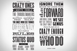
I was a little bored so I made up a quite similar Hi-Res copy of this poster,
you can download it for free
View attachment 315590
Have a good day!
I was a little bored so I made up a quite similar Hi-Res copy of this poster,
you can download it for free
View attachment 315590
Have a good day!
This is so awesome! thank u very much!
Dont kno if this is to much to ask for but do u think u can make up a hi-res copy of the one Mrguidogenio posted as well...maybe if u get bored again!?
I was a little bored so I made up a quite similar Hi-Res copy of this poster,
you can download it for free
View attachment 315590
Have a good day!
Awesome! I print it to hang on my office. Thank U.
----------
I prefer this one:
This one's also nice. Different style.
I know at least ONE font
The words "Crazy Ones," "Status Quo" and "Who Do" are in Cyclone. Many thanks to those who correctly identified the font house H&FJ (Hoefler & Frere-Jones) as a likely source.
The one font I CAN'T figure out is the word "Forward." I'm pretty sure it's an older font that I used once back in the 1980s, but I just can't remember the name!
I was a little bored so I made up a quite similar Hi-Res copy of this poster,
you can download it for free
View attachment 315590
Have a good day!
Thank you. Might use works Xerox 6279 printer
I was a little bored so I made up a quite similar Hi-Res copy of this poster,
you can download it for free
View attachment 315590
Have a good day!
Hey, appreciate the effort and thanks for the DL.
The words "Crazy Ones," "Status Quo" and "Who Do" are in Cyclone. Many thanks to those who correctly identified the font house H&FJ (Hoefler & Frere-Jones) as a likely source.
The one font I CAN'T figure out is the word "Forward." I'm pretty sure it's an older font that I used once back in the 1980s, but I just can't remember the name!
"Forward" looks like it's set in Knockout No. 26 by H&F-J (of course)
I was a little bored so I made up a quite similar Hi-Res copy of this poster,
you can download it for free
Have a good day!
you asked me for the .psd file ... there you go
Last edited:
Register on MacRumors! This sidebar will go away, and you'll see fewer ads.