Got a tip for us?
Let us know
Become a MacRumors Supporter for $50/year with no ads, ability to filter front page stories, and private forums.
Here's What the Music App SHOULD Look Like
- Thread starter Jayson A
- Start date
- Sort by reaction score
You are using an out of date browser. It may not display this or other websites correctly.
You should upgrade or use an alternative browser.
You should upgrade or use an alternative browser.
The one feature I want the most, is being able to Add to my Music from the lock screen.
Apple Music is incomplete without it =(
Apple Music is incomplete without it =(
The invisible button deletes music (for whatever reason). Maybe change it to a trash can?
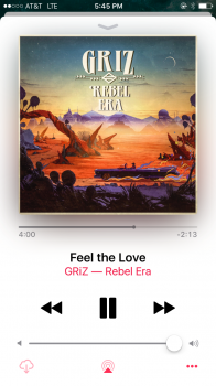
I thought a trash can would look weird on the now playing screen, so I opted to just do a greyed out cloud icon instead. It works because it shows that the track has been downloaded (being lighter), but it also remains a button if you'd like to "undownload" it (so to speak). It acts as a toggle button.
It's just that Apple used greyed out buttons for "in progress". I do like your idea though, thanks for sharing!I thought a trash can would look weird on the now playing screen, so I opted to just do a greyed out cloud icon instead. It works because it shows that the track has been downloaded (being lighter), but it also remains a button if you'd like to "undownload" it (so to speak). It acts as a toggle button.
In the now playing screen, at the bottom left.I've read about the 'invisible button' where is this button located in the music app?

Can't figure out why this button has made it into GM. Hopefully is fixed in public release of 10.0.1.
We're already on 10.0.1. This is the version people are getting.
[doublepost=1473393368][/doublepost]
In the now playing screen, at the bottom left.

Props for listening to Savant!
Wow complaining about some color.
I'm listening to music not staring at the player.
Some people have to much time
It has nothing to do with the color. There is a functional button in the bottom left that is invisible for some odd reason and Apple isn't fixing it!
We're already on 10.0.1. This is the version people are getting.
[doublepost=1473393368][/doublepost]
Props for listening to Savant!
"We", meaning beta testers, not the general public. You can't assume this bug will be in the final release of 10.0.0 or 10.0.1.
10.0.0 'final' will be only on shipping iPhone 7's, 10.0.1 final will drop to public shortly thereafter.
If anything needs fixing, it's the music controls in the lockscreen. To call it an eyesore would be sugarcoating it.
"We", meaning beta testers, not the general public. You can't assume this bug will be in the final release of 10.0.0 or 10.0.1.
10.0.0 'final' will be only on shipping iPhone 7's, 10.0.1 final will drop to public shortly thereafter.
I don't know where you're getting your information from but, we're currently ON 10.0.1. The new iPhones are shipping with 10.0.1 and 10.0.1 will be available next Friday, so yes, the version everyone is getting is the same version we have right now, unless they change it to 10.0.2.
We're not in Beta anymore.
Apple, please allow us to rate and "heart" songs from now playing again as what iOS 9 does.
I believe iOS 10 music app is moving backwards regarding functionality.
I believe iOS 10 music app is moving backwards regarding functionality.
Register on MacRumors! This sidebar will go away, and you'll see fewer ads.


