Become a MacRumors Supporter for $50/year with no ads, ability to filter front page stories, and private forums.

Renderz

macrumors 6502
Original poster
Feb 27, 2004
315
0
Hi folks,

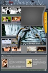
I know I've posted a link to my site on the Web Designer's forum already but I wanted to catch the Photographers. So I know this is very cheeky and I do apolgise but I would like to know what you folks think of my Photography website I've been designing and planning for weeks now.

http://www.terrylee.net

I really hope you like it. So far the feedback has been "Need to see more photos" which is encouraging! No death threats yet which has to be a good sign!
 

Attachments

  • LAYOUT.jpg
    LAYOUT.jpg
    71.8 KB · Views: 171

arogge

macrumors 65816
Feb 15, 2002
1,065
33
Tatooine
I am unexpectedly unable to complain that your site takes too long to download on my slow Internet connection. :) It seems pretty good overall, from my quick look through one section of the site.
 

Edge100

macrumors 68000
May 14, 2002
1,562
13
Where am I???
My honest first impression:

great photos, but the site is way too busy and, as others have stated, slow to load.

Also, I'm checking this on IE at work, and some of the layout is off. Under 'People Photography' on the home page, the white text is overlapping with the light background image, making the text impossible to read.

White text over pics at the bottom of the home page is also very hard to read.

I like simplicity; sites that let the photos speak for themselves. Your pics are great, and could stand out on a much simpler design.

Just my $0.02
 

termina3

macrumors 65816
Jul 16, 2007
1,078
1
TX
Beautiful site! The art side of it is very pleasing to the eye.

On the other hand, it hurts to look at so much going on at once…*also, I've been told it's "poor form" to force users to scroll down.

Great photos; your talent is readily apparent.
 

marclapierre13

macrumors 6502a
Jul 7, 2005
869
0
i absolutely love it. I will take more time to explore your photos, it looks really innovative so far, and very neat. One thing i would suggest, is that where you name is, there is 2 different colours, and different fonts. I would make the "Lee" the same font as "terry"..just because the title looks a little busy.

PS: I have cable internet, and it loaded really fast
 

Chappers

macrumors 68020
Aug 12, 2003
2,247
1
At home
Copied and pasted from your site

"Some photographers take landscapes, Terry loves telling the story of peoples' lives and their lives. Call me now if you want treasured memories of your children, familiy reunions, anniversaries and parties. Enjoy your life, let me capture it for you".

Your photos are good - but the writing needs some work. I hate telling people that they've made mistakes on spelling and grammar but this is an advertisement for your services so it should be correct.

I like the site - but it does seem from other responses that it is a love it or hate it layout. If you want to do wedding you need to have a more general appeal.
 

MaddMacs

macrumors 6502
Jan 16, 2008
316
12
Flagstaff, Az
The white text infront of the light grey is too hard to read, and the writing as said before, needs work. The tenses switch from third person to first person and back again. If you stick with first person it would seem more personal. And I am not sure what the grey box is at the upper right hand, it could have a photo there instead. IMHO
 

Kebabselector

macrumors 68030
May 25, 2007
2,990
1,641
Birmingham, UK
Which of the pages were you trying to access? I usually complain loudly about slow Web sites, but I didn't have a big problem with this example.

When viewed on a fast connection (like my employers link) then it's fine, however try it on a 2-3mb dsl line and you'll notice the speed (well I did).
 

ManWithhat

macrumors regular
Jun 24, 2008
220
0
There's too much to look at and it loaded so slow that the flash compilation (that I later viewed just to see it) had already finished by the time I looked at the top of the page.

I absolutely love the design, though. Great job. I know this would further kill your pageload, but I'd like to be able to see what I'm mousing over in your navigation bar at the top of the page.
 

Renderz

macrumors 6502
Original poster
Feb 27, 2004
315
0
It was a really hard decision to make the page heavier, but it isn't as bad as people think. It's just more "visible". It is comparible to some flash guru websites out there in terms of page weight.

I have slightly tweaked the homepage; it's impossible to please all of the people all of the time so I'm just going with my design instincts, let this current design run for about a month and keep an eye on the bounce rates via Google Analytics.

Thanks for all the feedback guys, much apprecaited.
 

Chappers

macrumors 68020
Aug 12, 2003
2,247
1
At home
I think the changes you've made are great - it feels much better. I would say ask a few women - I'm guessing (god I hate assuming things) but the majority of replies on this forum are from males. For weddings you need to appeal to women as they have a huge input into who the photographer is thats after the in-laws and parents :D .

Sorry to offer so many comments - but maybe just a dedicated site for weddings - then people can find it easily. You are undoubtly very good at what you do but sometimes it is good to appear as a specialist not a jack-of-all trades

I love the updated photos too - by the way. A much better advert for the site.

Although this chap from the wedding section might appear as if he can smell something bad.
 

Attachments

  • wedding_nosey.jpg
    wedding_nosey.jpg
    5 KB · Views: 262

marclapierre13

macrumors 6502a
Jul 7, 2005
869
0
I agree, the web page looks better. More organized and less crowded feel...nice work, if only I could get my webpage looking that good!!!!!!!
 

cphotographer

macrumors newbie
Aug 15, 2008
1
0
Nice site, but you need a better photo gallery. The way the images pop up and you have to click to close that image and then click on another image and so on. You should look at Adobe Lightroom web exports - that's what i currently use on my site - http://www.johnzdorphotography.com - or somthing else. Other than that i really like your site.
 

Renderz

macrumors 6502
Original poster
Feb 27, 2004
315
0
Music page updated.

Hey all concert photographers. I'm in the middle of revising my music photography page and I would like you kind folks to have a look and let me know what you think.

One of the comments which I received was he didn't understand the purpose of my website; so initially I've tried to make the Music page clearer for the visitor.

http://www.terrylee.net/music

Many thanks.
 

law guy

macrumors 6502a
Jan 17, 2003
997
0
Western Massachusetts
Terry - there's a lot of slow internet out there apparently. Your site loaded in a second or two for me. So for broadband, I suppose that I should be more thankful.
 
Register on MacRumors! This sidebar will go away, and you'll see fewer ads.