Become a MacRumors Supporter for $50/year with no ads, ability to filter front page stories, and private forums.

thelead

macrumors 6502a
Original poster
Apr 30, 2010
603
264
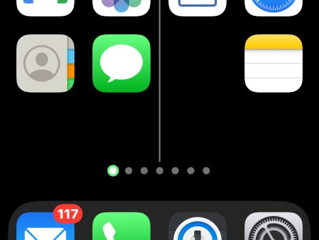
Why I’m the world is there so much space between the dock and the last row of icons on the flagship iPhone? It wasn’t too bad on the 14 Pro but it’s a glaring eyesore and makes things much less reachable than they should be On the 16PM.
 

mizmor

macrumors newbie
Jun 12, 2024
8
3
Because Apple knows best. In a couple years, they'll reduce that space and people will act like it's the second coming.

Seriously though, it's really annoying, but it's what we sign up for when buying into Apple and their adoption of Ford's mantra, "You can have it in any colour you want, as long as it's black."
 

DomC

macrumors 6502
Jul 28, 2010
451
172
Even on a 13 Pro, making the icons larger (which turns off the names) makes for a large space above the dock. Very weird. Just a little less space between the rows, and another row of icons would fit.
 

Attachments

  • IMG_4910.jpeg
    IMG_4910.jpeg
    223.9 KB · Views: 24
  • Like
Reactions: makingmark
Register on MacRumors! This sidebar will go away, and you'll see fewer ads.