Become a MacRumors Supporter for $50/year with no ads, ability to filter front page stories, and private forums.

spinedoc77

macrumors G4
Original poster
Jun 11, 2009
11,488
5,413
The last time I used an iPhone was my ip5s on iOS7. I absolutely love Android widgets, it's one of the things that keeps me there. I've been kind of considering iOS again with their widgets but have no idea how they work. Can someone describe the similarities and differences?

I'm particularly interested in widgets that currently work phenomenally in Android.

Calendar: Android I can set a widget where I can see my emails on the desktop, I can scroll through them, respond to them etc right on the desktop.

Messaging: Same thing, I can see, scroll through, respond to SMS/MMS right there on the desktop.

OneNote: This is my favorite, I can scroll through all my notes right on the desktop.

Google Voice: I can see all my texts, voice messages, etc, I can switch between using GV for all calls, none or selectively. I can see my account balance, etc.

Google Now: I like seeing news briefs, traffic alerts, etc. right on the desktop.

What can I expect in terms of functionality switching to iOS?
 

tbayrgs

macrumors 604
Jul 5, 2009
7,467
5,097
Knowing how you like to use your widgets Doc, you won't be satisfied with the options on iOS. Widgets in iOS don't offer the full functionality you like, more suitable for quick glances of information and some lighter functionality.

Here a the handful that I presently use:

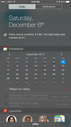
1) Fantastical: Great upgrade over the stock iOS Calendar, which also has a widget but just lists appointments for the day. I can touch on any day in the calendar to see a list of appts for the day. It also gives the option to include reminders. Touching an item will take you directly into the app.

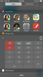
2) Launcher: This is (was) a great one but sadly, Apple dropped the hammer on this one, saying it violated the intended functionality and requirements of iOS Widgets. Wish I had paid for the Pro version, would've given me more than the 8 stock launch buttons.

3) PCalc Lite: Should be pretty self explanatory. :D

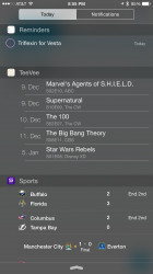
4) Reminders: Again, self explanatory. Touching a reminder brings you to it in the Reminders app.

5) TeeVee: Shows upcoming viewings of any shows subscribe to in the app. Nothing is actionable here.

6) Yahoo Sports: Shows your Favorites. As with other, touching an item brings you to that item in the app

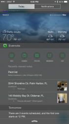
7) Weather: Another self explanatory widget

8) Evernote: Includes quick action buttons that will open that specific action in the app. Also shows your most recent notes. Again, touching a note will take you to the app.

As you can see, not quite the capabilities you can get out of many Android widgets but IMO, not a bad start. I've stated elsewhere one element I do like about iOS widgets is by having them in the pull down panel, they are accessible anywhere--don't have to leave an app and return to the home screen to use them.
 

Attachments

  • 2014-12-06 20.55.16.png
    2014-12-06 20.55.16.png
    501.7 KB · Views: 276
  • 2014-12-06 20.55.20.png
    2014-12-06 20.55.20.png
    748.7 KB · Views: 275
  • 2014-12-06 20.55.29.png
    2014-12-06 20.55.29.png
    351.6 KB · Views: 312
  • 2014-12-06 20.55.42.png
    2014-12-06 20.55.42.png
    937.2 KB · Views: 311
Last edited:

pdqgp

macrumors 68020
Mar 23, 2010
2,131
5,460
If you're an android users you can install Notification Toggle and add a launcher in your notifications panel too. You may have already done that though. Ironically, Apple shuts down their developers when they try to offer this.
 

Technarchy

macrumors 604
May 21, 2012
6,753
4,927
Too early to know honestly. Not enough support and not all that mature.

The extent of what is possible is a complete unknown with iOS 8 widgets at this point in time.

This is partly why I'm in a holding pattern with returning to the iPhone. I'd like a 6+ but I want iOS 8 features to be better supported
 

sunking101

macrumors 604
Sep 19, 2013
7,423
2,659
What's the effect on battery life with iOS widgets? I have always given (Android) widgets a wide birth as they have previously raped my battery. It's just not worth it for me.
 

tbayrgs

macrumors 604
Jul 5, 2009
7,467
5,097
What's the effect on battery life with iOS widgets? I have always given (Android) widgets a wide birth as they have previously raped my battery. It's just not worth it for me.

Honestly, no idea but that's primarily due to the terrific battery life I get out of my 6+. Considering iOS generally manages much of it's functionality to try to just sip battery (i.e. background tasks and multi-tasking), and that iOS Widgets for the most part have more limited functionality, I'd guess their impact on overall battery life to be minimal. Purely speculation though on my part.
 

Shanghaichica

macrumors G5
Apr 8, 2013
14,725
13,245
UK
Honestly, no idea but that's primarily due to the terrific battery life I get out of my 6+. Considering iOS generally manages much of it's functionality to try to just sip battery (i.e. background tasks and multi-tasking), and that iOS Widgets for the most part have more limited functionality, I'd guess their impact on overall battery life to be minimal. Purely speculation though on my part.

Yes I've got a couple and I'm still getting 10 hours of usage and over a day of standby time on my 6 plus. I have to admit that I rubbished the widgets when I first heard of them but their implementation is pretty useful and I've been able to find equivalents of the ones I used on android. Also it's not as cluttered as I inagined it would be.

If they improve the sharing features in the coming months I'd be very happy with iOS 8. At the moment that's probably all that I'm really missing from android.
 

Technarchy

macrumors 604
May 21, 2012
6,753
4,927
What's the effect on battery life with iOS widgets? I have always given (Android) widgets a wide birth as they have previously raped my battery. It's just not worth it for me.

Minimal due to the way iOS handles background tasks, where android apps tend to have a mind of their own and run rampant in the background.
 

pdqgp

macrumors 68020
Mar 23, 2010
2,131
5,460
What's the effect on battery life with iOS widgets? I have always given (Android) widgets a wide birth as they have previously raped my battery. It's just not worth it for me.

I use several widgets on my Note 3 with minimal to no impact on battery life. What widgets were you using? Not sure what device or OS your phone was one but my guess is the drain was likely due to an inefficient app.
 

tbayrgs

macrumors 604
Jul 5, 2009
7,467
5,097
Yes I've got a couple and I'm still getting 10 hours of usage and over a day of standby time on my 6 plus. I have to admit that I rubbished the widgets when I first heard of them but their implementation is pretty useful and I've been able to find equivalents of the ones I used on android. Also it's not as cluttered as I inagined it would be.

If they improve the sharing features in the coming months I'd be very happy with iOS 8. At the moment that's probably all that I'm really missing from android.

Agreed..the sharing capabilities aren't even in Android's neighborhood yet because unfortunately, as it's been implemented in iOS, we are at the mercy of the developers to add it too their apps. It's only been 2+ months so I won't pass judgment just yet but I hope to see some significant progress in the next 6-9 months.
 

Technarchy

macrumors 604
May 21, 2012
6,753
4,927
Agreed..the sharing capabilities aren't even in Android's neighborhood yet because unfortunately, as it's been implemented in iOS, we are at the mercy of the developers to add it too their apps. It's only been 2+ months so I won't pass judgment just yet but I hope to see some significant progress in the next 6-9 months.

6-9 months is what I would call optimistic.

By the time iOS8 features actually start showing up more widely, we'll be on iOS9 and the iPhone 6S.

There is a reason I stuck with my S5 and returned the iPhone 6; support for iOS 8 features is way too far and few to make changeover worth considering at this time.
 

Stuntman06

macrumors 6502a
Sep 19, 2011
961
5
Metro Vancouver, B.C, Canada
I personally do not like how iOS does widgets in general. They are basically an alternate notification screen. You have to drag down the notification drop down and then switch to widgets. When you are in widget mode, you have to switch back to notifications to view your notifications. Widgets are just not as convenient to get to in comparison to Android widgets where they are already on your home screen.

iOS widgets tend to be designed for information display more than anything else. There are many Android widgets that don't really display any information at all. They perform some function. For instance, my SoundHound widget invokes the song recognition function with a single tap from the home screen. The widget is just an icon that displays no information.
 

Abazigal

Contributor
Jul 18, 2011
20,396
23,901
Singapore
The one advantage I can see of iOS widgets is that you can have as many as you want, since they are all hidden in the notifications shade and won't clutter up your home screen.

How would this work in Android? Say I want to have 6 widgets active?
 

TechGod

macrumors 68040
Feb 25, 2014
3,275
1,129
New Zealand
I personally do not like how iOS does widgets in general. They are basically an alternate notification screen. You have to drag down the notification drop down and then switch to widgets. When you are in widget mode, you have to switch back to notifications to view your notifications. Widgets are just not as convenient to get to in comparison to Android widgets where they are already on your home screen.

iOS widgets tend to be designed for information display more than anything else. There are many Android widgets that don't really display any information at all. They perform some function. For instance, my SoundHound widget invokes the song recognition function with a single tap from the home screen. The widget is just an icon that displays no information.

The calculator widget proves you wrong.
 

tbayrgs

macrumors 604
Jul 5, 2009
7,467
5,097
I personally do not like how iOS does widgets in general. They are basically an alternate notification screen. You have to drag down the notification drop down and then switch to widgets. When you are in widget mode, you have to switch back to notifications to view your notifications. Widgets are just not as convenient to get to in comparison to Android widgets where they are already on your home screen.

iOS widgets tend to be designed for information display more than anything else. There are many Android widgets that don't really display any information at all. They perform some function. For instance, my SoundHound widget invokes the song recognition function with a single tap from the home screen. The widget is just an icon that displays no information.

I've brought this up before and we all certainly have our own preferences so I won't belabor the point too much. I won't disagree that overall, widgets on Android are far more plentiful, diverse and in many cases, functional than what's available on iOS.

I disagree regarding the convenience though. On Android, the customary location for the vast majority of widgets is on a home screen. This is certainly convenient if you're actually on that particular home screen but if you're anywhere else (I find myself spending most of my time in apps, regardless of the OS)--in another app, on a different home screen, in your recent apps switcher, in Settings, etc, you have to at a minimum hit your home button to access your widgets. If they're on another home screen, you'll have to swipe at least once more. How is this more convenient than pulling down the notifications/widgets panel? Yes, you may have to make a touch or swipe to switch from Notifications if that's what you were last looking at but that's no more effort than what I just described on Android. The added benefit on iOS is you can access these widget from anywhere and then swipe up to hide them without having to leave whatever you were doing..i.e. reading an email, browsing a web page, etc. I can also see them from my lock screen without having to unlock my device. Finally, there doesn't appear to be any limit to how many I can add (or at least, I haven't seen one yet) vs. the limited number of home screens you have on an Android device.

Again, not professing iOS's solution to necessarily be better, comes down to one's personal preferences. I just don't see how the iOS implementation is less convenient.
 

animalx

macrumors 6502
Apr 1, 2013
474
330
The one advantage I can see of iOS widgets is that you can have as many as you want, since they are all hidden in the notifications shade and won't clutter up your home screen.

How would this work in Android? Say I want to have 6 widgets active?

If someone wanted to have a bunch of widgets without cluttering the home screen, they could install a widget folder and put them there. Also, they could add more home screens if they'd like.

----------

I've brought this up before and we all certainly have our own preferences so I won't belabor the point too much. I won't disagree that overall, widgets on Android are far more plentiful, diverse and in many cases, functional than what's available on iOS.

I disagree regarding the convenience though. On Android, the customary location for the vast majority of widgets is on a home screen. This is certainly convenient if you're actually on that particular home screen but if you're anywhere else (I find myself spending most of my time in apps, regardless of the OS)--in another app, on a different home screen, in your recent apps switcher, in Settings, etc, you have to at a minimum hit your home button to access your widgets. If they're on another home screen, you'll have to swipe at least once more. How is this more convenient than pulling down the notifications/widgets panel? Yes, you may have to make a touch or swipe to switch from Notifications if that's what you were last looking at but that's no more effort than what I just described on Android. The added benefit on iOS is you can access these widget from anywhere and then swipe up to hide them without having to leave whatever you were doing..i.e. reading an email, browsing a web page, etc. I can also see them from my lock screen without having to unlock my device. Finally, there doesn't appear to be any limit to how many I can add (or at least, I haven't seen one yet) vs. the limited number of home screens you have on an Android device.

Again, not professing iOS's solution to necessarily be better, comes down to one's personal preferences. I just don't see how the iOS implementation is less convenient.
I personally find iOS' approach to be very clunky and cluttered. I think this is especially true if you have several widgets.
 
Last edited:

Jibbajabba

macrumors 65816
Aug 13, 2011
1,024
5
My favourite widget on android is from the local train company. It always displays current train times of by standard train and swaps direction based on GPS location.
 

spinedoc77

macrumors G4
Original poster
Jun 11, 2009
11,488
5,413
I've brought this up before and we all certainly have our own preferences so I won't belabor the point too much. I won't disagree that overall, widgets on Android are far more plentiful, diverse and in many cases, functional than what's available on iOS.

I disagree regarding the convenience though. On Android, the customary location for the vast majority of widgets is on a home screen. This is certainly convenient if you're actually on that particular home screen but if you're anywhere else (I find myself spending most of my time in apps, regardless of the OS)--in another app, on a different home screen, in your recent apps switcher, in Settings, etc, you have to at a minimum hit your home button to access your widgets. If they're on another home screen, you'll have to swipe at least once more. How is this more convenient than pulling down the notifications/widgets panel? Yes, you may have to make a touch or swipe to switch from Notifications if that's what you were last looking at but that's no more effort than what I just described on Android. The added benefit on iOS is you can access these widget from anywhere and then swipe up to hide them without having to leave whatever you were doing..i.e. reading an email, browsing a web page, etc. I can also see them from my lock screen without having to unlock my device. Finally, there doesn't appear to be any limit to how many I can add (or at least, I haven't seen one yet) vs. the limited number of home screens you have on an Android device.

Again, not professing iOS's solution to necessarily be better, comes down to one's personal preferences. I just don't see how the iOS implementation is less convenient.

Interesting. I have all my android widgets on 2 home screens and I think your point may apply at times. If I'm already in an app on android I have to close that app to get to my homescreen and view my widget, then hunt down the icon to open the app once again or pick it from the task manager. It might be slightly less effort to just slide down the widget panel, and slide it back up when done.

What I'm curious about is the interactability of iOS widgets. For example can touching a calendar entry take you right to that entry in the calendar app? Can touching an email entry take you right to that email in the email app?
 

MRU

macrumors Penryn
Aug 23, 2005
25,370
8,952
a better place
Are there any other folks who are not big widget users here. I have only 2 on my android device - time+weather & google search bar. Other than that I simply do not use them. I like the idea of them in principal, but neither like them, or actually use them in practice.
 

mattopotamus

macrumors G5
Jun 12, 2012
14,738
6,109
Are there any other folks who are not big widget users here. I have only 2 on my android device - time+weather & google search bar. Other than that I simply do not use them. I like the idea of them in principal, but neither like them, or actually use them in practice.

I never use widgets on Android. The only one I use on IOS is "sports alerts" b.c it gives me scores of games at a glance.

Side note: Sports alerts is a way better widget than espn scorecenter for those interested. You can easily change between different sports and your favorites right from the today pull down.
 

Oohara

macrumors 68040
Jun 28, 2012
3,050
2,423
In principle I really like the Wunderlist widget on iOS 8. It mirrors the Yosemite one and basically gives you a to-do list with tick boxes that can be ticked off.

However I don't actually use it because scrolling between widgets on my 6 Plus is too stuttery. This combined with the transparency/thin line design makes for something of a confusing mess in quick-glance situations. I have to say this surprised me when I began using my new iPhone.

One I do like however is a phone list app that automatically looks up any unknown phone number you have in the clipboard. This is pretty handy - copy the number in phone history and just pull down the widgets shade, and voilá. (This is only for Sweden though.)

I'd still love to see iOS widgets on the home screen, ones that mirror the app icon design guidelines (optionally occupying several icon spaces, as has been discussed here earlier).

My go-to widget on Android was Power Toggles, which I used for one tap controls for WiFi hotpot, flashlight, wifi on/off, flight mode etc. I was sure I'd miss the hell outta this one but actually I don't really. To my surprise I can live with going into Settings to toggle the hotspot and all the rest is covered by Control Center, which I find very handy especially since it's available straight from the lock screen.

Aside from that I find most Android widgets too ugly to use. Wunderlist is a good example. It was just too much of an eyesore for me to keep on any of my home screens.

To conclude, I'd say widgets need work on both platforms. I don't use them very much on either one.
 

mattopotamus

macrumors G5
Jun 12, 2012
14,738
6,109
In principle I really like the Wunderlist widget on iOS 8. It mirrors the Yosemite one and basically gives you a to-do list with tick boxes that can be ticked off.

However I don't actually use it because scrolling between widgets on my 6 Plus is too stuttery. This combined with the transparency/thin line design makes for something of a confusing mess in quick-glance situations. I have to say this surprised me when I began using my new iPhone.

One I do like however is a phone list app that automatically looks up any unknown phone number you have in the clipboard. This is pretty handy - copy the number in phone history and just pull down the widgets shade, and voilá. (This is only for Sweden though.)

I'd still love to see iOS widgets on the home screen, ones that mirror the app icon design guidelines (optionally occupying several icon spaces, as has been discussed here earlier).

My go-to widget on Android was Power Toggles, which I used for one tap controls for WiFi hotpot, flashlight, wifi on/off, flight mode etc. I was sure I'd miss the hell outta this one but actually I don't really. To my surprise I can live with going into Settings to toggle the hotspot and all the rest is covered by Control Center, which I find very handy especially since it's available straight from the lock screen.

Aside from that I find most Android widgets too ugly to use. Wunderlist is a good example. It was just too much of an eyesore for me to keep on any of my home screens.

To conclude, I'd say widgets need work on both platforms. I don't use them very much on either one.

That is how I feel about the today view. I actually remove everything outside of the one widget I use b.c I think it looks like a mess.
 

jamezr

macrumors P6
Aug 7, 2011
16,080
19,079
US
I've brought this up before and we all certainly have our own preferences so I won't belabor the point too much. I won't disagree that overall, widgets on Android are far more plentiful, diverse and in many cases, functional than what's available on iOS.

I disagree regarding the convenience though. On Android, the customary location for the vast majority of widgets is on a home screen. This is certainly convenient if you're actually on that particular home screen but if you're anywhere else (I find myself spending most of my time in apps, regardless of the OS)--in another app, on a different home screen, in your recent apps switcher, in Settings, etc, you have to at a minimum hit your home button to access your widgets. If they're on another home screen, you'll have to swipe at least once more. How is this more convenient than pulling down the notifications/widgets panel? Yes, you may have to make a touch or swipe to switch from Notifications if that's what you were last looking at but that's no more effort than what I just described on Android. The added benefit on iOS is you can access these widget from anywhere and then swipe up to hide them without having to leave whatever you were doing..i.e. reading an email, browsing a web page, etc. I can also see them from my lock screen without having to unlock my device. Finally, there doesn't appear to be any limit to how many I can add (or at least, I haven't seen one yet) vs. the limited number of home screens you have on an Android device.

Again, not professing iOS's solution to necessarily be better, comes down to one's personal preferences. I just don't see how the iOS implementation is less convenient.
C'mon now Tbayrgs........widgets in IOS are not nearly as functional or supported or thought out as on Android. Pointing out one very narrow use case of being in an app to check the Today screen is almost useless. When i am using my 6+ i hardly ever am in an app then check the Today notifications. I exit the app then check the Today screen. Then hinting that having widgets on the home screen is not as useful is just not accurate. You don't have to just have widgets on one screen in Android. You can have them take up the whole screen if you want them too. Plus you can have multiple screens filled with widgets. All of the information you need....right where you spend most of your time anyway. Then most apps in the Playstore have a widget available....you don't have to download and install a separate app just to get a widgets for say Calendar. the built in Calendar app already has a widget. So widget support is already built into Android. No need to install an app just to get information in the Today screen pull down. You can use the app you already have.

----------

That is how I feel about the today view. I actually remove everything outside of the one widget I use b.c I think it looks like a mess.
My thoughts too.....then you can't resize them. Moving them around is very limited.
 
Register on MacRumors! This sidebar will go away, and you'll see fewer ads.