Become a MacRumors Supporter for $50/year with no ads, ability to filter front page stories, and private forums.
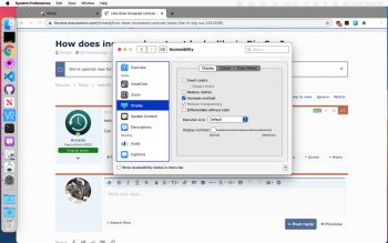
Arcade

macrumors 6502
Original poster
Oct 1, 2012
410
212
Bronx, NY
Hello,

Can someone please show what Big Sur looks like with increased contrast enabled?
 
screen-shot-2020-06-28-at-7-38-22-pm-jpg.928884
 

Attachments

  • Screen Shot 2020-06-28 at 7.38.22 PM.jpg
    Screen Shot 2020-06-28 at 7.38.22 PM.jpg
    241.7 KB · Views: 1,208
  • Like
Reactions: Arcade
More screenshots attached. I'm a bit surprised, it's looking pretty good; but there are some bugs. Seems to have fewer with dark mode.

I might keep it like this 🤔
 

Attachments

  • Screen Shot 2020-06-28 at 7.48.36 PM.png
    Screen Shot 2020-06-28 at 7.48.36 PM.png
    1.3 MB · Views: 300
  • Screen Shot 2020-06-28 at 7.41.31 PM.jpg
    Screen Shot 2020-06-28 at 7.41.31 PM.jpg
    61.8 KB · Views: 258
  • Screen Shot 2020-06-28 at 7.44.35 PM.jpg
    Screen Shot 2020-06-28 at 7.44.35 PM.jpg
    37.7 KB · Views: 242
  • Screen Shot 2020-06-28 at 7.45.22 PM.jpg
    Screen Shot 2020-06-28 at 7.45.22 PM.jpg
    178.6 KB · Views: 220
  • Screen Shot 2020-06-28 at 7.47.41 PM.jpg
    Screen Shot 2020-06-28 at 7.47.41 PM.jpg
    48.7 KB · Views: 218
  • Screen Shot 2020-06-28 at 7.43.04 PM.png
    Screen Shot 2020-06-28 at 7.43.04 PM.png
    1.5 MB · Views: 249
More screenshots attached. I'm a bit surprised, it's looking pretty good; but there are some bugs. Seems to have fewer with dark mode.

I might keep it like this 🤔

Yeah it actually looks pretty nice. I’ll keep it as default, I do like the normal Big Sur looks, but I like that you can get back a more classic Menu Bar that way. Would be cool if you could get just the high contrast menu bar and not the rest.

What’s that command icon thing in your menu bar? The icon looks like something I want, haha. Also surprised to see GitHub Desktop in use. Last time I tried it it lacked functionality to the extend that it didn’t feel like it made sense to not just use the command line. Couldn’t even do basic things like tags last I tried it. That’s a complete sidetrack from the topic of the thread, but yeah. Has it improved or is it more of a GUI convenience for the few things it does do?
That is iCanHazShortcut.

I use GitHub Desktop as a convenient GUI. Although I've been using it less than I used to.
 
More screenshots attached. I'm a bit surprised, it's looking pretty good; but there are some bugs. Seems to have fewer with dark mode.

I might keep it like this 🤔
This is pretty unrelated, but I can't help but ask: What does the new rainbow colored accent color option do? Can we pick our own accent color, or is it wallpaper-based?
 
That is iCanHazShortcut.

I use GitHub Desktop as a convenient GUI. Although I've been using it less than I used to.

Thanks

This is pretty unrelated, but I can't help but ask: What does the new rainbow colored accent color option do? Can we pick our own accent color, or is it wallpaper-based?

It allows every application to have their own, developer chosen accent colour, rather than a user defined one. So Music is red, mail is classic blue, Notes is yellow, etc.
 
  • Like
Reactions: superiska123
Thanks


It allows every application to have their own, developer chosen accent colour, rather than a user defined one. So Music is red, mail is classic blue, Notes is yellow, etc.

Thanks for the reply! That makes sense, and seems like a neat addition to the OS...
 
What would be truly awesome is having only certain Apps to be displayed with higher contrast. For instance, I find it incredibly hard to use Finder without the increased contrast, all the buttons are so flat and look the same...but I do not require higher contrast system wide.
 
  • Like
Reactions: Peadogie
Register on MacRumors! This sidebar will go away, and you'll see fewer ads.