Become a MacRumors Supporter for $50/year with no ads, ability to filter front page stories, and private forums.

ghall

macrumors 68040
Original poster
Jun 27, 2006
3,771
1
Rhode Island
I'm doing some web design for a small communications company in my area, and I was wondering what people thought of the main banner I created for the site.

If anyone is curious: The landscape was rendered twice in Carrara 5, once in photorealism mode, and another in wireframe, and the images were blended together in PhotoShop.
 

Attachments

  • bannerimage.jpg
    bannerimage.jpg
    104.9 KB · Views: 266
I don't think there's enough of the wireframe to make it look like it should be there. As it is now, it kind of just looks like there are artifacts in the image. I think you need to be a little more deliberate with your wireframe if you want it to look like you meant for it to be there.
 
tobefirst said:
I don't think there's enough of the wireframe to make it look like it should be there. As it is now, it kind of just looks like there are artifacts in the image. I think you need to be a little more deliberate with your wireframe if you want it to look like you meant for it to be there.

I tried changing it, but I don't want it to be "in your face". I like the subtlety, but your right, it definitaly needs more. It's supposed to look natural and smooth. That's the best I could get it. Any tips on what I could do to draw out the wireframe a little more.
 
tobefirst said:
I don't think there's enough of the wireframe to make it look like it should be there. As it is now, it kind of just looks like there are artifacts in the image. I think you need to be a little more deliberate with your wireframe if you want it to look like you meant for it to be there.


ditto, it just looks like it didn't render fully where as I think your going for more of a transition look, this looks un-finished or broken.
 
Maybe the foreground is wireframe while the background is rendered? Or vice versa? I think that the color you've chosen (or the program has chosen) to fill in the wireframe makes it look more like a mistake instead of intentional. I'd like to see the wireframe without a background, like it's really just "wires."

On other notes, bevel & emboss and drop shadows are overused. Stay away from them, especially used together.

Remember, less is more.
 
dornoforpyros said:
ditto, it just looks like it didn't render fully where as I think your going for more of a transition look, this looks un-finished or broken.

Any suggestions as to how I should implement this? I've tried some things, and this is the bext I could come up with:
 

Attachments

  • natural networks.jpg
    natural networks.jpg
    106.1 KB · Views: 173
What if you got rid of the landscape alltogether (scary, I know), but did the same thing with the name of the business. Started out on the left with a wireframe N and worked your way to the right to a fully rendered S. Maybe that would work a little better.

As for the rest of the "banner" part...maybe the idea above placed over a grayscale landscape or something? I'm thinking as I'm typing, so the thoughts aren't fully realized yet.
 
Agree with all that's been said about the wireframe and artifacts but I also feel the drop-shadow beneath the type is a bit heavy. It doesn't even necessarily have to be a neutral black either.
 
ghall said:
Any suggestions as to how I should implement this? I've tried some things, and this is the bext I could come up with:

Unfortunatly I haven't touched a 3D application in years but maybe try a different colour for the wire frame. I think part of the problem is the green looks almost like grass and blends into the mountain. Try a bright/navyish blue perhaps. You may have to tweak the colour in photoshop for that. Also the density of the wireframes on the mountain further back gives the look of it being solid.

So I'm not sure if you can render it with a less dense wireframe maybe? Sorry, as I said, I haven't touched a 3D app in a while.
 
Here's a slightly different approach that I came up with. I decided to blend the wireframe with the landscape.
 

Attachments

  • natural networks v2.jpg
    natural networks v2.jpg
    104 KB · Views: 175
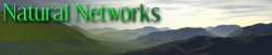
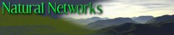
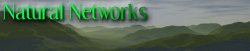
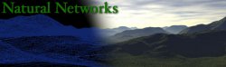
My advice, for whatever it's worth: To begin with, the image is just too dark. Also the wireframe isn't wireframey enough...is there a way to generate a version with fewer polygons? It's more or less noticeable that it's a wireframe at the bottom of the image, but then suddenly it gets mooshed into a blob of green and totally loses the effect. More contrast would also help. Also a less uggy green? As for the font, it's ever so slightly difficult to read, at least the "network" part. I'd use a thicker font, and make the drop shadow much less prominent. In fact, I'd try ditching it altogether (even though I do like my drop shadows!) and try white text with a black outline. I think the second version is closest to what you're trying to achieve, though my advice also applies to that one, plus I'd make the fade-over between wireframe and non-wireframe more gradual.

Now it might sound like I've totally trashed it, but I do like the idea...I suppose it's not the most original in the world, but nine years of print design I wanted to do something like that, and never quite got the opportunity where it would have been appropriate.

Edit: Oh, I forgot: since the name is "Natural Networks," maybe the image should follow the name, and go from natural on the left to networky on the right?

--Eric
 
ghall said:
Here's a slightly different approach that I came up with. I decided to blend the wireframe with the landscape.

hmm, is it possible for you to post your source images? Eg: the rendered image and the wireframe so we can play with it ourself's in PS?
 
Eric5h5 said:
Oh, I forgot: since the name is "Natural Networks," maybe the image should follow the name, and go from natural on the left to networky on the right?

--Eric

Brilliant!
 
dornoforpyros said:
hmm, is it possible for you to post your source images? Eg: the rendered image and the wireframe so we can play with it ourself's in PS?

Sure thing. Here they are.


Perhaps in the wireframe mode you should change the export colors to black background with bright green wires.... although thats "matrixy" thats the colors people usually associate with wireframes and such, plus it'd be a clear distinction.

Use color replace for those, and then do a gradient fade through the background image.

I'd whip something up now but alas, CS2 isn't installed on my MacBook =(
 
meh here's what I came up with after 5-10 min in PS. Truthfully after seeing the fully rendered picture I'd ditch the wireframe all together. I think it takes away more than it adds. but that's just my opinion.
 

Attachments

  • naturalnetworks.jpg
    naturalnetworks.jpg
    32 KB · Views: 130
Reverse out the type (white) in lower left and make bolder, maybe san-serif. It will be a lot stronger and feel more balanced.

Cheers...
 
I had a quick play - by making the wireframe higher contrast and green, and then using it as a second layer and using the "Screen" option. Then I used the Quick Mask and a gradient to fade out the wireframe layer, and adjusted the brightness on both to make it the type stand out. I wonder if a more 'computery' typeface might be appropriate as well?

I'm amazed at how realistic the mountains look, at first I thought it was a photo that you had somehow managed to map!

naturalnetworks2.jpg
 
Register on MacRumors! This sidebar will go away, and you'll see fewer ads.