Got a tip for us?
Let us know
Become a MacRumors Supporter for $50/year with no ads, ability to filter front page stories, and private forums.
How realistic are apples band photos?
- Thread starter h00ligan
- Start date
- Sort by reaction score
You are using an out of date browser. It may not display this or other websites correctly.
You should upgrade or use an alternative browser.
You should upgrade or use an alternative browser.
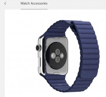
not very apparently. Since they're (badly) photoshopped.
I was shocked to see his quality of work on their site. Is it just my iPad rendering it strangely?
I checked two browsers?
I find it amazing apple would put is out.
Back of the watch for starters
View attachment 562312
I think it is just edits. Almost all companies used enhanced images to make a listing look more appealing. Often where most customers feel they've been mis sold
Quite possibly but to me that looks like a photoshop job.Is someone maybe unfamiliar with reflective surfaces?
If it reflections the photographer should have done a better job Imo
Lethe thing I wanted to know and thanks to those answering was if the colors were remote,h accurate.
Go look at the 360 views and animations on the website or in the app, It just reflects in an "unexpected" way. I'm also pretty sure Apple has been using renders for most product shots for years now.
As for the colours, there are threads where people show of their watches so you should be able to get a feel of the different bands under different lighting conditions...
As for the colours, there are threads where people show of their watches so you should be able to get a feel of the different bands under different lighting conditions...
I don't think they are that accurate. I think the sports bands are probably accurate but the rest aren't. Based on the pictures on the website I thought that the Milanese loop was hideous and the classic buckle just plain bland. However after seeing them in the flesh and in videos and pictures my opinion of them totally changed. I've since bought both. When I was preordering they were not even on my radar.
I found the leather bands horrendous looking online but they are really nice in person.
Bought the Milanese Loop, and I'd buy the classic buckle too if I could afford it.
I hate how Apple always prices things just slightly more than they're actually worth. It would be such an easy decision to get the classic buckle at $100.
Bought the Milanese Loop, and I'd buy the classic buckle too if I could afford it.
I hate how Apple always prices things just slightly more than they're actually worth. It would be such an easy decision to get the classic buckle at $100.
I don't think they use renders, I remember reading this years ago though; http://www.theverge.com/2013/5/8/43...icity-photographer-peter-belanger-on-shootingGo look at the 360 views and animations on the website or in the app, It just reflects in an "unexpected" way. I'm also pretty sure Apple has been using renders for most product shots for years now.
As for the colours, there are threads where people show of their watches so you should be able to get a feel of the different bands under different lighting conditions...
The post work happens on both renders and photographs, so it doesn't matter which method is used. The goal is typically to highlight all features that are visible in the shot, even though under typical lighting your eye would only be drawn to a subset of them at any given time. With elements like the band, they would try to match the typically perceived color. Metamerism suggests this isn't possible for every condition, and obviously the deep shadows here influence that. In that regard it is a judgement call on the part of whoever prepares it followed by whoever signs off on it. It should be close enough that you don't feel like they're different colors viewing on whatever display unless you compare them side by side. There are too many factors including screen brightness and various lighting conditions to make them identical side by side with every display under every lighting condition (again partly due to metamerism).
I don't think they use renders, I remember reading this years ago though; http://www.theverge.com/2013/5/8/43...icity-photographer-peter-belanger-on-shooting
They're real photos that are eventually converted into renders for consistency.
Register on MacRumors! This sidebar will go away, and you'll see fewer ads.


