Become a MacRumors Supporter for $50/year with no ads, ability to filter front page stories, and private forums.

kitki83

macrumors 6502a
Original poster
Mar 31, 2004
804
0
Los Angeles
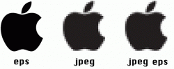
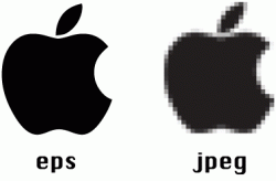
At work I am having constant problems with people thinking they can convert JPG into EPS. My company is so bad in distributing the latest talent artwork and logo. Even logos are JPGs that I have to upscale sometimes and do some tweaking. I just need help because more and more people think JPG can be made on my end to EPS quality. Basically they think I am capable of doing a raster image to Vector easily and no problem. They think or give me that face of incompetence that I dont want to or doesnt know how to. I always tell them if you grab the build of a car like the pinto and put the body of a mercedes is it true mercedes, no because when someone starts looking close to it they will see the flaws of it another is a copy machine, make a copy of something is near identical but a copy of a copy and so on it wont be true to the original nor would it be able to recopy it to be identical to the original. (Best analogies I can think to explain this). I just need to explain this to my bosses and coworker because its starting to appear that I am being a lazy designer.


Anyone got some way of explaining this to non creative people who thinks design is useless or not that important with out making it a design class?

Thank You
 
Put a big sign on the door to your office or entrance to your cubicle that looks like this (substitute your company logo for the Apple). That should explain the difference is 'plain English'.
 

Attachments

  • jpeg-eps.gif
    jpeg-eps.gif
    9.8 KB · Views: 595
Put a big sign on the door to your office or entrance to your cubicle that looks like this (substitute your company logo for the Apple). That should explain the difference is 'plain English'.

That won't help them understand that you can't magically convert the one on the right to the one on the left. I've dealt with clients who understood that .jpg was limited and that vector was better for logos. What they didn't seem to understand is that you can't just turn a jpg into a vector with a few clicks.
 
That won't help them understand that you can't magically convert the one on the right to the one on the left. I've dealt with clients who understood that .jpg was limited and that vector was better for logos. What they didn't seem to understand is that you can't just turn a jpg into a vector with a few clicks.

Then put a greater than sign between it, so it looks like eps > jpeg. If that doesn't work, at least having a large visual aid will help you explain, and will hopefully stick in their mind even if they can't remember your exact wording when you explained it to them.
 
I usually tell people that vectors are like string art or cat's cradles and that raster artwork is like a mosaic; coloured squares... seems to get the point across to most people without getting bogged down.
 
I usually tell people that vectors are like string art or cat's cradles and that raster artwork is like a mosaic; coloured squares... seems to get the point across to most people without getting bogged down.


=0 these are art illeterate people, they dont even know Carravaggio, the horror.
 
Just tell them raster doesn't scale without some loss in quality, while vector can scale to any size. That's what I do and it seems to work.
 
What about using stoid's idea, but using a big and small EPS and a big and small JPG (one at 100% and one at 500% or something). I think that would help get across that you can't enlarge a JPG w/o it crapping out on you.


Lethal
 
Just tell them raster doesn't scale without some loss in quality, while vector can scale to any size. That's what I do and it seems to work.

That's a great explanation. Simple and to the point.
 
Use stoid's and LethalWolfe's ideas plus...add two arrows (one pointing from eps to jpeg and the other from jpeg to eps but with a huge red X across it). That should help get the point across.
 
THanks Guys Iama work this out with my company logo and create a tutorial/guide deal for our next department meeting. I had a 20 minute meeting explaining someone this problem.


appreciate the help guys.
 
The next step is trying to get people to understand that you use JPEGs for photos on web sites, and pretty much nothing else. Certainly not logos....

--Eric
 
The next step is trying to get people to understand that you use JPEGs for photos on web sites, and pretty much nothing else. Certainly not logos....

--Eric

Surely that depends? I mean what if the logo is on a background with a gradient, gradients don't show up to well using the GIF format because you don't get the range of colours?

Or am I just plain wrong?
 
I have the same issues all the time.

I say, well you can't embroider a nice polo with a picture can you? Use examples like the big guys, Sprint, FedEx, etc..they don't have pictures. Also, an example I use a lot is billboards. If you take this crappy 60k image an make it into a billboard, well it's not going to work to well. Then I tell them, haven't you even tried to make a pictuer larger by dragging in "Word". Unfortunatly, thats when they get it.
 
Build a car out of LEGO blocks. Write JPEG on it.

Get a similarly sized, decent quality model car. Write EPS on it.

Bring them into work.

Point out that the closer you get to the LEGO car, the blockier and less car-like it looks.

Point out that this is not the case with the model car.

Then give them the LEGO car to play with, as that seems to suit their mentality better.
 
Anyone got some way of explaining this to non creative people ...

I explain it this way: saying that a curved line for example is described by a jpeg by actually drawing the line, but as a vector it is described as a mathematical formula. Most people seem to understand this.

The physically drawn line is only sharp at the size (or smaller) that it was drawn but the mathematically described line can be described at any size.

Further I would explain to them that you can take a jpeg graphic and *redraw* it as a Vector but, depending on the graphic, this can be time consuming and expensive.
 
Surely that depends? I mean what if the logo is on a background with a gradient, gradients don't show up to well using the GIF format because you don't get the range of colours?

Or am I just plain wrong?

I don't see any reason to use GIF at all. ;) (Although at least the patent expired, I think, so that nonsense is over with.) PNG or TIFF would probably be better depending on whether you're talking about web or print. JPEG uses lossy compression that introduces visual artifacts that are usually quite noticeable with anything other than photos. Anything with hard edges is not good, and especially anything incorporating text is hopeless with JPEG.

--Eric
 
I'll add mine to the previous good ideas. You'll need a rubber band, and two different size square objects (gum, mints etc.):

Ask your boss to arrange the blocks into a triangle or other simple shape
While he does that take a rubber band and expand your triangle to 500%
Ask your boss to do the same with the larger blocks
 
I like stoids picture, I added to it. I can get people to understand that an eps is needed for logos, what I can't get them to understand is an jpeg made into/saved as an eps is no better than a jpeg. It's like trying un-spill a glass of milk.

Yes, I know there is no such thing as an jpeg eps, maybe it should be called a jpeg made into an eps.
 

Attachments

  • attachment.gif
    attachment.gif
    21.4 KB · Views: 128
What needs to be added to that is to go beyond saying "JPEG" and "EPS". You need to say "Raster" and "Vector" as well, since there are multiple file formats for each.
 
What they didn't seem to understand is that you can't just turn a jpg into a vector with a few clicks.
Well of course you can do that, and maybe doing it would help to demonstrate the problem. Show them the horrors of autotracing, so they can see just how sorry the state of the art is most of the time!
 
I had a similar but different issue. I'm a tech person and my problem was with our in house designers.

We needed SVG images for icons on a phone. These would then be rasterised on the fly depending upon the screen size of the device. Not perfect but it worked.

We had problems with some icons causing problems, on looking in detail we found that the the problem icons had really large file sizes, ie about 480k instead of about 20-30k. Looking at the SVG XML we saw this:

<svg>
....
lots and lots of binary date
....
</svg>

Basically if they didn't have an .ai version of the icon they had just dragged a TIFF into Illustrator and exported it as an SVG! We never managed to persuade them this wouldn't work and had to get the icons built elsewhere!
 
Register on MacRumors! This sidebar will go away, and you'll see fewer ads.